Integrating Divi Mobile with the Divi Theme Builder
Divi Mobile enhances your website's mobile navigation by providing a highly customizable mobile menu. This guide will help you integrate Divi Mobile with the Divi Theme Builder to create a cohesive and functional mobile header.
Step 1: Add Shortcode to Your Header Layout
- Using Divi Mobile Custom Header: If you opt to use the Divi Mobile custom header, configure your mobile menu directly through the WordPress Customizer (Appearance > Customize). In this setup, there's no need to manually add the shortcode to the Theme Builder.
- Not Using Divi Mobile Custom Header: If you are not using the Divi Mobile custom header and prefer to use the Theme Builder:
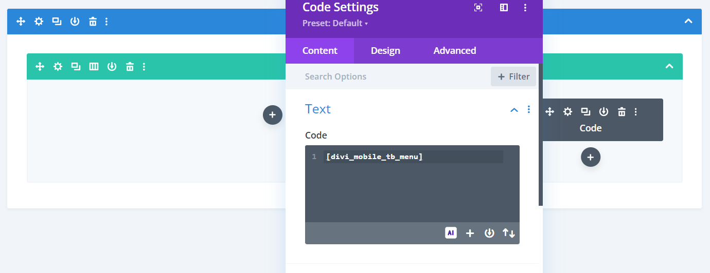
- Place the
[divi_mobile_tb_menu]shortcode into your header layout. Use the Divi Code module to insert the shortcode where you want the mobile menu to appear in your header. - This method allows you to fully control the placement and appearance of your mobile menu using the Theme Builder's powerful design capabilities.
- Place the

Step 2: Activate Theme Builder in Divi Mobile Settings
- Go to Appearance > Customize > Divi Mobile.
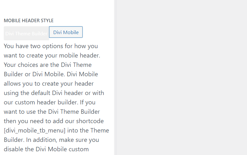
- Within the Divi Mobile settings, locate the General Settings section. Here, find the Mobile Header Style option.
- Toggle the Theme Builder button to activate. This setting ensures that your Divi Mobile menu is properly handled within the layouts created in the Divi Theme Builder.

Tips for Success
- CSS for Z-Index: To ensure your mobile menu appears above other elements, adjust the z-index of the section, row, and column within the Theme Builder where the shortcode is placed. You may need to add the following CSS if required:
.et-l--header {
    z-index: 999;
    position: relative;
}
- Avoid Multiple Shortcodes: Only add the
[divi_mobile_tb_menu]shortcode once within your header layout. Adding multiple instances for different screen sizes is unnecessary and can lead to conflicts or rendering issues. - Consistent Menu Style Across Pages: The mobile menu style configured through Divi Mobile will be consistent across all pages. It is not possible to create different mobile menu styles for different pages using this method.
Finalizing Your Mobile Menu Setup
After configuring these settings, review your mobile header in the Theme Builder preview to ensure everything displays correctly. Test the functionality on various devices to confirm the mobile menu behaves as expected.
By following these steps, you can effectively integrate Divi Mobile with the Divi Theme Builder, enhancing your website's mobile navigation and ensuring a seamless experience across all devices.