Creating a Simple Custom Header and Menu with Divi Mobile
Divi Mobile is a powerful plugin for creating a responsive and visually appealing mobile menu and custom header on your Divi-powered WordPress site. This guide will walk you through the process of configuring a simple yet effective mobile navigation experience.
Live Preview Loading
- While working within WordPress, you might encounter delays in the live preview mode's responsiveness. This is a common occurrence due to the foundational structure of WordPress.
- Should the live preview not reflect your changes immediately, proceed to publish your modifications and then refresh the page. Repeating this process can help in accurately displaying your updates.
- To verify the appearance and functionality of your mobile menu accurately, consider viewing your site from a separate device where you're not logged into the WordPress admin area, such as on a mobile phone. This approach offers a more authentic user perspective.
Step 1: Access Customize Settings
- Navigate to your WordPress admin dashboard.
- Go to Appearance > Customize to open the Theme Customizer.

Adjust General Settings
- Premade Menu Styles: Click on General Settings. Select Style 1 from the premade menu styles. This style provides a basic, user-friendly navigation layout. Click Publish to save changes.

- Mobile Header Style: Ensure that the Mobile Header Style is set to Divi Mobile. This option allows you to utilize Divi Mobile's custom header builder. Click Publish.

- Primary Menu Selection: Scroll to the Primary Menu section and select the menu you wish to display as your primary mobile menu. Click Publish.

- Menu Movement: Choose Expand from outside screen for the Select Primary Menu Movement feature. This setting determines how the menu appears on the screen. Click Publish.

Customize the Custom Header
- Enable Custom Header: Return to the previous menu and select Custom Header. Toggle the Yes button to create a custom header. Click Publish.
- Upload Custom Header Logo: Choose and upload a custom header logo from your media gallery. This logo will represent your brand on all mobile pages. Click Publish.

Style the Burger Menu
- Burger Menu Background Color: Go back to the previous menu and select Burger Menu. Under the burger menu background section, select a color that complements your brand or site design. Click Publish.
Define Menu Style
- Menu Background Color: Navigate to the Menu Style section. Set your preferred menu background color to enhance visual appeal. Click Publish.
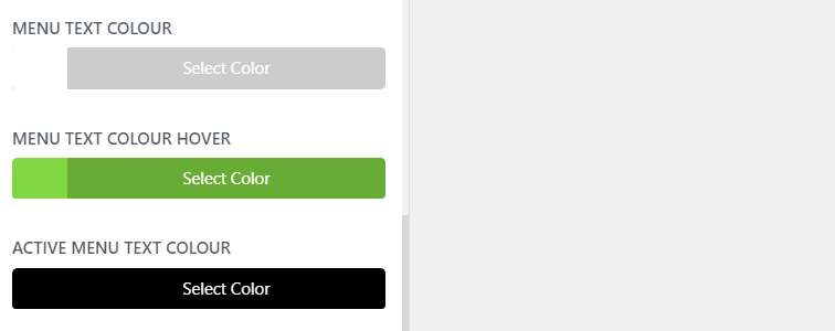
- Menu Text Settings: Adjust the menu text color, hover color, and active menu text color to ensure readability and visual consistency. Click Publish.

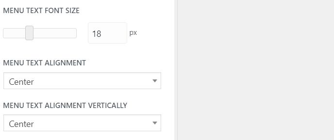
- Text Size and Alignment: Further down, set the menu text size and alignment according to your design preferences. These adjustments contribute to the menu's usability and appearance. Click Publish.

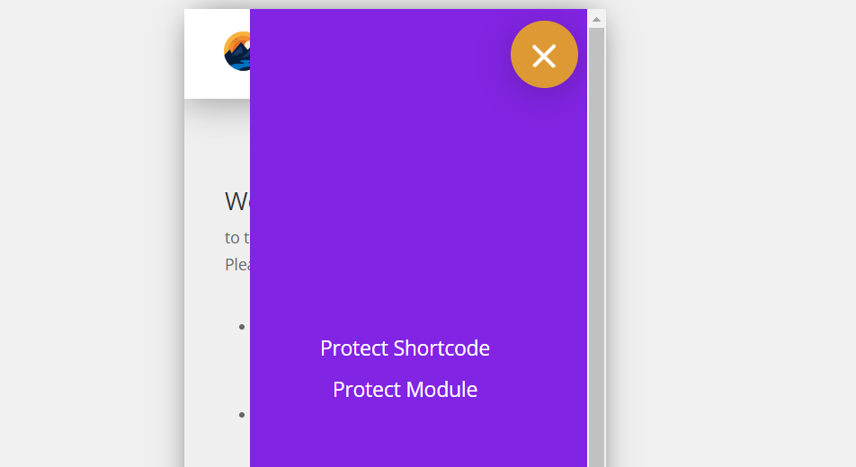
Mobile Menu Example


Finalizing Your Custom Mobile Menu
After completing these steps, you'll have a basic yet fully functional custom mobile menu and header, tailored to your site's needs and style preferences. Remember, the Divi Mobile plugin offers extensive customization options, so feel free to explore beyond these basic settings to further enhance your mobile site's navigation.
Tips for Success
- Consistency: Ensure your mobile header and menu design align with your site's overall style for a cohesive user experience.
- Testing: Preview your site on various mobile devices to verify that the menu functions and appears as expected across different screen sizes.
- Updates: Keep Divi Mobile updated to take advantage of the latest features and improvements.
More Information
For detailed information on additional settings within Divi Mobile, please refer to the comprehensive documentation available.