Planning Your Mobile Menu
Before diving into Divi Mobile, it's essential to carefully plan your mobile header and menu. Consider the user experience and what elements you will include in the menu.
Questions to consider:
- Is the Theme Builder necessary? Be aware that it can sometimes cause conflicts due to various modules and code.
- How many items will your menu include?
- Do any of your menu items have sub-items or nested sub-items?
- Do you intend to use the mobile header on desktop as well?
- We offer various options tailored to different needs.
Read our best practices and preservation tips here
Theme Customiser
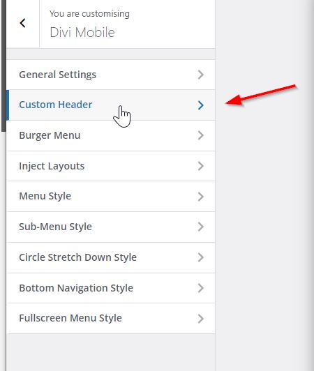
Currently, we use the theme customizer because Divi Mobile was created before the Divi Theme Builder was available. One important thing to note about the customizer is that it saves all settings related to the theme you're working on directly to the database.
What does this mean for you?
If you decide to introduce a child theme midway through your project, you will need to reconfigure your menus.
Therefore, it's best to plan ahead. If you're considering using a child theme, make sure to install it before you start configuring Divi Mobile. This approach helps avoid redoing work later on.
Mobile Header
Start with the mobile header, which should include elements like the logo, hamburger icon, search, and shopping cart if you're using WooCommerce.
We recommend using our "Custom Header" feature for greater control and easier troubleshooting.

While we suggest this option, you can also use the native Divi Builder header or the Theme Builder. If opting for the Theme Builder, be sure to enable specific settings by checking out our documentation here.
Consider the simplicity and future-proofing of your choice—using either the Divi option or ours is typically the easiest and safest route.
Burger Menu
Next, focus on the Burger Menu. We provide various styles and the option to upload your own SVG code. This allows for customization with CSS animations. Choosing a style is straightforward, with no significant complications.
Menu Style
Give some thought to the menu style. We have several styles designed for different menu sizes. For instance:
- Circle Stretch Down: This style does not support sub-items and is best for menus with brief labels.
- Bottom Navigation: Positioned at the bottom of the screen, this style also does not accommodate sub-items.
Sub-Menu Style
Like the main menu style, sub-menu styles cater to various requirements. For example, the "Side by Side" style supports up to two levels (parent and child), while the "Overlap Slide In" style is ideal for menus with a deeper hierarchy.
Main Takeaway Points:
- Plan ahead
- Stick to a plan
- Make it simple for you to build and maintain
- Do not change theme or add child theme after as changes will be lost