Thumbnail Module
Overview
The Thumbnail module displays the featured image for each post or product in a loop layout. It includes options for image size, linking, placeholders, and optional hover effects such as image flipping.

When to use it
Use this module as component of a Custom Loop Layout that will be used inside the Archive Loop to dynamically display the featured image of each loop item. Custom loop layouts are saved in the Divi Library.
This module is not compatible with the Loop Builder.
Content Tab
Configure how the featured image is sourced, displayed, and linked.
Main Settings
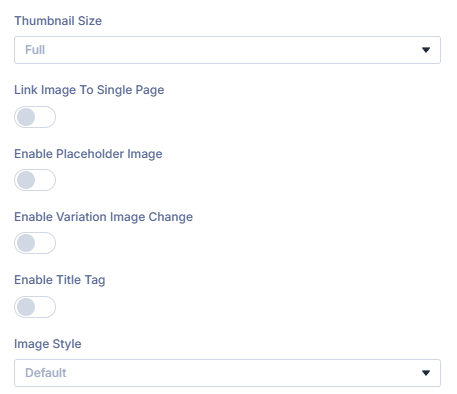
Thumbnail Size: Choose which image size to render in the loop output.
Select from your site’s registered WordPress image sizes such as Thumbnail, Medium, Large, or Full.
Link Image to Single Page: Make the image link to the post or product page.
When enabled, the image becomes clickable and links to the loop item’s single page.
Open Link in New Tab: Opens the link in a new browser tab.
Enable to open the linked page in a new browser tab.
Enable Placeholder Image: Show a fallback when the item has no featured image.
When a post or product lacks a featured image, this setting displays a fallback image.
Placeholder Image: Upload or select the fallback image.
Choose or upload the image that will display when no featured image is available.
Placeholder Alt Text: Define the alt attribute for accessibility.
Provide concise, descriptive alternative text for screen readers and SEO.
Placeholder Title Text: Add a title attribute for the placeholder image.
Optionally add a title attribute that may appear as a tooltip in some browsers.
Image Style: Choose the behavior of the image on hover.
Select how the thumbnail behaves when hovered frpm the following options.
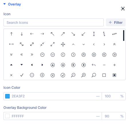
Default: Displays the featured image with an Overlay.
Shows the post or product’s featured image with and overlay Color and optional Icon.
When you enable this setting Styling Options for the Overlay color and icon are added to the Design Tab of this module.
Image Only (no overlay): Displays the featured image with no hover effects.
Shows the post or product’s featured image by itself with no applied effects when hovered.
Flip Hover: Displays a secondary image on hover (requires ACF).
Replaces the primary image with a secondary image when hovered. This requires an ACF image field assigned to the current post or product.

Flip Image ACF Field: Choose the ACF field containing the secondary image.
Select which ACF field provides the secondary image displayed during the hover effect.
Design Tab
This is where all the design settings for the Thumbnail module lives. You will only see available design settings for the selections you have made on the Content Tab.
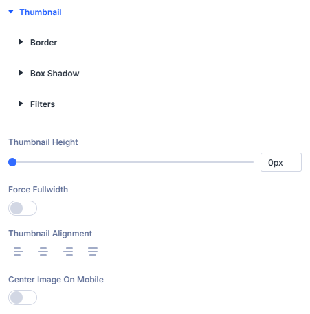
Thumbnail
Design settings for the thumbnail image can be found in the Thumbnail section.
Overlay
Design settings for the overlay color and icon can be found in the Overlay section.