Archive Loop Module
Overview
The Archive Loop module renders query results such as posts, products, or custom post types. It is used on archive templates or standard pages when you want a loop grid with pagination that updates dynamically when connected to Filter Posts.

Add Archive Loop first to confirm it outputs the correct post type, then connect a Filter Posts module to enable Ajax filtering.
When to use it
The Archive Loop module in Divi Ajax Filter is fully compatible with the native Loop Builder introduced in Divi 5. Both tools serve the same goal—displaying lists or grids of posts—but differ in how much control you need over the design and structure.
▶ Use Archive Loop when you want a quick, ready-to-go layout that automatically supports Ajax filtering, pagination, and sorting without additional setup. It is ideal for category, tag, or product archives that need standard cards with predictable layouts.
▶ Use Loop Builder when you require a custom design for each post item or need advanced styling. You can still connect a Filter Posts module to a Loop Builder layout if you need Ajax filtering on a custom loop.
Content Tab
This is where all the functional settings for the Archive Loop module lives.
Template Picker
The template picker helps you get started quickly with the Archive Loop module by giving you various options for how posts are displayed and which posts are displayed.
It will load settings for the following based on your selection:
- Loop Design – Choose from some preset design settings to determine how posts are displayed.
- Loop Query – Choose from some preset query settings that control what is shown and in which order.
Main Settings
Configure what content to show and when.
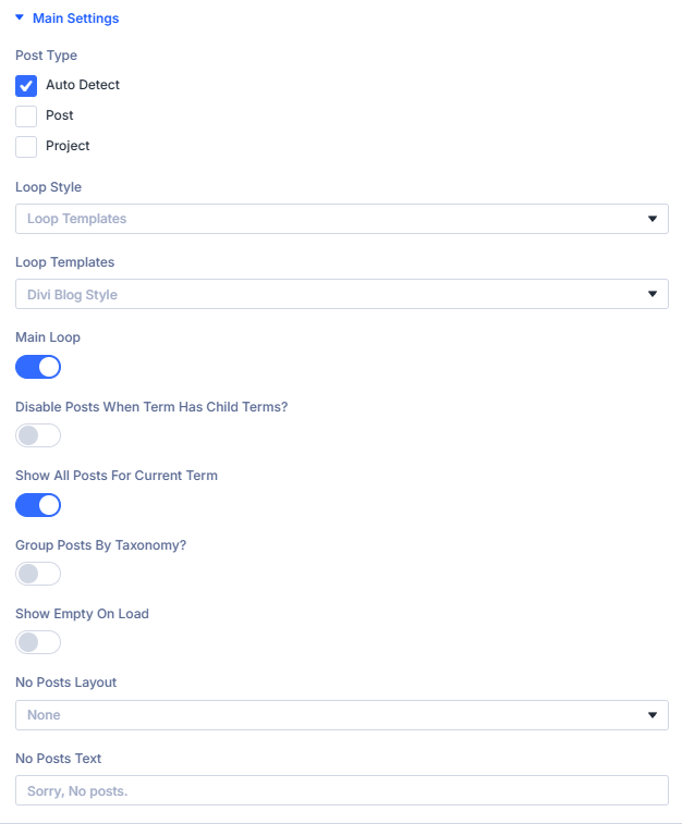
Post Type: Choose which post type to display.
Select the post type that will populate the loop, such as Post, Product, or Project.
When building archive templates in the Theme Builder, use Auto detect to automatically match the current archive’s post type.
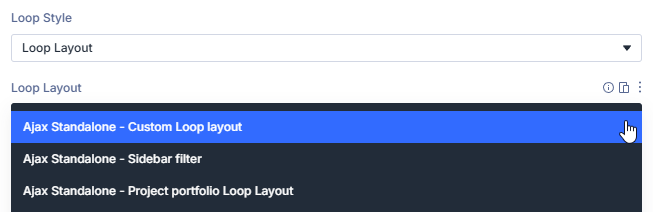
Loop Style: Determine how the loop is rendered on the page.
Loop Templates: Select a predefined layout when using Loop Templates.
Pick from several built-in template options:
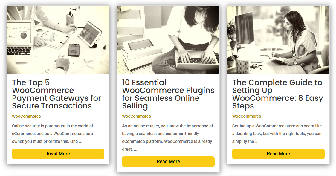
- Divi Blog Style – A standard blog grid showing featured images and metadata.
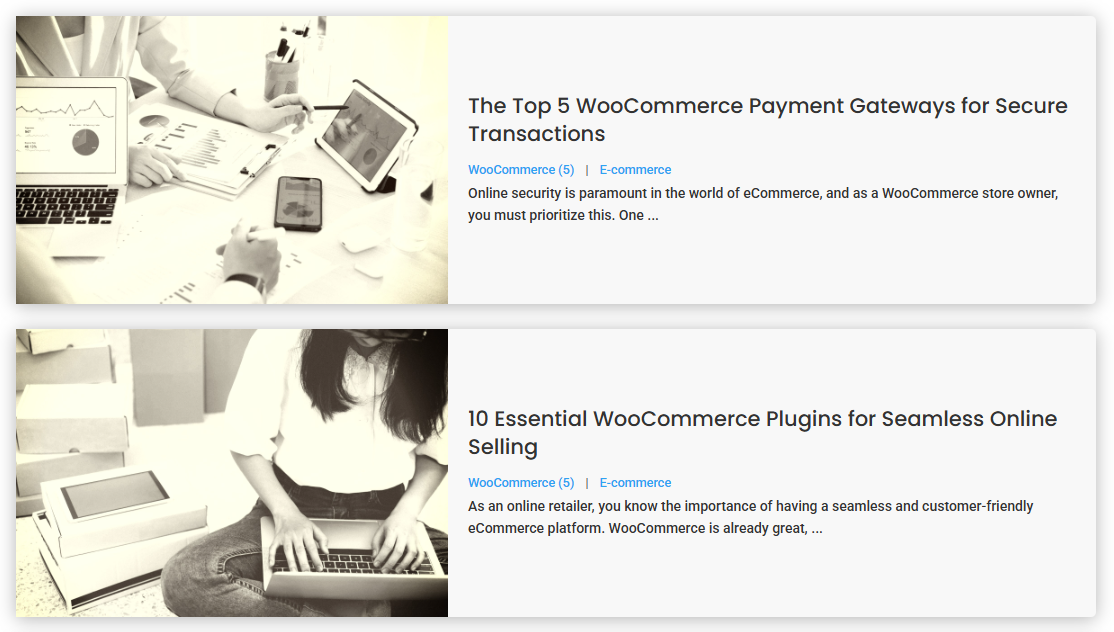
- Minimal List – A lightweight vertical list without extra styling.
- Background Image – A card layout using the featured image as a background.
- Custom Template (Advanced) – Use your own PHP-based layout for complete control.
Loop Layout: Load a saved Divi Loop Layout from the Divi Library.
This will show you a dropdown that lists all your saved layouts in the Divi Library that can be used for your Loop Layout.
Shortcode: Render results using a shortcode from another plugin or custom query.
If you are using a plugin that produces a shortcode that you want to render your loop you can enter it here.

Main Loop: Set whether this loop is the primary results target.
Enable this option when using multiple Archive Loop modules on a single page. The main loop acts as the target that receives filter results from the Filter Posts module.
Disable Posts When Term Has Child Terms: Hide parent term posts when subterms exist.
When viewing taxonomy archives (categories, tags, or custom taxonomies), this setting hides posts belonging to a parent term if that term has child terms. This prevents duplicated or mixed results and keeps parent term archives focused on grouping rather than content display.
Show All Posts For Current Term: Include all posts related to the current archive term.
When enabled, all posts linked to the active archive term are displayed — even if they also belong to other terms. For example, on a Category archive, all posts tagged with that category will appear regardless of additional taxonomy relationships.
Group Posts By Taxonomy: Organize results into taxonomy-based groups.
Outputs the results grouped under headings for a selected taxonomy, such as Category, Tag, or Product Type. Useful for directory-style layouts or category-separated listings.
Grouping Taxonomy: Select the taxonomy by which you want to group posts.
This will show you a dropdown that lists all your Taxonomies you can group by.

When you enable this setting Styling Options for the Taxonomy Title are added to the Design Tab of this module.
Show Empty On Load: Start with no results until filters are applied.
When enabled, the Archive Loop will not show any posts on initial page load. Results appear only after the user interacts with a Filter Posts module or another trigger.
No Posts Layout / Text: Define what appears when no results are found.
Choose a Divi Library layout to display when the query returns no results, or enter custom text (e.g., “Sorry, no posts found”).
Loop Options
This is where you can further fine-tune which posts are either included or excluded from the results, how it is ordered, and when it is displayed.
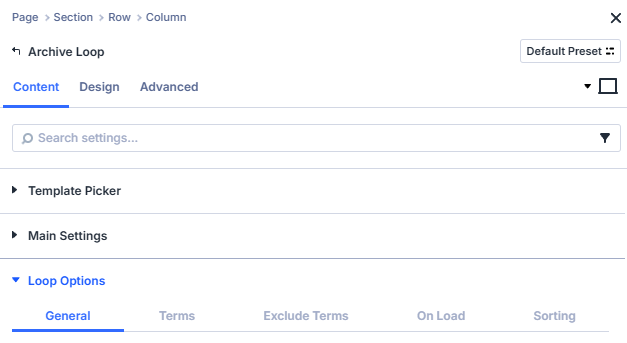
- General
- Terms
- Exclude Terms
- On Load
- Sorting
Use the General settings to define the core query for your loop. Control which post statuses are displayed, how many appear, and how they relate to the current post or global WordPress query.
Post Status: Limit results by status of the selected post type.
Published – Displays only posts that are live and publicly visible on the site. This is the default and recommended setting for most archives.
Pending – Includes posts that are awaiting editorial approval before publication. Useful for previewing content workflows.
Draft – Shows posts saved as drafts. Ideal when testing layouts or filters before publishing.
Private – Displays posts marked as private. These are only visible to logged-in users with sufficient permissions (typically Editors or Administrators).
Future – Includes scheduled posts set to publish at a later date. Helpful for previewing upcoming content in a timeline or event-style archive.
Query Filters: Choose whether this module should respect global WordPress query filters.
Default – Keeps all standard WordPress query filters active. This means the loop will respect global settings and hooks such as pre_get_posts, category visibility, and any third-party modifications added by plugins or themes.
Ignore – Bypasses global WordPress query filters and runs a clean, direct query for the selected post type. Use this option when you need the loop to display raw results unaffected by other plugins, custom filters, or global restrictions.
Include Current Post: Choose whether to include the current post in the loop.
When enabled, the loop will include the post currently being viewed (for example, the active single post or page). Turn this off when you want to exclude the current post from related lists to avoid duplication.
Post Count: Set how many posts to display in the loop.
Defines the total number of posts shown per page before pagination or load more triggers. The default is 10, matching the standard WordPress posts-per-page value.
Offset: Skip a number of posts before displaying results.
Allows you to start the loop after a specified number of posts. For example, setting an offset of 1 will skip the first post in the query and display results starting from the second. This can be used to create staggered layouts, such as featuring the first post separately.
Relationship Type: Show posts by their relation to the current post.
Use this setting when displaying an Archive Loop inside a single post template or dynamic page to output posts that share a specific relationship with the current post. You can match posts by shared taxonomies, custom fields, ACF relationships, or even the current logged-in user.
This is useful for displaying related content, such as posts in the same category, similar products, or upcoming events connected to the one being viewed.
None: Show posts without relationship filtering. default
Displays posts based solely on the main query settings (such as post type, status, or taxonomy). Use this when you want a general listing that is not tied to the current post’s context.
Categories: Show posts sharing the same categories as the current post.
Filters results to display posts that belong to one or more of the same categories as the current post. Ideal for creating “Related Posts” sections on blog pages where you want to show content from matching categories.
Tags: Show posts sharing the same tags as the current post.
Limits the loop to posts that share one or more tags with the post being viewed. Use this when you want finer-grained relationships than category-based matches.
Custom taxonomy: Relate posts by any registered taxonomy.
Allows you to choose a custom taxonomy (such as Product Type, Event Category, or Location) and show posts that share one or more terms with the current post. Perfect for CPT archives or advanced relationships beyond standard categories or tags.
Post object / relationship: Match posts linked via ACF relationship fields.
Displays posts that are connected to the current post through an ACF Post Object or Relationship field. For example, an Event post can display its related Performers or Venues if those are linked through an ACF relationship.
ACF field match: Show posts with matching ACF field values.
Filters posts based on a shared field value in ACF.
For instance, if both Projects and Teams share a field like project_id, this option can list all teams with the same project_id as the current project.
Current user's posts: Limit results to posts created by or assigned to the logged-in user.
Displays only posts authored by or assigned to the current logged-in user. Useful for dashboards, profile pages, or membership sites where users should only see their own submissions or related content.
Sticky Posts: Control how sticky posts behave in the loop.
Choose how WordPress sticky posts (posts marked to stay at the top of lists) are handled in this loop. This setting is useful for controlling how featured or pinned posts appear in blog or news listings.
Include normally: Show sticky posts and pin them to the top. default
Sticky posts are included in the loop and behaves as intended by displaying them first. This means that sticky posts will override any other sorting rules.
Include, but don’t pin to top: Display sticky posts without prioritizing them.
Sticky posts are included in the results but will not appear before regular posts. They follow the same sort order as all other posts in the loop.
Exclude completely: Remove sticky posts from the loop entirely.
Any post marked as sticky will be skipped in the query. Use this to prevent featured posts from appearing twice if they are shown in a separate “Featured” section.
Show only sticky posts: Display exclusively the posts marked as sticky.
Filters the query to show only posts that are set as sticky in WordPress. Useful for building a dedicated featured posts grid or hero section.
Select the categories, tags, custom taxonomies, or ACF term fields you want to include in the loop. Choose one or more terms to narrow results; leave all unchecked to use the broader base query.
Include categories: Limit results to selected categories.
Select one or more categories to restrict the loop to posts assigned to any of those terms. Leave all checkboxes unchecked to ignore category filtering and use the broader query.
This option can be combined with Include tags, Include ACF Field, or Include taxonomies for further narrowing.
Include tags: Limit results to selected tags.
Choose one or more tags to show posts that match any of the selected tags. Leave all checkboxes unchecked to ignore tag filtering.
This option can be combined with Include categories, Include ACF Field, or Include taxonomies for further narrowing.
Include Taxonomies: Choose a custom taxonomy to include in the loop.
Select the taxonomy you want to filter by, for example a product attribute or a custom taxonomy registered by a plugin or theme.
Leave this unset to ignore custom taxonomy filtering.
Include Taxonomy Terms: Pick the terms from the selected taxonomy.
After choosing a taxonomy, select one or more terms to restrict results to posts that match any of those terms.
Leave all terms unchecked to include all terms within the chosen taxonomy.
Include ACF field: Match results using a selected ACF field.
Choose the ACF field that should be used to filter posts. Supported field types depend on your ACF setup.
If no field is selected, the loop will not apply an ACF-based include filter.
Include ACF value: Provide the value to match for the selected ACF field.
Enter the value that posts must contain in the chosen ACF field to be included.
Leave this empty to skip value-based matching.
Exclude specific categories, tags, or custom taxonomy terms from the loop. Select the terms you want to remove from results; leave all unchecked to include everything.
Exclude categories: Remove posts assigned to selected categories.
Tick one or more categories to exclude any posts that belong to those terms from the loop.
Leave all checkboxes unchecked to allow posts from all categories.
Exclude tags: Remove posts assigned to selected tags.
Choose one or more tags to prevent posts with those tags from appearing in the loop.
Leave all checkboxes unchecked to allow posts with any tag.
On Load limits results only on initial page load. These selections are ignored after the user filters the content. Leave everything unchecked to use the broader base query on load.
On Load Categories: Include selected categories on page load only.
Tick one or more categories to restrict the first render to posts in those categories.
After any filter action, these limits no longer apply.
On Load Tags: Include selected tags on page load only.
Choose one or more tags to narrow the initial results.
Subsequent filtering replaces these on-load constraints.
On Load Taxonomies: Choose a custom taxonomy for page-load filtering.
Select the taxonomy to use for initial results, such as a product attribute or any registered custom taxonomy.
On Load Taxonomy Terms: Pick the terms from the selected taxonomy.
After selecting a taxonomy, choose one or more terms that results must match on page load only.
Leave all terms unchecked to include all terms for the chosen taxonomy on the first render.
Use the Sorting settings to define the order in which posts appear. Choose the main sorting criteria, direction, and optionally apply secondary sorting for additional organization.
Sort Order: Choose the primary field used to sort results.
Select the field that determines how results are ordered. Pair this with Order by to choose ascending or descending.
Date: Order by the post’s publish date.
Choose this option to sort in either Ascending or Descending order by published date.
ID: Order by the post’s numeric ID.
Useful for strict chronological creation order when dates are unavailable or identical.
Linked Posts Order: Order by a relationship-defined order.
Use when another module or data source provides a linked ordering (for example, a related items list).
Menu Order: Order by the page or post’s menu order value.
Ideal for pages or custom post types where you manually assign order values.
Modified: Order by the last modified date.
Surfaces content that was edited most recently.
Name: Order by the post slug.
Sorts by the URL-friendly name of the post.
Relevance: Order by search relevance.
Use when the loop is driven by a search query to prioritise best matches.
Random: Shuffle the order on each load.
Displays posts in a random order; note that order changes per request.
Title: Order alphabetically by post title.
Use Ascending for A–Z or Descending for Z–A.
ACF Field: Order by the value of a chosen ACF field.
Displays a dropdown that lists available ACF fields you can sort by. Works with both String and Numeric values.

Sorting ACF Field: Choose the ACF field to sort by.
Select the ACF field name used to determine order.
ACF Field Type: Define how the field value should be interpreted.
- Numeric – Sorts by numeric value (e.g., prices, scores, counts).
- String – Sorts alphabetically by text content.
Choosing the correct type ensures accurate ordering.
ACF Date Picker: Order and sort results using an ACF Date Picker field.
Select the ACF Date Picker field that contains the date you want to sort by.
This option is useful for displaying posts or events in order of their custom date values, such as upcoming events or recently published items.

ACF Date Picker Field: Choose the ACF date picker field you want to use.
Select the ACF field name from the list of fields available in your ACF setup. Make sure it is a Date Picker field type.
Date Picker Method: Choose the date comparison method.
Determine how the selected ACF Date Picker field should be used to filter or order results.
- Default – Displays all posts using the selected date field without filtering by time period.
- Today – Displays posts with a date matching today’s date only.
- Today and Future – Includes posts with dates from today onward, ideal for upcoming events.
- Today and Next x Days – Shows posts dated today and within the next chosen number of days.
- In the Past – Displays posts with a date earlier than today, useful for past events or archives.
- Last 7 Days (including today) – Includes posts with dates from the past 7 days, including today.
- Yesterday and Past x Days – Displays posts dated yesterday and the specified number of days before.
Adjusting these options allows for flexible date-based ordering — ideal for event listings, time-sensitive content, or ongoing schedules.
Order By: Set the direction of the primary sort.
Choose whether to display results in Ascending or Descending order based on the selected Sort Order.
For example, sort by Date – Descending to show the latest posts first.
Secondary Sort Order: Choose a secondary field to sort by after the primary sort.
Select an additional sort key (for example, an ACF field or custom value) to refine the order of posts that share the same value in the primary sort.
This is optional and most useful when multiple posts share identical dates or titles.
Secondary Order By: Set the direction of the secondary sort.
Choose Ascending or Descending to define how posts are ordered for the secondary sort.
Use Ascending when you want smaller or earlier values to appear first.
Grid Settings
Controls how posts are laid out visually.

Grid Style: Choose how posts are displayed in the loop.
Select the grid style to determine how results are structured on the page.
Each style offers different layout behaviour and may reveal additional options.
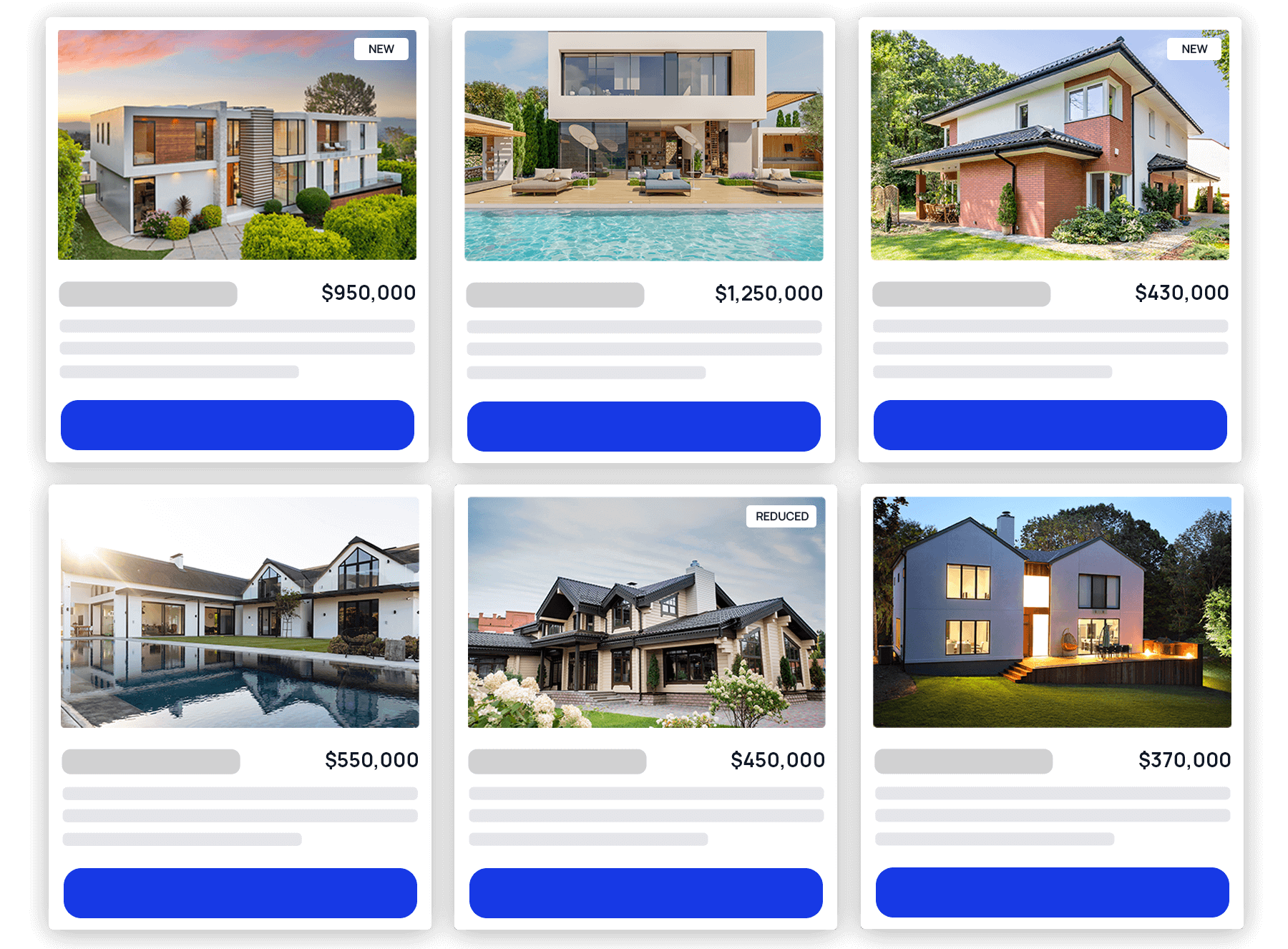
Grid: Display results in a multi-column grid.
Shows posts in a traditional column grid. Combine with Columns and Equal Height Posts for a balanced layout.
List: Display results in a single-column vertical list.
Stacks posts vertically for easy reading. Ideal for content-focused layouts like news feeds or article lists.
Grid / List View Switch: Add a user-controlled toggle between grid and list views.
Enables a toggle button allowing visitors to switch between Grid and List views dynamically.
Use this to give users more control over how content is displayed.

Grid List Position: Choose the position of the grid/list switch.
Select whether the view switch control appears on the Left or Right of the loop header.
Default State: Choose the default display mode for the grid/list switch.
Set the initial state shown when the page loads — either Grid or List.
Cookie Time: Control how long the view preference is remembered.
Define how many days the chosen view (grid or list) should be stored in the browser’s cookie.
Setting this to 0 days disables persistent storage.
Masonry: Display posts in a flexible, flowing masonry grid.
Arranges posts of varying heights in a compact layout without fixed rows.
Commonly used for portfolios, galleries, and blog grids with variable content lengths.

Masonry Ajax Delay: Adjust the loading delay for masonry items.
Define the delay in milliseconds before the masonry layout is refreshed after Ajax filtering.
Use higher values if images or dynamic elements need additional load time.
Equal Height Posts: Make all grid items the same height.
Enable this option to ensure all grid items align uniformly, regardless of title or excerpt length. This creates a clean, consistent appearance for multi-column layouts.
When enabled, you will have an additional option to align the last module in the grid item to the bottom of the container.
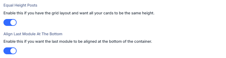
This setting will have no effect on the Masonry grid style.
Columns: Adjust how many columns appear in the grid.
Use the slider or input to define the number of columns displayed per row.
Common choices include 3 for standard blog grids or 4 for product-style layouts.
Custom Gutter Gaps: Control spacing between grid items.
Toggle this option to set custom horizontal and vertical spacing between posts.
Use smaller gaps for compact grids or larger ones to create more breathing room between items.
Element Settings
Control how the loop outputs pagination and helper UI elements like sorting and counts.

Choose How To Display Load More Posts: Select how additional results are revealed.
Pick how visitors access additional results.
None: Do not show a built-in loading control.
The loop renders a single page of results with no load more, infinite scroll, or pagination controls.
Load More: Append the next set of results on button click.
Displays a Load more button that fetches and appends the next batch of items below the current list.
Load More Text: Set the button label.
Enter the text shown on the Load more button, for example “Load more” or “Show more posts”.
Load More Loading Text: Show feedback while fetching.
Enter the text displayed while new results are loading, for example “Loading…” or “Fetching posts…”.
Load More Button Alignment: Choose the button position.
- Left – Align the button to the left edge of the loop container.
- Center – Center the button beneath the results.
- Right – Align the button to the right edge of the loop container.
When you use Load More Styling Options for the text and button are added to the Design Tab of this module.
Pagination: Navigate between pages of results.
Shows pagination controls so visitors can move to the next or previous page (and optionally numbered pages, depending on theme/styles). Active filters (category, tag, custom fields, price range, and other filter types) are preserved when visitors move to page 2 and beyond — including when results come from the Search Posts module (e.g. Divi Machine). The Filter Posts reset still clears all filters as expected.
Pagination Position: Choose where the pagination control appears.
Place pagination at the Bottom, Top, or Top and Bottom of the results list.
Scroll To Top After Pagination: Automatically scroll back to the loop after a page change.
Enable to move the viewport to the loop container when users switch pages. Improves UX on long pages.
Scroll To Top Offset: Adjust the final scroll position in pixels.
Set a positive or negative offset to account for sticky headers or spacing, for example 80px to stop below a fixed menu.
Infinite Scroll: Automatically load more results as the user scrolls.
Fetches the next batch of items when the visitor reaches the end of the current list, without clicking a button.
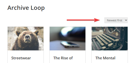
Show Default OrderBy Menu: Display the built-in sorting dropdown.
Adds the default WooCommerce/WordPress OrderBy dropdown so users can change the sort field or direction at runtime.
Show Results Count: Display the number of results.
Enable to show a results counter for the current query or filtered view.

Results Count Position: Choose where the counter appears.
Select the position of the count relative to the loop (for example Top or Bottom).
Results Count Singular Text: Set text when there is one result.
Enter the message for a single-item result, for example “Showing the only result”.
Results Count All Text: Set text when all results are visible.
Use %d as a placeholder for the total number of results, for example “Showing all %d results”.
Results Count Multiple Text: Set text for paged ranges.
Use three %d placeholders in order: start, end, total.
Example: “Showing %d–%d of %d results”.
Extra Settings
Control how each result card links out.

Link Each Layout To Single Page: Make loop layout link to its single post page.
Enable to wrap the loop item with a link to the post, product, or custom post type single page.
Link To External URL: Replace the single post link with an external link.
Enable when you want clicks on a result to open an external destination instead of the single page.
External ACF Field: Choose the ACF text field that stores the external URL.
Select the ACF field containing the full URL to open when Link To External URL is enabled.
Open In New Tab: Open the link in a new browser tab.
Applies to both single page links and external URLs.
Loop Template Settings
These options appear when Loop style is set to Loop Templates and vary by the selected template.

When you select a loop template, relevant Styling Options are added to the Design Tab under Loop Template Settings.
- Blog Style
- Minimal List
- Background Image
- Shop Style
Use the Blog Style settings to control common blog card elements such as featured image, meta, and excerpt.
Enable Featured Image: Show the post’s featured image.
Toggle the featured image for each card.
Featured Image Size: Choose the image size to load.
Select one of the registered WordPress image sizes for the featured image:
- Thumbnail: Small square size defined in Settings → Media. Good for compact lists and small cards.
- Medium: Standard medium size. Suits most grid cards where performance is a priority.
- Medium Large: Wider than Medium. Useful for two or three column grids.
- Large: Big display size for spacious layouts or hero-style cards.
- Full Size: Original image dimensions. Highest quality with the largest file size.
Enable Post Title: Show the post title.
Displays the title in the card content area.
Enable Read More Button: Add a read more button under the content.
Shows a button that links to the single post.
Read More Text: Set the button label.
Appears when Enable Read More Button is on. Enter the label, for example “Read more”.
Fullwidth Button: Make the button span the card width.
Appears when Enable Read More Button is on. Expands the button to full width within the card.
Enable Author: Show the post author.
Adds the author name to the meta row.
Enable Date: Show the publish date.
Displays the post date.
Date Format: Set the date display format.
Appears when Enable Date is on. Enter a PHP date format string, for example F j, Y.
See some more examples below:
| Format | Output Example | Description |
|---|---|---|
F j, Y | March 7, 2025 | Full month, day without leading zero, four-digit year |
Y-m-d | 2025-03-07 | ISO-style numeric date |
l, F j | Friday, March 7 | Day name and month |
M jS, Y | Mar 7th, 2025 | Short month, ordinal day, and full year |
d/m/Y | 07/03/2025 | Common numeric format (UK style) |
You can reference the PHP date format documentation for the complete list.
Enable Categories: Show the post categories.
Displays the post categories.
Enable Categories Count: Show the number of categories.
Appears when Enable Categories is on. Adds a count next to categories where supported.
Enable Tags: Show the post tags.
Displays the assigned tags.
Content Display: Choose what content appears in the card.
Select how each card outputs its text content.
Excerpt: Show a trimmed summary of the post.
Displays the post excerpt with optional controls for length and behaviour.
Excerpt Length (Words): Set the excerpt length.
Choose how many words to display in the excerpt.
Excerpt More Text: Set the truncation or expand text.
Enter the text shown for truncated or expandable excerpts, for example “...”.
Excerpt Click Action: Choose what happens when the excerpt is clicked.
Pick the action you prefer:
- Expand Text - Reveal more text.
- Go to Post - Link to the single post page.
- No Action - Do nothing.
Content: Show the full post content.
Renders the complete post content inside the card. Use with care on long articles.
No Content: Do not show any body text.
Hides the excerpt or content. Cards may still show titles and meta if enabled.
Enable Comment Count: Show the number of comments.
Adds a comment count to the meta row.
Meta Separator: Set the separator used between meta items.
Enter a character such as • or | to separate meta fields.
Use the Minimal List settings to output a compact list with optional meta and a short excerpt.
Enable Featured Image: Show the post’s featured image.
Toggle the featured image for each card.
Featured Image Size: Choose the image size to load.
Select one of the registered WordPress image sizes for the featured image:
- Thumbnail: Small square size defined in Settings → Media. Good for compact lists and small cards.
- Medium: Standard medium size. Suits most grid cards where performance is a priority.
- Medium Large: Wider than Medium. Useful for two or three column grids.
- Large: Big display size for spacious layouts or hero-style cards.
- Full Size: Original image dimensions. Highest quality with the largest file size.
Enable Post Title: Show the post title.
Displays the title in the card content area.
Enable Read More Button: Add a read more button under the content.
Shows a button that links to the single post.
Read More Text: Set the button label.
Appears when Enable Read More Button is on. Enter the label, for example “Read more”.
Fullwidth Button: Make the button span the card width.
Appears when Enable Read More Button is on. Expands the button to full width within the card.
Enable Author: Show the post author.
Adds the author name to the meta row.
Enable Date: Show the publish date.
Displays the post date.
Date Format: Set the date display format.
Appears when Enable Date is on. Enter a PHP date format string, for example F j, Y.
See some more examples below:
| Format | Output Example | Description |
|---|---|---|
F j, Y | March 7, 2025 | Full month, day without leading zero, four-digit year |
Y-m-d | 2025-03-07 | ISO-style numeric date |
l, F j | Friday, March 7 | Day name and month |
M jS, Y | Mar 7th, 2025 | Short month, ordinal day, and full year |
d/m/Y | 07/03/2025 | Common numeric format (UK style) |
You can reference the PHP date format documentation for the complete list.
Enable Categories: Show the post categories.
Displays the post categories.
Enable Categories Count: Show the number of categories.
Appears when Enable Categories is on. Adds a count next to categories where supported.
Enable Tags: Show the post tags.
Displays the assigned tags.
Content Display: Choose what content appears in the card.
Select how each card outputs its text content.
Excerpt: Show a trimmed summary of the post.
Displays the post excerpt with optional controls for length and behaviour.
Excerpt Length (Words): Set the excerpt length.
Choose how many words to display in the excerpt.
Excerpt More Text: Set the truncation or expand text.
Enter the text shown for truncated or expandable excerpts, for example “...”.
Excerpt Click Action: Choose what happens when the excerpt is clicked.
Pick the action you prefer:
- Expand Text - Reveal more text.
- Go to Post - Link to the single post page.
- No Action - Do nothing.
Content: Show the full post content.
Renders the complete post content inside the card. Use with care on long articles.
No Content: Do not show any body text.
Hides the excerpt or content. Cards may still show titles and meta if enabled.
Enable Comment Count: Show the number of comments.
Adds a comment count to the meta row.
Meta Separator: Set the separator used between meta items.
Enter a character such as • or | to separate meta fields.
Use the Background Image settings to display content over an image with optional hover effects and overlay controls.

Enable Post Title: Show the post title.
Displays the title in the card content area.
Enable Read More Button: Add a read more button under the content.
Shows a button that links to the single post.
Read More Text: Set the button label.
Appears when Enable Read More Button is on. Enter the label, for example “Read more”.
Fullwidth Button: Make the button span the card width.
Appears when Enable Read More Button is on. Expands the button to full width within the card.
Enable Author: Show the post author.
Adds the author name to the meta row.
Enable Date: Show the publish date.
Displays the post date.
Date Format: Set the date display format.
Appears when Enable Date is on. Enter a PHP date format string, for example F j, Y.
See some more examples below:
| Format | Output Example | Description |
|---|---|---|
F j, Y | March 7, 2025 | Full month, day without leading zero, four-digit year |
Y-m-d | 2025-03-07 | ISO-style numeric date |
l, F j | Friday, March 7 | Day name and month |
M jS, Y | Mar 7th, 2025 | Short month, ordinal day, and full year |
d/m/Y | 07/03/2025 | Common numeric format (UK style) |
You can reference the PHP date format documentation for the complete list.
Enable Categories: Show the post categories.
Displays the post categories.
Enable Categories Count: Show the number of categories.
Appears when Enable Categories is on. Adds a count next to categories where supported.
Enable Tags: Show the post tags.
Displays the assigned tags.
Content Display: Choose what content appears in the card.
Select how each card outputs its text content.
Excerpt: Show a trimmed summary of the post.
Displays the post excerpt with optional controls for length and behaviour.
Excerpt Length (Words): Set the excerpt length.
Choose how many words to display in the excerpt.
Excerpt More Text: Set the truncation or expand text.
Enter the text shown for truncated or expandable excerpts, for example “...”.
Excerpt Click Action: Choose what happens when the excerpt is clicked.
Pick the action you prefer:
- Expand Text - Reveal more text.
- Go to Post - Link to the single post page.
- No Action - Do nothing.
Content: Show the full post content.
Renders the complete post content inside the card. Use with care on long articles.
No Content: Do not show any body text.
Hides the excerpt or content. Cards may still show titles and meta if enabled.
Enable Comment Count: Show the number of comments.
Adds a comment count to the meta row.
Post Content Visibility: Choose when overlay content is visible.
Select how the title, meta, and excerpt appear over the image:
- Show on Hover: Hide content by default and reveal it when the user hovers the card.
- Always Show: Keep the overlay content visible at all times.
- Never Show: Hide the overlay content completely.
Image Hover Animation: Choose the image hover effect.
Pick the animation applied to the background image on hover:
- None: No animation is applied.
- Zoom In: Slightly zoom the image in on hover.
Content Alignment: Set how overlay content is aligned.
Choose the overlay’s alignment within the card, for example Center Center.
Color Theme: Choose the overlay colour theme.
Select the preset that best contrasts with your images:
- Light: Light overlay and text styling.
- Dark: Dark overlay and text styling.
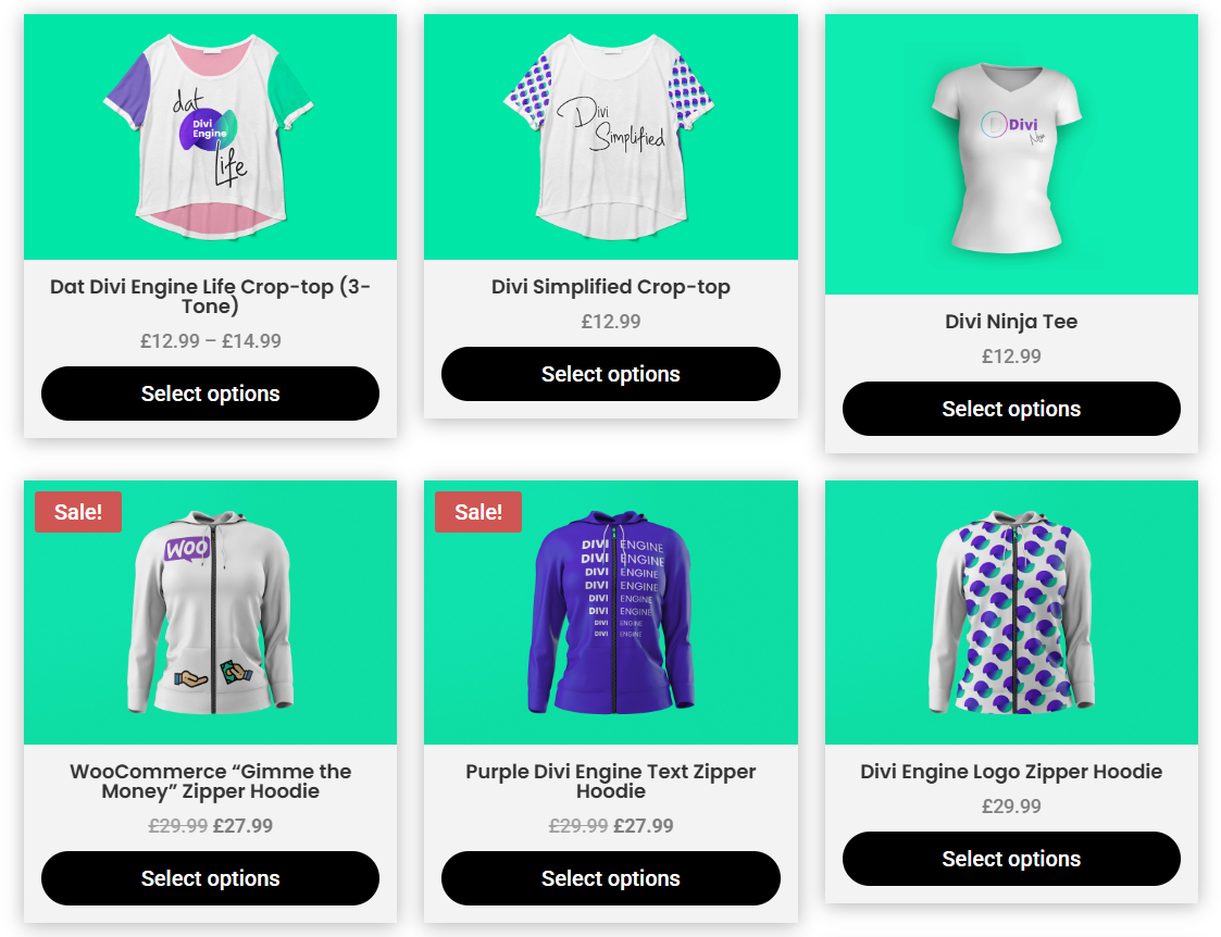
Use the Shop Style settings to configure product cards with pricing, ratings, cart actions, and taxonomy meta.
Enable Overlay: Show an overlay on product images.
Activates the template’s overlay layer over the product image.
Enable Price: Show the product price.
Displays the pricing set on the product.
Sale product and variable pricing will be shown if the product has any of those set.
Enable Rating: Show the product rating.
Displays the average rating stars where available.
Enable Excerpt: Show the product excerpt.
Outputs the short description inside the card.
Enable Add To Cart Button: Show an add to cart button.
Adds the add to cart button to each product card.
Enable Variations: Show a variation selector where applicable.
Displays variation options when the product has variations like colors or sizes.
Enable Featured Image: Show the products’s featured image.
Toggle the featured image for each card.
Featured Image Size: Choose the image size to load.
Select one of the registered WordPress image sizes for the featured image:
- Thumbnail: Small square size defined in Settings → Media. Good for compact lists and small cards.
- Medium: Standard medium size. Suits most grid cards where performance is a priority.
- Medium Large: Wider than Medium. Useful for two or three column grids.
- Large: Big display size for spacious layouts or hero-style cards.
- Full Size: Original image dimensions. Highest quality with the largest file size.
Enable Post Title: Show the product title.
Displays the product name in the card.
Read More Text: Set the secondary button label.
Enter the label for the read more or view button which is displayed when a product is not available or out of stock.
Fullwidth Button: Make the buttons span the card width.
Expands the relevant Add to Cart or Read More button to full width.
Enable Categories: Show the product categories.
Outputs assigned product categories.
Enable Categories Count: Show the number of categories.
Adds a count next to categories when supported.
Design Tab
This is where all the design settings for the Archive Loop module lives. You will only see available design settings for the selections you have made on the Content Tab.
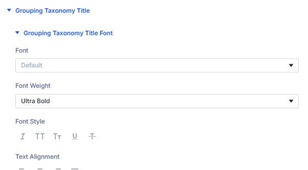
Grouping Taxonomy Title
Design settings for Taxonomy Title text can be found in the Grouping Taxonomy Title section.
Results Count
Design settings for Results Count text can be found in the Results Count section.

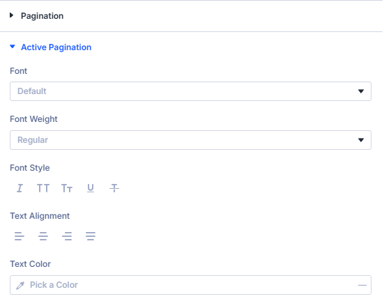
Pagination Appearance
Design settings for both Pagination and Active Pagination text can be found in the corresponding sections.
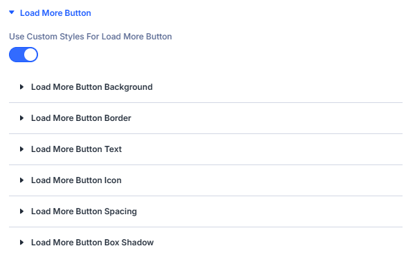
Load More Button
Various design settings for the Load More Button can be found in the Load More Button section.
Add to Cart Button Template
Various design settings for the Add to Cart Button can be found in the Add to Cart Button Template section.

View Cart Link Template
Various design settings for the View Cart Link can be found in the View Cart Link Template section.
These settings can also be used to style the view cart link as a button.
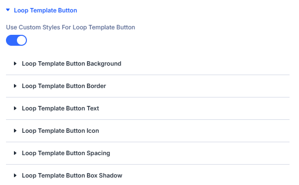
Loop Template Button
Various design settings for the Read More Button can be found in the Loop Template Button section.
Loop Template Styling
General design settings for all Loop Templates can be found in the Loop Template Settings section.

You will also see an additional tab of settings that correspond to the selected template.

If you find that a Loop Template Design setting is missing or there is a setting you really need, please either make a request on our Feedback Site or contact our amazing Support Team.
Preloader Appearance
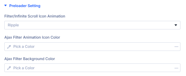
Design settings for the Ajax Preloader that is shown when posts are loaded from the database can be found in the Preloader Setting section.
You can also choose between the following animations:
- Three Lines Vertical
- Three Lines Horizontal
- Three Dots Bouncing
- Donut
- Donut Multiple
- Ripple