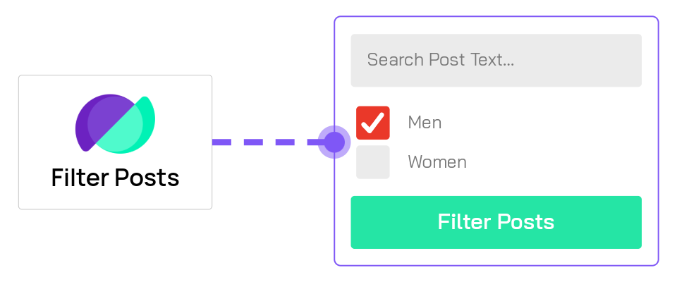
Filter Posts Module
This reference is for Divi 5. For Divi 4, see Filter Posts module under Modules → Divi 4.
Overview
The Filter Posts Module adds dynamic filtering capabilities to your Divi pages, allowing visitors to filter posts, products, or custom post types without page reloads. It works seamlessly with the Archive Loop Module and Loop Builder layouts to create sophisticated search and filter interfaces for archives, category pages, and custom layouts.
When to use it
Use the Filter Posts Module when you need to:
- Add category or tag filters to blog archives
- Create product filtering for WooCommerce shops (by price, attributes, stock status)
- Filter posts by custom fields or ACF data
- Add keyword search to archive pages
- Build location-based filtering with ACF Map Radius Search
- Create faceted search interfaces with multiple filter criteria
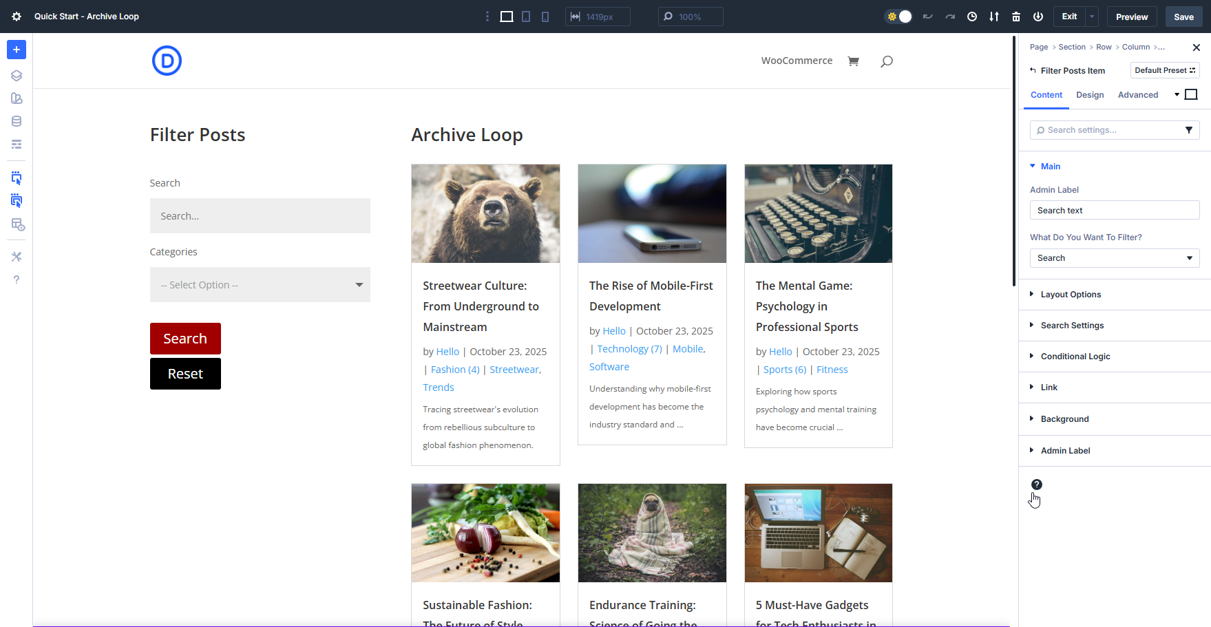
The Filter Posts module must be placed on the same page as an Archive Loop Module or an active Loop Builder loop.
Add the Archive Loop module or activate the Loop Builder loop first to confirm it displays the correct posts, then add the Filter Posts module to control those results.
Getting Started
Before diving into settings, understand the basic workflow for creating a filtered archive:
- Add an Archive Loop Module or activate a Loop Builder loop on your page first. This displays the posts/products that will be filtered.
- Add the Filter Posts Module to the same page as the loop. In Layout Settings, choose Sidebar (Vertical Filters) or Fullwidth (Horizontal Filters) to match how you placed the module in the layout.
- Click "Add New Filter Item" in the Filter Posts settings to create your first filter.
- Configure the filter item by selecting what to filter (categories, price, custom fields, etc.) and how to display it (dropdown, checkboxes, slider, etc.).
- Repeat step 3 to add additional filters for multi-criteria filtering.
Each filter item you add works in conjunction with others, allowing visitors to refine results using multiple criteria simultaneously.
For detailed information on configuring individual filter items, see the Filter Item Settings.
Content Tab
This is where all the functional settings for the Filter Posts module lives.
Filter Items
Filter items are the individual filters you add to create your filtering interface. Each filter item targets specific data (categories, price, custom fields, etc.) and can be displayed in various formats (dropdown, checkboxes, slider, etc.).

To add filter items:
- Click Add New Filter Item.
- Give the item an admin name for organization.
- Select what data to filter (categories, price, ACF fields, etc.).
- Choose how to display it (dropdown, checkboxes, slider, etc.).
- Configure type-specific options.
For detailed documentation on all filter item settings, see the Filter Item Settings Reference.
Main Options
Configure the post type, target loop, update behavior, and global filter actions.
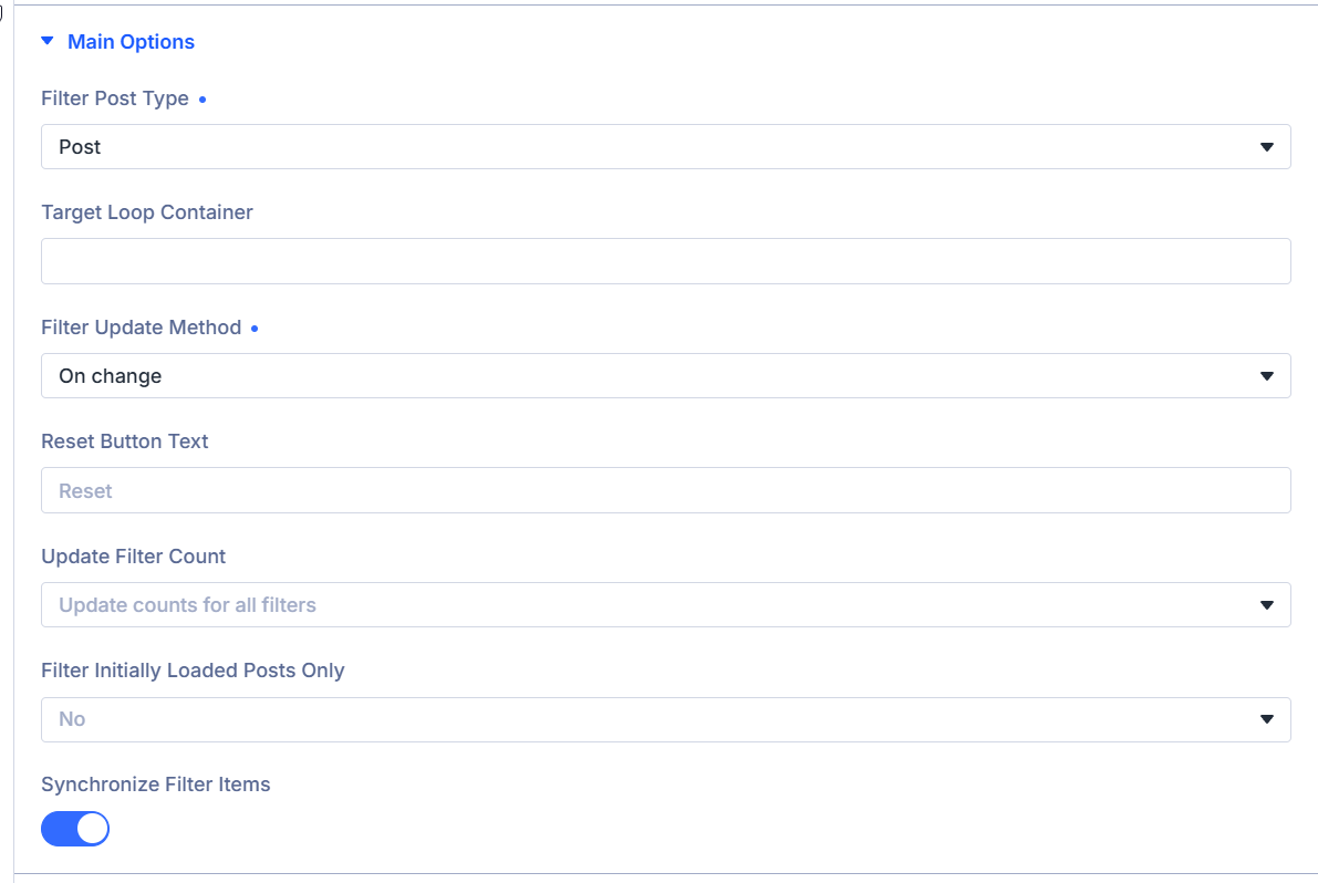
Filter Post Type: Choose the post type to filter
Choose the post type the filter should target. The list is loaded from post types registered on your site, such as Post, Product, or custom post types.
Match this to the loop you want to filter.
Target loop container: Point the filter at a specific loop
Optional. If the page has more than one Loop Builder loop, enter a CSS selector for the section or row that wraps the loop you want to filter.
Examples: #my-shop or .main-results.
Leave blank to let the plugin choose the archive loop when present, then match Filter Post Type when possible, then the first suitable loop.
Filter Update Method: Choose when results update
- On change — Update results as soon as a visitor changes a filter.
- On button click — Update results only after the visitor clicks the filter button.
Date range filters: With On change, results update only after both start and end dates are selected in a date range picker. Single-date pickers still update as soon as a date is chosen.
Filter Button Text: Label the apply button
Shown when Filter Update Method is On button click.
Enter the text on the filter button, such as Search, Filter, or Show results.
Reset Button Text: Label the reset button
Enter the text on the reset button that clears active filters, such as Reset or Clear filters.
Inline Buttons?: Place filter and reset side by side
Shown when Filter Update Method is On button click.
Enable to show the filter and reset buttons on one row.
Update filter count: Choose when counts refresh
Choose when filter option counts refresh after visitors apply filters.
- Update counts for all filters — Refresh counts on every filter item.
- Do not update the selected filter group counts — Refresh all counts except the filter group the visitor changed.
- Do not update any filter counts — Keep the initial counts and do not refresh them after filtering.
Filter Initially Loaded Posts Only: Limit filtering to the first page of results
- Yes — Filter only the posts initially loaded on the page.
- No — Filter across the full matching result set.
Use Yes when you want to refine a curated set already shown in the loop.
Synchronize filter items: Keep matching selections in sync
When enabled, choosing the same option in one filter item selects it in every matching filter item on the page.
Use this when several filters should stay aligned.
Layout Settings
Control how the filter module is laid out on the page and how visitors open or reset filters.
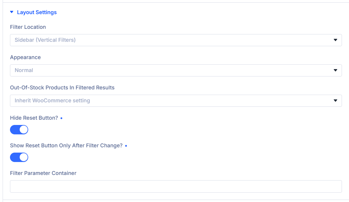
Filter Location: Choose sidebar or full-width layout
Choose how the filter module is arranged. This changes the layout and which Design options are available.
- Sidebar (Vertical Filters) — Stack filters in a vertical column. Use when the module sits beside the loop, such as in a sidebar column.
- Fullwidth (Horizontal Filters) — Arrange filters in a horizontal row across the content width. Use when the module sits above or below the loop.
Columns: Set how many filter columns show on desktop
Shown when Filter Location is Fullwidth (Horizontal Filters).
Choose Auto or a fixed column count from 1 through 10.
Column Min Width: Set the minimum width for each column
Shown when Filter Location is Fullwidth (Horizontal Filters).
Set the minimum width for each filter column before the row wraps.
Column Gap: Set the space between columns
Shown when Filter Location is Fullwidth (Horizontal Filters).
Set the horizontal space between filter columns.
Appearance: Choose how filters are shown
- Normal — Show all filters at once.
- Toggle — Let visitors expand or collapse each filter group.
- Slide — Show filters in a panel that slides in from the side.
Toggle start state: Set which toggle groups start open
Shown when Appearance is Toggle.
- First Option Open
- All Closed
- All Open
Out-of-stock products in filtered results: Control WooCommerce stock visibility
Choose how out-of-stock products appear in AJAX-filtered results:
- Inherit WooCommerce setting
- Always hide
- Always show
Toggle Slide Button ID: Choose the button that opens the slide panel
Shown when Appearance is Slide.
Enter the CSS ID of the element that opens and closes the filter panel. A Divi Button on the page works well.
Button Hide Filter Text: Label the slide button while the panel is open
Shown when Appearance is Slide.
Enter the text shown on the slide trigger button while the filter panel is open.
Hide Reset Button?: Remove the reset option
Enable to hide the reset button completely.
Align Reset Button: Set reset button position
Shown when Hide Reset Button? is off and Inline Buttons? is off.
- None
- Left
- Right
Show Reset button only after filter change?: Show reset after a change
Shown when Hide Reset Button? is off.
Enable to show the reset button only after a visitor changes at least one filter.
Filter Parameter Container: Choose where active filter tags appear
Enter a CSS selector, such as .filter-tags-container or #my-filter-tags, for the element that should show active filter tags.
Leave this empty to use the default placement: below the filter buttons on Loop Builder layouts, or inside the loop container on Archive Loop layouts.
Extra Settings
Control scrolling after Ajax updates.
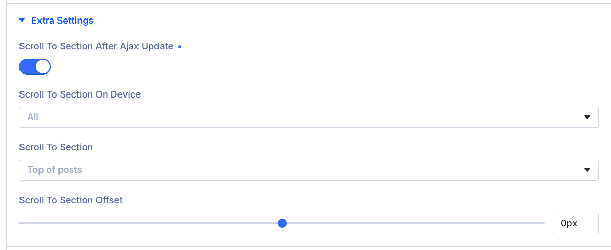
Scroll to section after Ajax update: Scroll after results update
Enable to scroll the page after an Ajax filter update so visitors land near the updated results.
Scroll to section on device: Limit scrolling by device
Shown when Scroll to section after Ajax update is enabled.
- All
- Desktop
- Tablet & Mobile
- Mobile
Scroll to section: Choose the scroll target
Shown when Scroll to section after Ajax update is enabled.
- Top of posts
- Top of orderby
- Top of filters
Scroll to section offset: Fine-tune the scroll position
Shown when Scroll to section after Ajax update is enabled.
Set how many pixels to move up or down from the default scroll position. Use a negative value to stop above the target.
Mobile Settings
Control mobile filter toggles and labels.
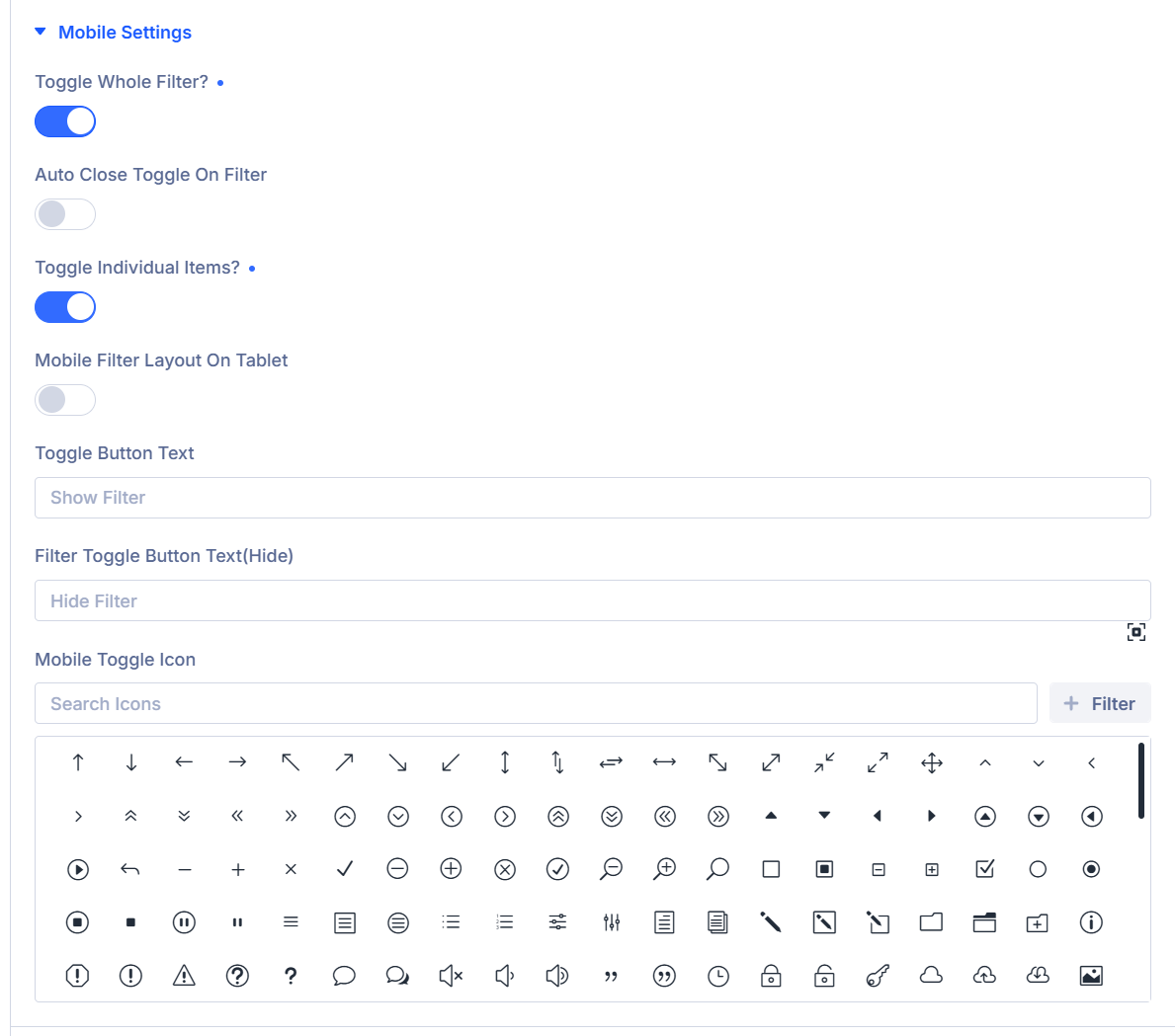
Toggle Whole Filter?: Collapse the full filter panel on mobile
Enable to hide the full filter panel behind a mobile toggle button.
Auto Close Toggle on Filter: Close the mobile panel after a selection
Shown when Toggle Whole Filter? is enabled.
Enable to close the mobile filter panel after a visitor changes a filter.
Toggle Individual Items?: Collapse each filter item on mobile
Enable to make each filter item expandable on mobile instead of showing the full panel at once.
Mobile filter layout on tablet: Use mobile behavior on tablet widths
Shown when Toggle Whole Filter? or Toggle Individual Items? is enabled.
Enable to apply the same mobile filter behavior up to 980px wide, not only on phone.
Toggle Button Text: Label the mobile open button
Shown when Toggle Whole Filter? is enabled.
Enter the text shown on the mobile toggle button, such as Filters.
Filter Toggle Button Text(Hide): Label the mobile close button
Shown when Toggle Whole Filter? is enabled.
Enter the text shown on the toggle button while the filter panel is open.
Mobile Toggle Icon: Choose the mobile toggle icon
Shown when Toggle Whole Filter? or Toggle Individual Items? is enabled.
Choose the icon shown on the mobile toggle control.
Design Tab
Style filter labels, fields, buttons, and mobile toggles. Standard Divi design groups are also available.
Filter Item
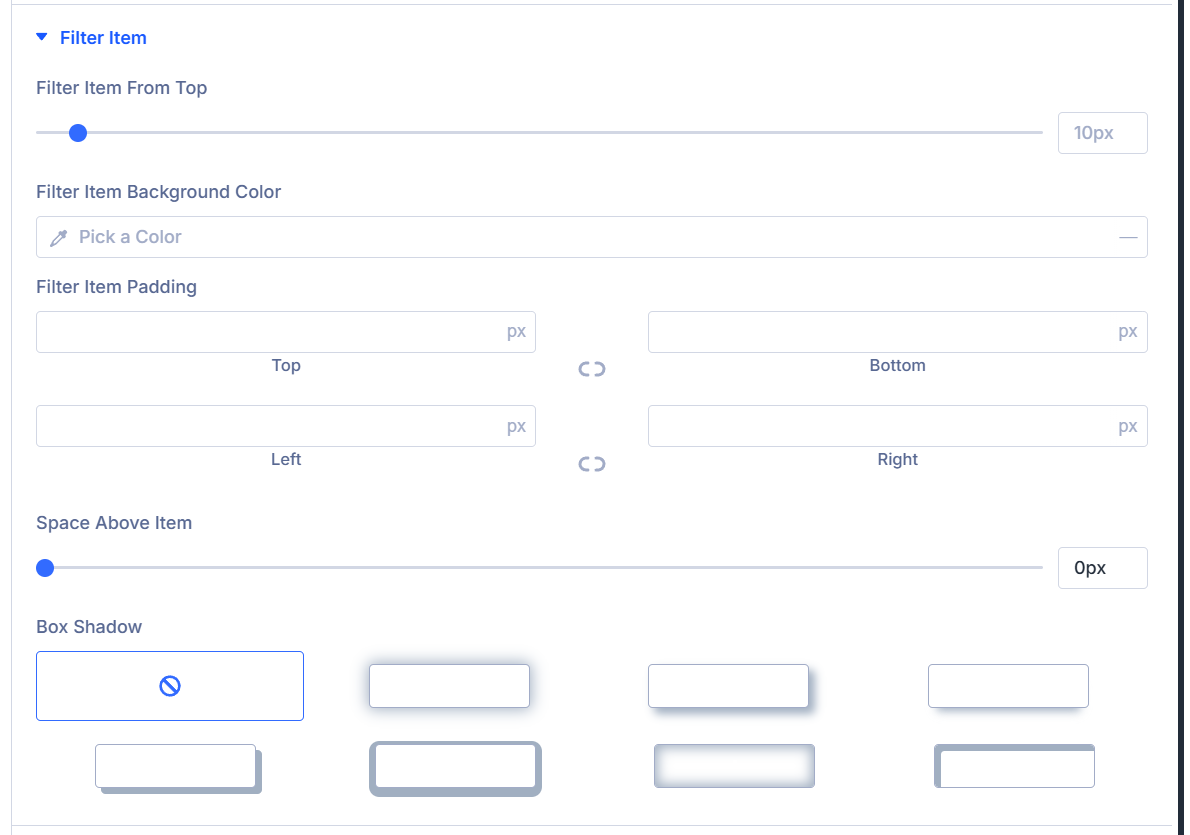
Filter Item From Top: Set the distance from the top of the filter item
Set the top offset for each filter item group.
Filter Item Background Color: Set the background behind filter options
Set the background color for the container that holds each filter item's options.
Filter Item spacing: Set padding inside the filter item container
Use the spacing controls to set padding around the filter item options.
Space Above Item: Set the space above the label
Set the space between the filter label and the field below it.
Toggle Icon: Choose the closed-state toggle icon
Shown when Appearance is Toggle in Layout Settings.
Choose the icon shown when a toggle filter item is closed.
Toggle Close Icon: Choose the open-state toggle icon
Shown when Appearance is Toggle in Layout Settings.
Choose the icon shown when a toggle filter item is open.
Box Shadow: Add shadow to the filter item container
Use the standard Divi box shadow controls on the filter item container.
Filter Label Text
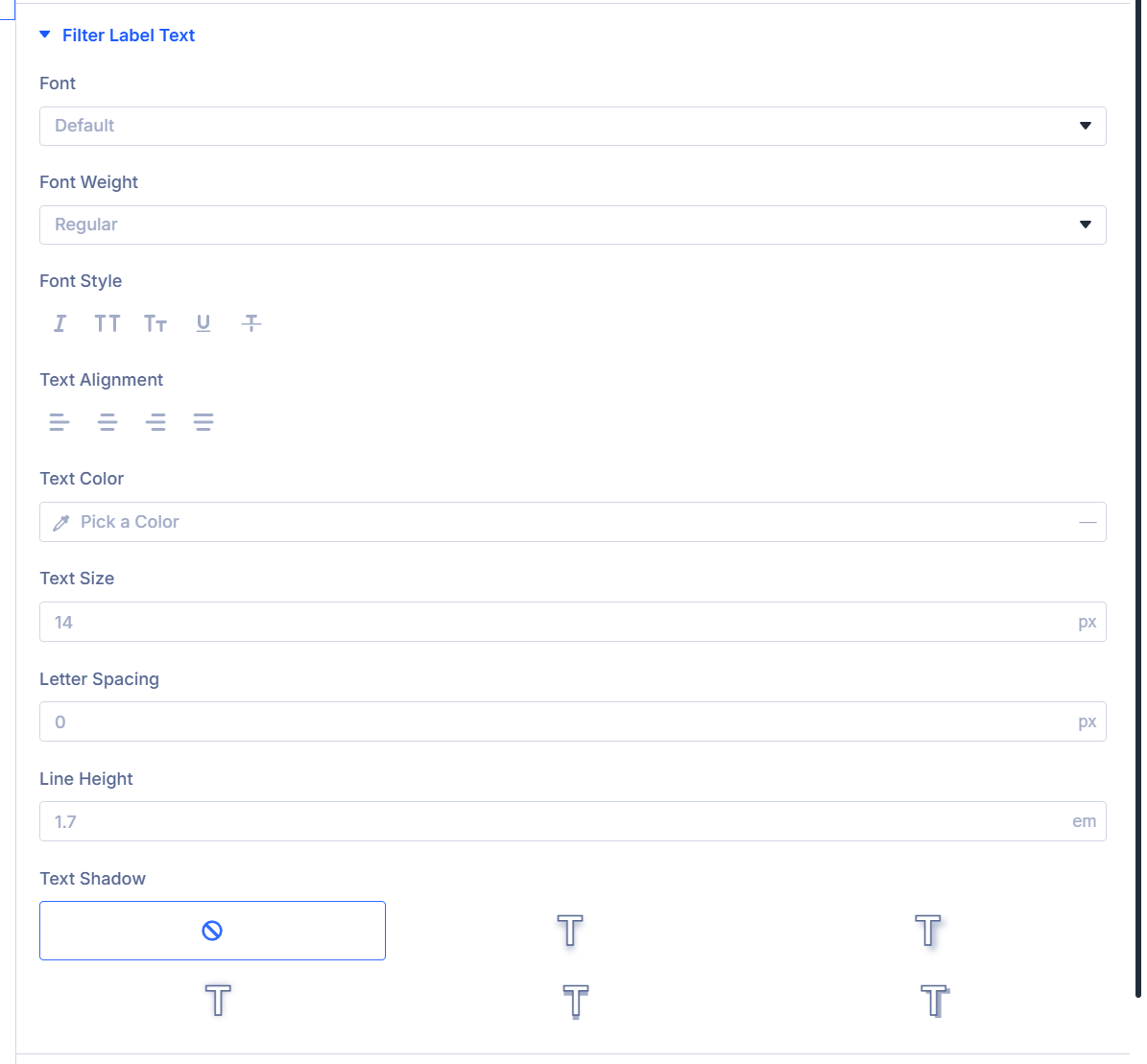
Filter Label Text: Style filter item labels
Use the font controls to style the label above each filter item.
Fields
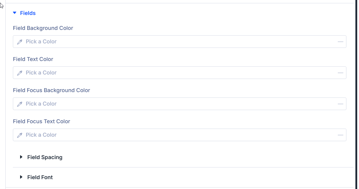
Field Background Color: Set the field background
Set the background color for filter input fields.
Field Text Color: Set the field text color
Set the text color for filter input fields.
Field Focus Background Color: Set the focused field background
Set the background color when a field has focus.
Field Focus Text Color: Set the focused field text color
Set the text color when a field has focus.
Field Spacing: Set field padding and margin
Use the spacing controls to adjust field padding and margin.
Field Font: Style field text
Use the font controls to style text inside filter fields.
All Buttons
All Buttons: Style every filter action button together
Use the button controls to style all filter action buttons as a group.
Search Buttons
Search Buttons: Style the apply button
Use the button controls to style the filter or search button.
Reset Buttons
Reset Buttons: Style the reset button
Use the button controls to style the reset button.
Filter Parameters
Filter Parameters: Style active filter tags
Use the button controls to style the active filter tag chips.
Mobile Toggle Button
Shown when Toggle Whole Filter? or Toggle Individual Items? is enabled in Mobile Settings.
Mobile Toggle Button: Style the mobile filter toggle
Use the button controls to style the mobile filter toggle button.
Mobile Settings
Shown when Toggle Whole Filter? or Toggle Individual Items? is enabled in Mobile Settings.
Filter Toggle Icon Color: Set the mobile toggle icon color
Choose the color for the mobile filter toggle icon.
Standard Divi design groups
The Design tab also includes standard Divi groups for the module wrapper:
- Sizing
- Spacing
- Border
- Box Shadow
- Filters
- Transform
- Animation
Use these groups to style the overall filter module wrapper and shared layout spacing.
What's next?
- Filter Item Settings Reference - Comprehensive guide to all filter item configuration options
- Archive Loop Module - Learn how to configure the Archive Loop that displays filtered results