Filter Item Settings
These options apply to Filter Posts Item modules inside Filter Posts on Divi 5. Divi 4 uses the same concepts with different UI.
Overview
Each filter item is a child module that targets one criterion (taxonomy, price, keyword search, custom field, etc.) and renders it as a dropdown, checkboxes, range, stars, swatches, and more. Sections below follow the builder group titles (Content, Design, Advanced). Some groups only appear when What do you want to filter? or Filter Type match—as noted.
Content Tab
Main Settings
Identify the module in the builder, pick what data to filter, fine-tune taxonomy or field sources, term order, and include/exclude slugs where supported.
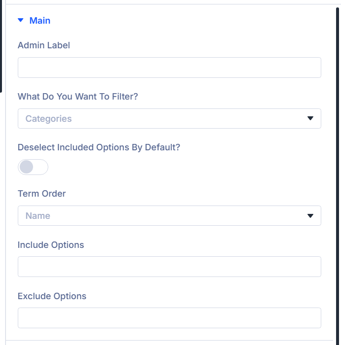
Admin Label
Text shown next to this item in the builder layer list only (not on the frontend).
What do you want to filter?
Defines the filter source (categories, taxonomy, WooCommerce-specific types, published date, post types, custom meta, keyword search, ACF fields or map radius, etc.). Choices come from your site (Loading… clears when options load).
Choose your taxonomy
When: Taxonomy is selected for What do you want to filter?. Pick the taxonomy to list and filter.
Add Post Types
When: Post Types filter. Ordered list of post type slugs the search/filter should affect (shown for that filter mode).
Custom Meta Name
When: Custom Meta. Meta key whose values drive the filter.
ACF Field (or Custom field)
When: Advanced Custom Fields / custom-fields integration list uses “Custom Fields”—labels switch to Custom field. Choose which field backs the filter.
ACF Custom Database table Query (or Custom field Custom Database table Query)
When: ACF/custom field filter mode. Enables loading options from an ACF (or mapped) external table instead of defaults.
ACF Database Table Map (or Custom field Database Table Map)
When: Database query toggle enabled. Maps the field to the correct table.
Select Table Column (or Select custom field table column)
When: Database query toggle enabled. Column used for matching values.
Product Attributes
When: Product Attributes filter. Pick the WooCommerce attribute to expose.
Deselect Included Options by Default?
When: Filter Type is Checkbox / Radio Buttons. If the archive loop restricts results to certain terms, they can auto-select—enable this so the selection starts All instead.
Term Order
When: Filters that list terms/options: Categories, Tags, Taxonomy, ACF/custom field modes in that family, Product Attributes, Custom Meta (comma list in UI).
Options: ID, Name, Menu Order, Numeric.
Include Options
When: Categories, Tags, Taxonomy, ACF/custom field modes in that family, Custom Meta. Comma-separated slugs to keep in the filter list only.
Exclude Options
Same availability as Include Options. Slugs omitted from the list.
Layout Options
Display type, formatting for numeric and date modes, taxonomy swatches vs stars for products, sticky filter chips, labels, column width.
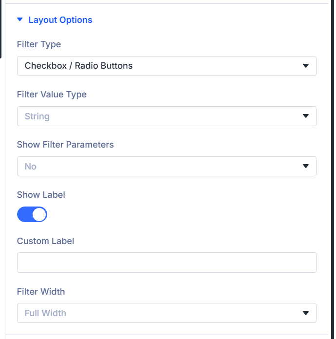
Filter Type
Hidden for Text Search. Otherwise choose among Select, Checkbox / Radio Buttons, optionally Number / Range (when supported for current source), Date/Date Range Picker (ACF modes and published-date style filters that offer it changing when source changes). Switching parent filter type can reset this to sensible defaults automatically.
Filter Value Type
Shows when filtering needs string vs numeric behavior (excluding date-range mode conflicts and some swatches). String, Numeric, Numeric with decimal.
Single Date?
When: Filter Type is Date/Date Range Picker. Enables one picker instead of a range.
Include Presets?
When: Date/date range picker. Shows quick ranges (Today, last 7 days, this month, all time).
Date Format
Picker format hint (YYYY style note in builder).
Date Field Placeholder
Placeholder text for date inputs.
Disable Dates
None, Disable Past Days, Disable Future Days.
Date & Time Picker Language
Locales list from plugin languages.
Range Type
When: Number / Range. Treats control as picker Select, Single thumb, Double thumb.
Display Attributes as Swatches? / Display Ratings as Stars?
When: Product Attributes (swatches) or Rating filters (stars). Turns options into visuals.
Min Price Setting / Max Price Setting
When: Price filter (What do you want to filter? = product price pattern). Choose store min/max, current category archive (category pages), or custom ranges from range options.
Show Filter Parameters
Whether active choices appear above the archive: No, Yes with Title, Yes without Title, just the Value.
Show Label
Toggle the frontend label row.
Custom Label
When: Show Label is on. Overrides the auto label; blank keeps default wording.
Filter Width
Column span preset: Full, three quarters, two thirds, half, one third, one quarter widths.
Radio / Checkbox Settings
When: Filter Type is Checkbox / Radio Buttons, and filter is not the star-only rating variant that skips this block.
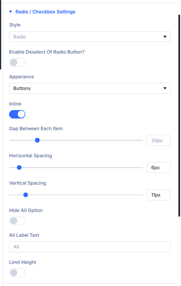
Style
Radio or Checkbox (multiple select).
Enable Deselect Of Radio Button?
When: Style is Radio. Lets visitors clear a single-choice selection after picking one.
Multiple Select Relation
When: Checkbox style. AND vs OR between chosen values.
Apperance
Presentation: Normal, Divi Style, Buttons, Select Drop Down, Image Swatches (Taxonomy/Term Only) (builder spelling: Apperance).
Image Swatch Source
When: Appearance = Image Swatches — Custom field image / ACF Image Field, or WooCommerce Category Image.
Custom field image name / ACF Image Field Name
When: Swatches using custom-field image source. Pick the image field supplying thumbnails.
All Option Image
Upload for All / clear swatch chip.
Show Swatch Name?
Text label beside each swatch.
Swatch Name Position
When: Swatch names on and layout Inline (see Inline) enables above/below name placement (Above / Below).
Divi Style
When: Appearance is Divi Style while Style stays Radio — paints Divi radios as Radio vs Check skin.
Inline
Layouts options in rows vs stacked blocks.
Gap Between Each Item, Horizontal Spacing, Vertical Spacing
Fine pixel gaps when inline layout enabled.
Hide All Option
Removes fallback “All …” chip.
All Label Text
When: All option visible. Overrides its label copy.
Limit Height
Collapses tall lists behind show more UI.
Max Height, Show More Text, Show Less Text, Show More Icon, Show Less Icon
When: Limit height enabled. Sets scroll cap, copy labels, icons.
Select Settings
When: Filter Type is Select and source is not Text Search.
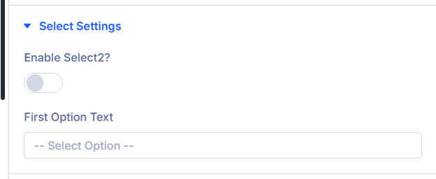
Enable Select2?
Enhanced dropdown UX — enable on parent Filter Posts module too when you want parity.
First Option Text
Label for neutral first row (typically “Any” wording).
Range Settings
When: Filter Type includes Number / Range, or WooCommerce price range mode (product price paths).
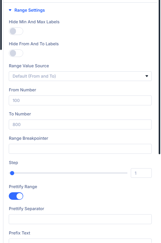
Hide Min and Max Labels
Hides labeled min/max readouts beside bar.
Hide From and To Labels
Hides from/to captions on dual sliders.
Range Value Source
Default (From and To), values From ACF/custom field, or fully Custom Values stepping list.
From Number / To Number
When: Source is Default. Starting slider endpoints.
Set Your Custom Values
When: Source Custom Values — comma list; endpoints must align with slider defaults documented in-help.
Range Breakpointer
Values at/above show as capped label (builder example notes “100+” pattern).
Step
Slider increment.
Prettify Range
Number formatting polish.
Prettify Separator
Thousands separator token when prettify on.
Prefix Text / Suffix Text
Currency or unit wrappers before/after slider readout.
Search Settings
When: What do you want to filter? = Text Search.
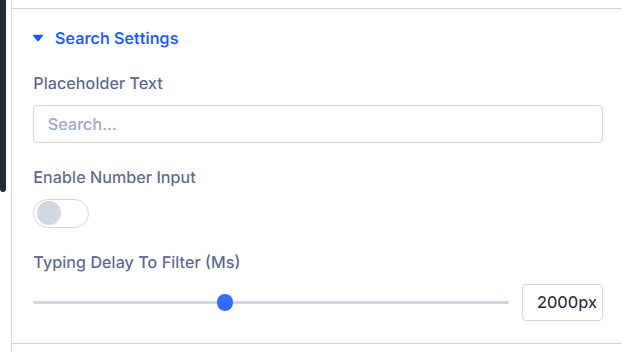
Placeholder Text
Muted hint inside keyword input.
Enable Number Input
Treats keyboard as numeric entry vs general text search.
Typing Delay To Filter (ms)
Debounce milliseconds before AJAX refresh when parent module updates On change behavior.
Category/Tags & Taxonomy Settings
When: Source is Categories, Tags, or custom Taxonomy mode.
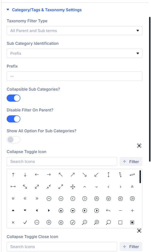
Taxonomy Filter Type
Only Parent Terms, Only Sub Terms of Selected Term, Sub Terms of Current Term (archive only), All Parent and Sub terms.
Parent Term
When: Showing sub terms under a chosen parent (slug/value text field).
Disable Hierarchical?
When: sub-term modes that show children. Flattens one level (no grandchildren).
Sub Category Identification
When: Only Parent Terms mode not forced into “only_child” variants—prefix vs indentation scheme.
Prefix
Leading characters labeling child rows when prefix identification chosen.
Collapsible Sub Categories?
Enable expandable trees.
Disable Filter on Parent?
When: collapsible hierarchy on: clicking parent expands only without filtering.
Show All Option for Sub Categories?
Adds All chip inside accordion groups.
Collapse Toggle Icon / Collapse Toggle Close Icon
Icon pair expanded vs collapsed subtree affordance.
ACF Settings (or Custom field settings)
When: ACF-ish field filtering or map radius filtering.
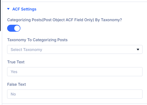
Categorizing Posts(Post Object ACF Field only) by taxonomy? (or Categorizing Posts (post object custom field only) by taxonomy?)
When: What do you want to filter? is the advanced custom-fields option (exact label mirrors your integrations). Turn on when you route post-object field relationships through taxonomy groupings.
Taxonomy To Categorizing Posts
When: Categorizing toggle is enabled. Selects which taxonomy organizes those grouped options.
Show All For Taxonomy Categorizing?
When: Categorizing is on and Filter Type uses Checkbox / Radio Buttons. Adds an All fallback row alongside grouped choices.
ACF Map Name
When: What do you want to filter? is the map/radius choice (builder wording references ACF map fields). Pick the map field belonging to your filtered post type; it cannot live inside repeater/group structures per builder help text.
Radius Field Placeholder
When: Map/radius filter. Placeholder for the numeric radius control.
Default Radius Field Value
When: Map/radius filter. Starting radius; if you pair with dropdown mode, ensure the value exists in Radius Field Dropdown Values.
ACF Map Radius Unit
When: Map/radius filter. Kilometers or Miles.
Place Map Search Fields Inline?
When: Map/radius filter. Places address and radius widgets on one row.
Make Radius Field As Dropdown?
When: Map/radius filter. Switches radius to fixed dropdown steps.
Radius Field Dropdown Values
When: Map/radius filter and radius dropdown toggle is enabled. Comma-separated distance values displayed in order.
True Text / False Text
When: What do you want to filter? uses the toggle-style advanced custom-fields mode. Overrides labels for checked vs unchecked display.
Empty Options
Hidden when: you filter strictly by keyword Text Search, by product price, by product weight, by map radius, or Number / Range is the chosen Filter Type for compatible sources—those workflows skip this bundle.
Otherwise you can steer how empty/zero-hit choices behave.
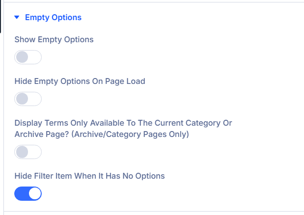
Show Empty Options
Surface choices that currently yield zero hits.
Hide Empty Options On Page Load
Defer empty rows until interactions occur.
Display Terms Only Available To The Current Category Or Archive Page? (archive/category pages only)
Restrict taxonomies to contextual archive vocabulary.
Hide Filter Item When It Has No Options
Auto-remove entire chip when backend returns zero choices.
Count Settings
When: Checkbox / Radio Buttons (radio filter type). Pair with Design styling after counts enabled.
Show Count
Append result totals per chip.
Allow Duplication Filter Count For All Option?
When counts enabled. Sums subgroup counts onto All.
Conditional Logic
Reveal this row only when sibling items expose matching Logic IDs. Used for dependent filters (builder parity with Forms logic UI).
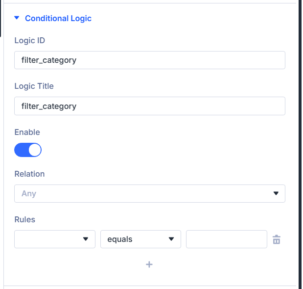
Logic ID
Unique slug referencing this item from sibling rules (English characters, underscores).
Logic Title
Admin-facing label surfaced in picker lists.
Enable
Master switch for conditioned visibility.
Relation
Combine rows with All (every rule must pass) versus Any (at least one rule passes). Only visible once Enable is on.
Rules
Visual rule builder keyed off sibling Logic IDs detected on the parent Filter Posts instance.
Link, Background, Admin Label (standard Divi)
Shared Divi wrappers ship after Conditional Logic inside builder.
- Link — Optional wrapper link behaviors.
- Background — Module-level background décor.
- Admin Label — Second admin title area grouped by Divi (Admin Label Group) beyond Main › Admin Label field if present; keep whichever your workflow prefers documented in builder parity.
(Refer to Divi docs for universal Link/Background/Admin fields.)
Design Tab
Text
Divi exposes Text typography controls; the plain text color picker is hidden in this module so you stay within the plugin’s dedicated field colors.
Use Text for label and general copy styling where Divi typography applies.
Text typography
Standard Divi text styling; primary color is intentionally omitted here in favor of dedicated field color pickers.
Field
Input colors, spacing, typography for editable controls.
Field Background Color
Idle input fill.
Field Text Color
Idle text hue.
Field Focus Background Color
Focused state backdrop.
Field Focus Text Color
Focused typography color.
Spacing grouped
Wrapper padding/margin presets for controls.
Field Font
Typography family for typed values.
Count Settings
When: Content Show Count is enabled.
Distance from Top
Vertical offset aligning count badges versus base line.
Range Settings
When: numeric range slider or WooCommerce price range display.
Appearance
Thumb skin families: Flat, Big, Modern, Sharp, Round, Square.
The builder exposes two styling tabs (Range Primary, Range Secondary); select a tab, then edit that lane below.
Primary Color
When: Range Primary tab is active. Color for that half of the slider.
Range Primary Font
When: Range Primary tab is active. Typography for readouts on that lane.
Secondary Color
When: Range Secondary tab is active. Color for that half of the slider.
Range Secondary Font
When: Range Secondary tab is active. Typography for readouts on that lane.
Radio / Checkbox Style
When: Appearance Divi Style or Buttons for radio/check variants, OR height limit icons present.
Paint native control chrome and accordion affordances.
Background Color, Checked Background Color, Checked Tickmark Color
Divi-themed radio and checkbox veneers. Checked Tickmark Color applies when Appearance is Divi Style (not Buttons-only styling).
More/Less Icon Size, positioning top/right
When Height limit toggled. Icon metrics for collapse affordances.
Radio / Checkbox
When: same visibility gate as Radio / Checkbox Style (meaningful radio/check layout active).
Interior tab strips: Font Style, Post Count, Checked Font Style drive three Font Group exposures.
Font Style tab
Unchecked option label typography.
Post Count tab
Count numeral styling.
Checked Font Style tab
Selected option typography.
Swatch Settings
When: Product attribute swatches on or Image Swatches appearance on non-rating radios.
Swatch Style
Circle vs Square.
Swatch Width / Swatch Height
Pixel footprint.
Background Color / Active Background Color
Idle vs picked fill.
Border Color / Active Border Color
Ring colors default vs picked.
Border Width
Stroke thickness.
Swatch Alignment
Left / Center / Right row justification.
Star Settings
When: Product rating filter with swatch mode enabled.
Star visual palette trio.
Star Background Color
Empty-star surface.
Star Color
Base star pigment.
Star Active Color
Filled selection tone.
Category/Tags & Taxonomy Settings
When: Categories, Tags, or Taxonomy filtering and content configuration uses indented children or collapsible parents.
Adds hierarchy spacing + accordion icon cosmetics.
Child Indent Spacing
Left gutter for indented child rows.
Collapse Toggle Icon Size
Accordion glyph scale.
Collapse Toggle Icon Color
Glyph hue.
Standard Divi design groups
Module wrapper polish beyond field-specific palettes.
- Sizing
- Spacing
- Border
- Box Shadow
- Filters
- Transform
- Animation
Use together to align gutters with sibling columns and motion preferences.
Advanced tab (standard Divi)
- Attributes — Custom data attributes safely merged.
- CSS (Custom CSS) — Targeted snippets.
- Conditions (Divi display conditions).
- Visibility — Responsive / scroll visibility toggles per Divi norms.
- Transition (Transition Group) — Motion curves for property changes when applicable.
- Position — Layering / anchors.
- Scroll — Effects tied to scrolling.
Consult Divi Advanced documentation when you need granular behavior beyond plugin filters.
What's next?
- Filter Posts module — Parent module loops, toggle layout, AJAX refresh cadence.
- Archive Loop module — Build the filtered results canvas beside these items.