Divi Mobile Plugin: Custom Header Settings Guide
Creating a mobile menu with Divi Mobile offers extensive customization to enhance your website's mobile experience. The Custom Header Settings play a crucial role in tailoring how your site's header looks and functions on mobile devices. This guide will walk you through the key settings available for customizing your mobile header.
Video
Live Preview Loading
- While working within WordPress, you might encounter delays in the live preview mode's responsiveness. This is a common occurrence due to the foundational structure of WordPress.
- Should the live preview not reflect your changes immediately, proceed to publish your modifications and then refresh the page. Repeating this process can help in accurately displaying your updates.
- To verify the appearance and functionality of your mobile menu accurately, consider viewing your site from a separate device where you're not logged into the WordPress admin area, such as on a mobile phone. This approach offers a more authentic user perspective.
Implementing Custom Header Settings
- In your WordPress dashboard, find and select Divi Mobile inside the Theme Customizer.
- Look for the Custom Header Settings section where you can configure the Custom Header Settings.
- After making your selections, be sure to save your changes to apply them to your site.
Key Custom header Settings
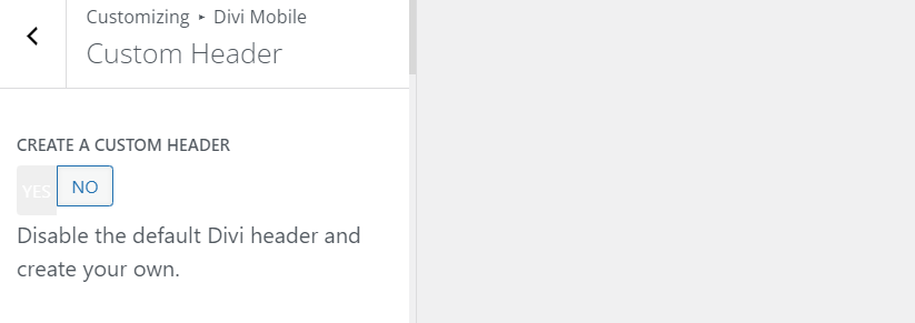
Enable Custom Header
Toggle the "Yes" button to activate the custom header feature. This allows you to start designing a header that aligns with your brand and improves user navigation.

Upload a Logo
Upload a logo specific to your mobile header. This logo represents your brand on all mobile pages and is crucial for brand recognition.

Different Logo on Scroll
Opt to display a different logo when users scroll down on their mobile devices. This feature can be used to maintain logo visibility against varying background colors or to introduce a simplified logo design for scroll.
Adjust Header Height
Define the height of your custom header. Adjusting this setting helps ensure that your logo and navigation icons fit well within the header space without appearing too cramped or too sparse.
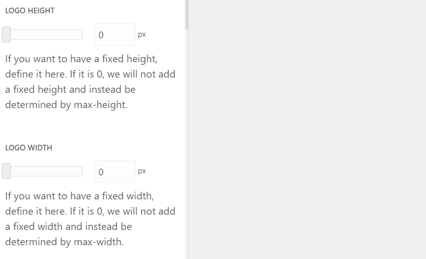
Change Logo Size
Adjust the height and width of your logo to ensure it's appropriately sized for your mobile header, enhancing visibility and aesthetic appeal.

Header Background Color
Assign a background color to your custom header. This color should complement your website's design palette and improve the header's visual integration with the rest of your site.

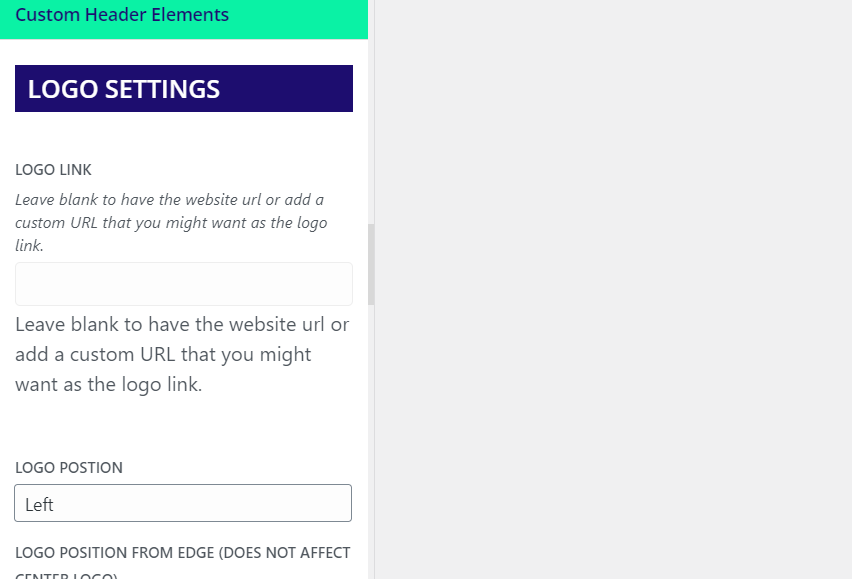
Logo Position
Set your logo's position within the header—left, right, or center. This alignment plays a significant part in the header's overall balance and user accessibility.

WooCommerce Cart Icon
If WooCommerce is installed, you have the option to display a cart icon in the mobile header, offering quick access to the shopping cart for your users.
WordPress Search Feature
Enable the WordPress search feature within your mobile header, allowing visitors to easily search your website content directly from the header.
WooCommerce Account Icon
Include a WooCommerce account icon in your mobile header to provide users with a direct link to their account page, enhancing the shopping experience.
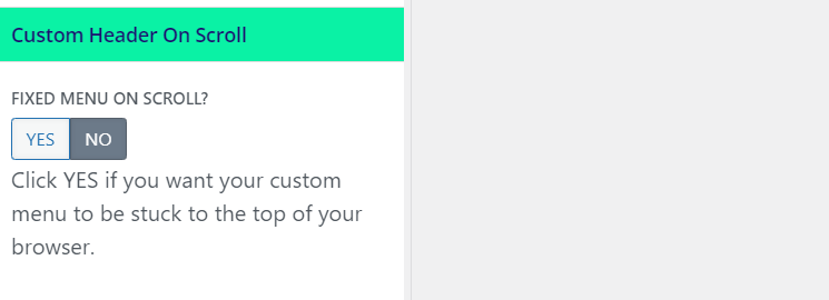
Custom Header on Scroll Settings
Customize how your header behaves as users scroll down the page. Options include adjusting the header's height upon scroll and deciding whether the header should remain fixed at the top of the screen, ensuring constant access to the navigation menu.

Tips for Success
- Consistency is Key: Ensure your mobile header reflects the overall branding and design scheme of your website for a cohesive look across devices.
- Test Across Devices: Regularly test your mobile header on various devices and screen sizes to ensure optimal display and functionality.
- Keep User Experience in Mind: Prioritize easy access to navigation and key site features like search and shopping cart to enhance the mobile user experience.
By utilizing the Custom Header Settings in Divi Mobile, you can significantly improve your website's mobile navigation and branding, creating a seamless and enjoyable experience for your mobile users.
Menu Preservation Across Theme Changes
- Divi Mobile associates the mobile menu you design directly with your currently active theme
- Switching your website's theme to a different parent or child theme necessitates the reconfiguration of your mobile menu. This is essential to note, as a theme change can disrupt the appearance and functionality of your previously designed mobile menu.
- Before altering your site's theme, plan for the recreation of your mobile menu under the new theme. This ensures a seamless transition and maintains the navigational experience for your mobile users.