Divi Mobile: Sub Menu Style Settings Guide
Enhancing the mobile experience on your Divi site includes paying special attention to how sub-menus are displayed and interacted with. Divi Mobile provides robust customization options for your site's sub-menu style, ensuring a seamless and intuitive navigation experience for your users. This guide delves into the Sub Menu Style Settings, explaining each option and how to utilize them effectively.
Video
Live Preview Loading
- While working within WordPress, you might encounter delays in the live preview mode's responsiveness. This is a common occurrence due to the foundational structure of WordPress.
- Should the live preview not reflect your changes immediately, proceed to publish your modifications and then refresh the page. Repeating this process can help in accurately displaying your updates.
- To verify the appearance and functionality of your mobile menu accurately, consider viewing your site from a separate device where you're not logged into the WordPress admin area, such as on a mobile phone. This approach offers a more authentic user perspective.
Implementing Sub Menu Style Settings
- In your WordPress dashboard, find and select Divi Mobile inside the Theme Customizer.
- Look for the Sub Menu Style Settings section where you can configure the Sub Menu Style Settings.
- After making your selections, be sure to save your changes to apply them to your site.
Key Sub Menu Style Settings
Sub-Menu Style
Choose the appearance of your sub-menu from three built-in styles: Collapse Nested, Overlap Slide-In, and Side By Side. Each style offers a unique way for your sub-menus to be displayed and interacted with, catering to different design preferences and user experiences.
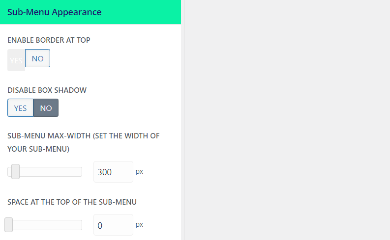
Sub-Menu Appearance
Within the Sub-Menu Appearance section, you're provided with the tools to customize your sub-menu's look further. Adjust the width, color, spacing, and other visual aspects to match your site's design and improve readability. These settings allow you to create a sub-menu that not only functions well but also aligns with your site's aesthetic.

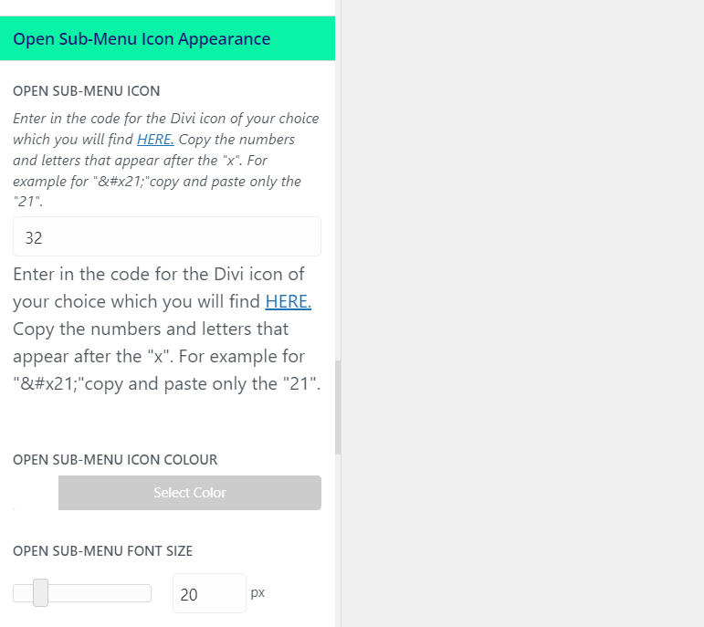
Open Sub-Menu Icon Appearance
By default, parent menu items with a sub-menu attached will display an icon indicating that expansion is possible. Customize this icon's appearance for when the sub-menu is open, tailoring its look to fit seamlessly within your menu's design. This could involve changing the icon's size, color, or even replacing it with a custom graphic.

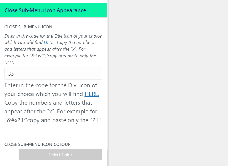
Closed Sub-Menu Icon Appearance
This setting allows you to customize the icon displayed when the sub-menu is closed. The level of customization ensures consistency across your menu's design while providing clear visual cues to users about the menu's interaction state.

Tips for Success
- Consistency is Key: Ensure your sub-menu's design is consistent with the main menu and overall site design for a cohesive user experience.
- User-Friendly Navigation: Choose a sub-menu style and appearance that enhances usability, making it easy for users to navigate your site on mobile devices.
- Test Across Devices: Regularly test your sub-menu on different devices and screen sizes to guarantee a smooth navigation experience for all users.
By customizing the Sub Menu Style Settings in Divi Mobile, you can significantly enhance your mobile site's navigation, making it intuitive and visually appealing. This guide provides the foundation for creating a sub-menu that not only meets your design criteria but also elevates the user experience on your Divi site.
Menu Preservation Across Theme Changes
- Divi Mobile associates the mobile menu you design directly with your currently active theme
- Switching your website's theme to a different parent or child theme necessitates the reconfiguration of your mobile menu. This is essential to note, as a theme change can disrupt the appearance and functionality of your previously designed mobile menu.
- Before altering your site's theme, plan for the recreation of your mobile menu under the new theme. This ensures a seamless transition and maintains the navigational experience for your mobile users.