Divi Mobile Plugin: General Settings Guide
The Divi Mobile plugin enhances your website’s mobile navigation with a customizable and user-friendly mobile menu. Understanding the General Settings within the Divi Mobile plugin is crucial for optimizing your site's mobile navigation. This guide will walk you through the key settings and options available.
Video
Live Preview Loading
- While working within WordPress, you might encounter delays in the live preview mode's responsiveness. This is a common occurrence due to the foundational structure of WordPress.
- Should the live preview not reflect your changes immediately, proceed to publish your modifications and then refresh the page. Repeating this process can help in accurately displaying your updates.
- To verify the appearance and functionality of your mobile menu accurately, consider viewing your site from a separate device where you're not logged into the WordPress admin area, such as on a mobile phone. This approach offers a more authentic user perspective.
Implementing General Settings
- In your WordPress dashboard, find and select Divi Mobile inside the Theme Customizer.
- Look for the General Settings section where you can configure the General Settings.
- After making your selections, be sure to save your changes to apply them to your site.
Key General Settings
Select a Premade Menu Style
- Choose a style that fits the structure and size of your mobile menu. The plugin offers various premade styles to accommodate different menu sizes and layouts.
- Refer to the Divi Mobile documentation for detailed descriptions of each style. Consider the number of items in your menu and the overall design of your site when selecting a style.

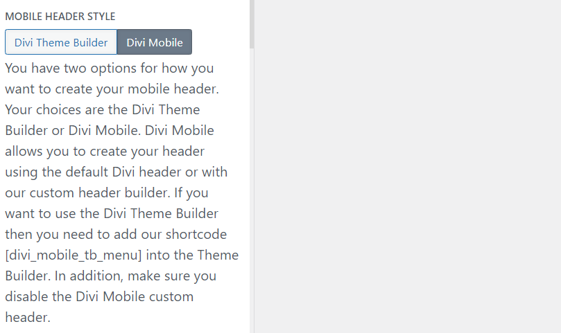
Mobile Header Style
You have two options for creating your mobile header:
- Divi Theme Builder: If you prefer to use the Divi Theme Builder for your header, insert the
[divi_mobile_tb_menu]shortcode in the desired location within the Theme Builder. Ensure you disable the Divi Mobile custom header to avoid conflicts. - Divi Mobile: For a quicker setup, Divi Mobile allows you to use the default Divi header or its custom header builder for more personalized options.

Select the Primary Menu
Choose the menu you want to display as the primary navigation on mobile devices. This setting is essential for directing users through your site’s content.

Primary Menu Movement
Decide how the primary menu appears and interacts with user input. Options might include sliding in from a side, dropping down from the top, etc., depending on the aesthetic and functional needs of your site.

Expand from Shape Style
This setting allows you to customize the appearance of submenu items as they expand. Choose a shape style that aligns with your menu’s design and enhances the user experience.
Select a Secondary Menu for Bottom Navigation
Divi Mobile offers the option to have a secondary menu that appears at the bottom of the screen. This feature is useful for highlighting specific navigation items like contact information or important links.

Divi Menu Breakpoint
Set the screen width (in pixels) at which the mobile menu should activate. This breakpoint ensures that your site’s navigation is appropriately adjusted for various screen sizes, maintaining usability across devices.

Fixed or Not Fixed Menu
Determine whether the mobile menu should be fixed to the top of the screen as users scroll. A fixed menu remains accessible regardless of the scroll position, improving navigation on lengthy pages.
Tips for Success
- Consistency: Ensure your mobile menu’s design and behavior are consistent with your brand and provide a seamless user experience.
- Testing: Regularly test your mobile menu on various devices and browsers to ensure it performs as expected and remains user-friendly.
- Updates: Keep the Divi Mobile plugin updated to take advantage of the latest features and improvements.
By carefully configuring the General Settings in Divi Mobile, you can create a compelling and navigable mobile menu that enhances your website's usability and accessibility on mobile devices.
Menu Preservation Across Theme Changes
- Divi Mobile associates the mobile menu you design directly with your currently active theme
- Switching your website's theme to a different parent or child theme necessitates the reconfiguration of your mobile menu. This is essential to note, as a theme change can disrupt the appearance and functionality of your previously designed mobile menu.
- Before altering your site's theme, plan for the recreation of your mobile menu under the new theme. This ensures a seamless transition and maintains the navigational experience for your mobile users.