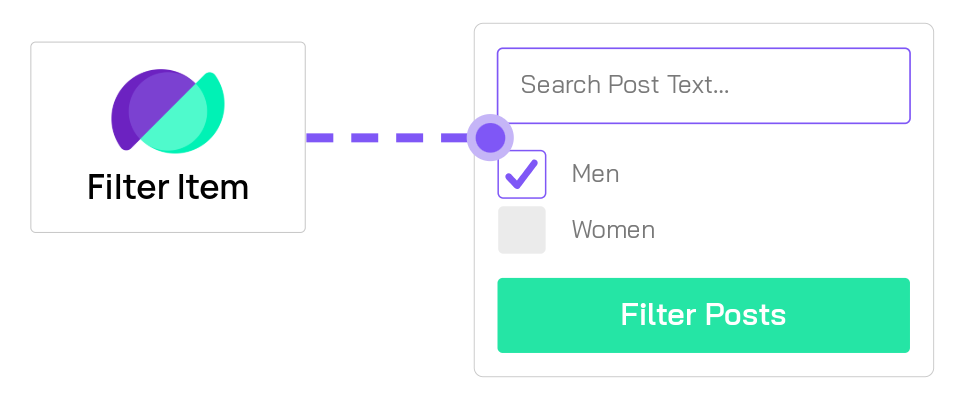
Filter Item Settings
Overview
Filter items are the individual filters you add to the Filter Posts Module. Each filter item targets specific data (categories, price, custom fields, etc.) and can be displayed in various formats (dropdown, checkboxes, slider, etc.). This reference guide covers all filter item configuration options.
Before configuring filter items, ensure you have already added the Filter Posts Module to your page. Click Add New Filter Item within the module settings to begin.
Common Settings (All Filter Types)
These settings are available for all filter items regardless of type.
Admin Filter Name

Admin Filter Name: Internal identification
Give this filter item a descriptive name for the backend only. This helps you organize multiple filters but is never shown to visitors.
Examples:
- "Product Category Filter"
- "Price Range Slider"
- "Search Box"
- "Color Attribute"
This is especially helpful when you have many filter items and need to quickly identify them in the builder.
Filter Display
Show Label: Display field label
Enable this to show a label above the filter input. Disable to hide the label and use placeholder text only.
Custom Label: Override the label text
When "Show Label" is enabled, enter custom text for the label. If left blank, the filter uses the field name or taxonomy name as the label.
Examples:
- "Filter by Category"
- "Price Range"
- "Search Products"
- "Select Color"
Filter Width
Filter Width: Set the input width
Control the width of this filter input. Options typically include:
- Full Width - Stretches to fill available space
- Half Width - Takes up 50% of the row
- One-Third - Takes up 33% of the row
- Custom - Specify a pixel or percentage value
This is useful for creating multi-column filter layouts where some filters appear side-by-side.
Filter Type Selection
The first and most important decision when creating a filter item is choosing what data to filter.
What Do You Want To Filter
What Do You Want To Filter: Choose the filter source
This determines what data this filter will target. Available options are organized by category:
Content Filters:
- Categories - Filter by the default WordPress category taxonomy
- Tags - Filter by the default WordPress tag taxonomy
- Taxonomy - Filter by any custom taxonomy (you'll select which taxonomy in subsequent settings)
- Post Types - Filter by post type (posts, pages, products, custom post types)
Search Filters:
- Search - Add a keyword search box to filter by post title, content, or custom fields
Custom Data Filters:
- Custom Meta - Filter by any WordPress meta field value
- ACF Fields - Filter by Advanced Custom Fields data (text, number, select, checkbox, radio, date, etc.)
- ACF Map Radius Search - Filter posts by distance from a location using ACF Map fields
WooCommerce Filters:
- Product Attributes - Filter WooCommerce products by attributes (color, size, brand, etc.)
- Product Price - Add a price range slider for WooCommerce products
- Product Weight - Filter products by weight range
- Product Rating - Filter products by customer rating
- Stock Status - Filter products by stock availability (in stock, out of stock, on backorder)
Each filter type unlocks different configuration options in the sections below.
Filter Type (Display Style)
Filter Type: Choose the input style
Select how users interact with this filter:
- Dropdown - Traditional select dropdown (single selection)
- Checkbox - Multiple checkboxes (multi-select)
- Radio Button - Radio buttons (single selection)
- Range Slider - Numeric range with min/max slider (for numbers, prices, dates)
- Date Picker - Calendar interface for selecting dates or date ranges
- Swatch - Visual swatches for attributes or custom values
- Search Box - Text input for keyword filtering
The available display types depend on what data you're filtering. For example, price filters work well with range sliders, while categories typically use dropdowns or checkboxes.
Filter Value Type: Data handling
Specify how filter values should be treated:
- String - Text values (default for most taxonomy and text fields)
- Number - Numeric values (enables proper numerical sorting)
- Array - Multiple values (automatically used for checkboxes or multi-select)
Setting the correct value type ensures filters sort and compare values properly.
Content Filters
Search Filter
Add a keyword search box to filter posts by title, content, excerpt, or custom fields.
Search Text: Placeholder text
Enter the placeholder text shown in the search box before users type.
Examples:
- "Search products..."
- "Find posts by keyword"
- "Search by title or content"
- "What are you looking for?"
Post Type: Limit search scope
Select which post type(s) this search filter should search within. Leave blank to search all post types, or select specific types like "Posts", "Products", or your custom post types.
This is useful when you have multiple post types on your site but only want to search specific ones.
Taxonomy Filters (Categories, Tags, Custom Taxonomies)
Filter by WordPress taxonomies including default categories/tags or custom taxonomies.
Taxonomy Selection: Choose which taxonomy (Custom Taxonomy only)
When "Taxonomy" is selected as the filter type, use this setting to specify which taxonomy to filter by (e.g., Product Categories, Portfolio Types, Locations, etc.).
Category/Tag Order: Sort taxonomy terms
Control how category or tag options are ordered in the filter:
- Alphabetical - Terms sorted A-Z by name (most common)
- Count - Terms sorted by number of posts (most popular first)
- Custom Order - Use the order defined by a term ordering plugin
- Term ID - Sort by the database ID of each term
Include Terms: Whitelist specific terms
Enter a comma-separated list of term slugs to include. Only these terms will appear in the filter. Leave blank to show all terms.
Example: web-design,branding,photography
Use this to curate which options appear in the filter, hiding irrelevant or internal-use terms.
Exclude Terms: Blacklist specific terms
Enter a comma-separated list of term slugs to exclude from the filter. These terms will be hidden.
Example: uncategorized,drafts,internal
Show Hierarchical: Display parent/child relationships
For hierarchical taxonomies (like categories), enable this to show the parent-child structure with indentation or expandable sub-categories.
When enabled:
- Parent → Child relationships are visually indicated
- Users can understand the taxonomy structure
- Sub-categories appear nested under parents
Limit to Current Term Children: Context-aware filtering
When viewing a category archive, enable this to only show child terms of the current category.
Example: On a "Clothing" category page, only show "Shirts", "Pants", "Shoes" rather than all product categories including unrelated "Electronics" or "Books".
This creates context-aware filters that adapt based on where the user is browsing.
WooCommerce Filters
Product Attributes
Filter WooCommerce products by attributes like color, size, brand, material, etc.
Product Attributes: Select which attribute
Choose which WooCommerce product attribute this filter should target (e.g., Color, Size, Brand, Material).
You must have product attributes configured in WooCommerce → Products → Attributes first. If no attributes appear, create them in WooCommerce.
Show Attribute Swatches: Visual attribute display
Enable this to display attribute values as visual swatches instead of text. Perfect for color attributes—users will see color squares instead of color names.
This requires properly configured attribute swatches in WooCommerce using a swatches plugin or theme feature.
Product Price
Add a price range slider for WooCommerce products. The slider always uses a valid minimum and maximum from your store (min ≤ max), so it will not appear stuck at a single value when the page loads.
Max Price Setting: Set the slider maximum
Define the maximum price value for the price slider. This should be equal to or higher than your most expensive product.
Example: Enter 1000 for products up to $1,000.
The slider minimum is typically 0, and users can select any range between 0 and your maximum.
Price Range Type: Variable product handling
Choose how to handle variable products with multiple price points:
- Any Variation - Show product if any variation falls within the selected range
- All Variations - Only show product if all variations fall within the range
Example: A variable product has variations priced at $20, $30, and $40. If user selects $25-$35 range:
- "Any Variation": Product shows (because $30 is in range)
- "All Variations": Product doesn't show (because $20 and $40 are outside range)
Other WooCommerce Filters
Product Weight: Filter by weight range
Similar to price filtering, this creates a range slider for product weight. Useful for shipping-focused sites or products sold by weight.
Configure minimum, maximum, and step values for the weight slider.
Product Rating: Filter by customer ratings
Allow users to filter products by star rating (1-5 stars). Typically displayed as checkboxes or radio buttons.
Shows only products with reviews matching the selected rating.
Stock Status: Filter by availability
Filter products by stock status:
- In Stock
- Out of Stock
- On Backorder
Useful for helping customers find available products quickly.
Advanced Custom Fields (ACF) Filters
Filter posts by Advanced Custom Fields data. The configuration options vary significantly based on the ACF field type.
ACF Field Selection
ACF Field: Select the field
Choose which ACF field to use for filtering. The dropdown will show all ACF fields available for the current post type.
Supported field types include:
- Text, Textarea, Number
- Select, Checkbox, Radio
- True/False
- Date Picker, Date Time Picker
- Relationship, Post Object
- And more
The available configuration options change based on which field type you select.
Field Data Type: Specify value format
For text and number fields, specify the data type for accurate filtering:
- Integer - Whole numbers only (1, 2, 100)
- Decimal - Numbers with decimal points (1.5, 99.99, 3.14159)
- Text - Alphabetic text values
This ensures proper sorting and range filtering. For example, without specifying "Integer", the values might sort as text (1, 10, 2, 20) instead of numerically (1, 2, 10, 20).
ACF Map Radius Search
Create location-based filtering using ACF Map fields.
ACF Map Radius Search: Distance-based filtering
This special filter type allows users to search for posts within a certain distance (radius) from a location.
Use cases:
- Store locators
- Event finders
- Real estate searches
- Service area searches
Requires the ACF Pro plugin with Map field type configured on your post type.
Configuration includes:
- Map field selection
- Default search radius
- Unit of measurement (miles or kilometers)
- Maximum allowed radius
True/False Field Options
Special options for boolean (true/false) ACF fields.
True Text: Label for "true" option
Set the label shown for the "true" state.
Examples:
- "Yes" / "No"
- "Enabled" / "Disabled"
- "Available" / "Unavailable"
- "Featured" / "Standard"
- "In Stock" / "Out of Stock"
False Text: Label for "false" option
Set the label shown for the "false" state. Choose labels that clearly communicate the meaning to users.
Display Type Settings
These settings control how filters appear visually to users.
Dropdown/Select Options
Settings specific to dropdown (select) filters.
Enable Select2: Enhanced dropdown
Enable Select2 for this specific dropdown to add search functionality within the select box. This overrides the global Select2 setting for this filter only.
Benefits of Select2:
- Search/filter options within the dropdown
- Better UX for long option lists
- Modern, customizable appearance
- Keyboard navigation
Recommended for filters with 10+ options.
First Option Text: Default selection label
Set the text for the first (default) option in the dropdown. This appears when no filter selection has been made.
Common values:
- "All Categories"
- "Select an option"
- "Any"
- "Choose..."
- Leave blank for no default option
Checkbox / Radio Button Options
Settings specific to checkbox and radio button filters.
Checkbox / Radio Button Functionality: Selection behavior
Choose how checkboxes or radio buttons behave:
-
Standard - Normal selection behavior (most common)
- Checkboxes: Include posts matching any selected option
- Radio: Include posts matching the selected option
-
Exclude - Selected items are excluded from results rather than included
- Use when you want to hide certain options
- Example: "Hide posts from these categories"
-
Require All - When multiple boxes are checked, posts must match ALL selections (AND logic)
- Use for intersection filtering
- Example: Show products that are BOTH "Red" AND "Large"
Checkbox / Radio Style: Visual style
Select the visual appearance:
- Default - Standard browser checkboxes/radios
- Custom - Styled checkboxes/radios matching your theme
- Toggle - Toggle switches instead of checkboxes
- Button - Button-style selectors
Choose a style that matches your site's design system.
Display Inline: Horizontal layout
Enable this to arrange checkboxes or radio buttons horizontally in a row instead of vertically stacked.
Useful for short option lists or when space is limited.
Gap Between Each Item: Spacing for inline display
When displaying inline, set the horizontal spacing between each checkbox or radio button (in pixels).
Example: 15 creates 15px of space between options.
All Label Text: "Select all" option
Enter the label text for an "All" option that appears at the top of the list. When selected, it clears all filters.
Examples:
- "All Categories"
- "Show All"
- "Any"
Hide All: Remove the "All" option
Enable this to hide the "All" option, requiring users to select at least one filter value or manually reset.
List Height Management
Limit Height Of Checkbox / Radio Filter: Set maximum height
Enable this to set a maximum height for long checkbox/radio lists. When the list exceeds this height, it becomes scrollable. The frontend renders valid max-height CSS so Show More and Show Less expand and collapse the list correctly.
Prevents extremely long filter lists from dominating the page.
Max Height Of The Filter Item: Height value
When height limiting is enabled, specify the maximum height. You can enter a number (treated as pixels) or a value with a unit (e.g. 150px, 10rem). The value is output as valid CSS on the frontend.
Examples: 300 limits the list to 300px; 150px or 10rem also work and render correctly.
Expandable Lists
Show More Text: Expandable list label
For collapsed lists, set the text for the "show more" link that expands the full list.
Examples:
- "Show more options"
- "+ View all"
- "See more"
Show Less Text: Collapse list label
Set the text for the "show less" link that collapses an expanded list.
Examples:
- "Show fewer options"
- "- Collapse"
- "See less"
Show More/Less Icon: Icon display
Choose an icon to display next to the show more/less text (e.g., chevron, plus/minus).
Show More/Less Icon Size: Icon dimensions
Set the size of the show more/less icon in pixels.
Show More/Less Icon Position Top: Vertical offset
Adjust the vertical position of the icon relative to the text.
Show More/Less Icon Position Right: Horizontal offset
Adjust the horizontal position of the icon relative to the text.
Only Show Available Options: Hide empty options
Enable this to automatically hide checkbox or radio options that would return zero results based on other active filters.
This creates a dynamic, smart filtering experience where options update based on what's actually available.
Example: If user filters by "Color: Red", the "Size" filter automatically hides sizes that don't exist in red products.
Swatch Options
Settings for visual swatch filters (commonly used with color attributes).
Swatch Style: Visual appearance
Select how swatches are displayed:
- Color - Solid color squares
- Image - Image thumbnails
- Label - Text labels in styled boxes
Swatch Width: Swatch dimensions
Set the width of each swatch in pixels.
Example: 40 creates 40px wide swatches.
Swatch Height: Swatch dimensions
Set the height of each swatch in pixels.
Example: 40 creates 40px tall swatches.
Swatch Background Color: Default background
Set the background color for swatches (applies when no color or image is specified).
Swatch Border Color: Swatch outline
Set the border color for swatch boxes.
Active Swatch Background Color: Selected state background
Set the background color for the currently selected swatch.
Active Swatch Border Color: Selected state outline
Set the border color for the currently selected swatch to provide clear visual feedback.
Swatch Border Width: Border thickness
Set the border width in pixels (e.g., 2).
Range Slider Options
Settings for numeric range sliders (used for prices, numbers, weights, etc.).
Range From Number: Minimum value
Set the starting (minimum) value for the range slider.
Example: 0 for prices starting at $0.
Range To Number: Maximum value
Set the ending (maximum) value for the range slider.
Example: 5000 for prices up to $5,000.
Number/Range Step: Slider increment
Define how much the slider moves with each step.
Example: 10 means the slider moves in increments of 10 (0, 10, 20, 30...).
Use larger steps for broader ranges, smaller steps for precision.
Number/Range Appearance Style: Slider visual style
Choose the visual design of the range slider:
- Classic - Traditional double-handle slider
- Modern - Sleek contemporary design
- Minimal - Simple, minimal styling
Range Primary Colour: Active range color
Set the color for the active (selected) portion of the range slider track.
Range Secondary Colour: Track color
Set the color for the inactive (unselected) portions of the slider track.
Range Hide Min And Max Values: Hide endpoints
Enable this to hide the minimum and maximum value labels typically shown at the ends of the slider.
Range Hide From And To Values: Hide current selection
Enable this to hide the currently selected range values (the handles' positions).
Number / Range Prettify: Format number display
Enable this to format numbers with separators for readability.
Example: 1000 becomes 1,000.
Number / Range Prettify Separator: Thousands separator
Choose the character used to separate thousands:
- Comma (1,000)
- Period (1.000)
- Space (1 000)
- None (1000)
Choose based on your locale's conventions.
Number / Range Before Text: Prefix text
Add text or symbols before the number.
Examples:
- "$" for currency
- "€" for euros
- "£" for pounds
Number / Range After Text: Suffix text
Add text or symbols after the number.
Examples:
- "lbs" for weight
- "km" for distance
- "sqft" for area
- "yrs" for years
Date Picker Options
Settings for date and date range filters.
When Filter Update Method is set to On change, date range filters run the filter only after both start and end dates are selected. Selecting the first date does not trigger an update; results update after the second date is chosen. Single-date pickers still update as soon as a date is selected. If third-party scripts throw errors during date selection, the plugin uses fallback logic so the second date selection still triggers filtering.
Date Picker Mode: Single or range selection
Choose whether users can select:
- Single Date - One specific date
- Date Range - A start and end date
Date Format: Display format
Set how dates are displayed to users.
Common formats:
- MM/DD/YYYY (US format)
- DD/MM/YYYY (European format)
- YYYY-MM-DD (ISO format)
- DD-MM-YYYY
- YYYY.MM.DD
Disable Past Dates: Future-only selection
Enable this to prevent users from selecting dates in the past.
Use cases:
- Event filters (upcoming events only)
- Booking systems
- Future availability searches
Disable Future Dates: Historical dates only
Enable this to prevent users from selecting future dates.
Use cases:
- Filtering historical content
- Past event archives
- Published content dates
Blackout Dates: Disable specific dates
Enter specific dates that should be disabled in the calendar picker (comma-separated).
Format: YYYY-MM-DD
Example: 2024-12-25,2024-12-31,2025-01-01 (holidays)
Use this to block out unavailable dates or dates with no content.
Filter Display Options
These settings control how filter selections and counts are displayed.
Show Filter Parameter: Display active selections
Enable this to show the current filter selections above the results.
Example: "Filtering by: Category: News, Year: 2024"
This helps users understand what filters are currently active and provides context for the results they're seeing.
Display Filter Count: Show result counts
Enable this to display the number of posts available for each filter option.
Example:
- Web Design (12)
- Branding (8)
- Photography (24)
This helps users understand which filters will return results and how many.
Filter Count Distance From The Top: Position the count
Adjust the vertical position of the count number relative to the filter option text.
Use negative values to move it up, positive values to move it down.
Display Empty Filter Option: Show zero-result options
Enable this to show filter options even when they have no posts. When disabled, options with zero results are automatically hidden.
When to enable:
- To show all available categories even if some are empty
- To maintain consistent filter structure
When to disable:
- To keep the interface clean and focused
- To avoid confusion from empty options
Advanced Features
Conditional Logic
Advanced conditional logic allows you to show or hide filter items based on the values of other filters.
Logic ID: Unique identifier
Assign a unique ID to this filter for use in conditional rules on other filters.
Format: Use only English letters and numbers without special characters.
Examples:
filter_categoryprice_rangeproduct_colorlocation
Other filters can reference this ID in their conditional logic rules.
Logic Title: Admin label
Give this conditional rule a descriptive name for backend organization (not shown to users).
Example: "Show color filter only for t-shirts"
Enable: Activate conditional logic
Toggle conditional logic on or off for this filter item.
When enabled, this filter will only appear when the specified conditions are met.
Relation: AND or ANY
When multiple rules are defined, choose how they combine:
- ALL - All conditions must be met (AND logic)
- ANY - At least one condition must be met (OR logic)
Example:
- ALL: Show filter only when Category = "Clothing" AND Type = "T-Shirt"
- ANY: Show filter when Category = "Clothing" OR Category = "Accessories"
Rule 1, 2, 3...: Define conditions
Each rule consists of three parts:
- Field - Select which filter (by its Logic ID) to evaluate
- Operator - Choose the comparison:
- Equals
- Not equals
- Greater than
- Less than
- Contains
- Does not contain
- Is empty
- Is not empty
- Value - Enter the value to compare against
Example scenarios:
Scenario 1: Show "Color" filter only when "Product Type" equals "T-Shirt"
- Field: product_type
- Operator: Equals
- Value: t-shirt
Scenario 2: Show "Size" filter when price is greater than 50
- Field: price_range
- Operator: Greater than
- Value: 50
Scenario 3: Show "Brand" filter when category is NOT "Sale"
- Field: category
- Operator: Not equals
- Value: sale
You can add multiple rules and control how they combine using the "Relation" setting (ALL or ANY).
For more information on Divi's conditional logic, see the Elegant Themes conditional logic guide.
What's next?
- Filter Posts Module - Return to the main Filter Posts module documentation
- Archive Loop Module - Learn how the Archive Loop displays filtered results