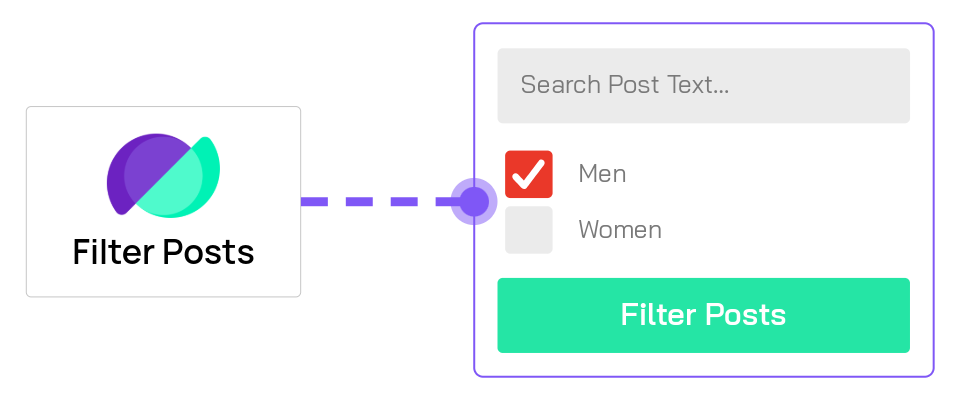
Filter Posts Module
Overview
The Filter Posts Module adds dynamic filtering capabilities to your Divi pages, allowing visitors to filter posts, products, or custom post types without page reloads. It works seamlessly with the Archive Loop Module and Loop Builder layouts to create sophisticated search and filter interfaces for archives, category pages, and custom layouts.
When to use it
Use the Filter Posts Module when you need to:
- Add category or tag filters to blog archives
- Create product filtering for WooCommerce shops (by price, attributes, stock status)
- Filter posts by custom fields or ACF data
- Add keyword search to archive pages
- Build location-based filtering with ACF Map Radius Search
- Create faceted search interfaces with multiple filter criteria
The Filter Posts module must be placed on the same page as an Archive Loop Module or an active Loop Builder loop.
Add the Archive Loop module or activate the Loop Builder loop first to confirm it displays the correct posts, then add the Filter Posts module to control those results.
Getting Started
Before diving into settings, understand the basic workflow for creating a filtered archive:
- Add an Archive Loop Module or activate a Loop Builder loop on your page first. This displays the posts/products that will be filtered.
- Add the Filter Posts Module to your page (position it above, below, or beside the Archive Loop).
- Click "Add New Filter Item" in the Filter Posts settings to create your first filter.
- Configure the filter item by selecting what to filter (categories, price, custom fields, etc.) and how to display it (dropdown, checkboxes, slider, etc.).
- Repeat step 3 to add additional filters for multi-criteria filtering.
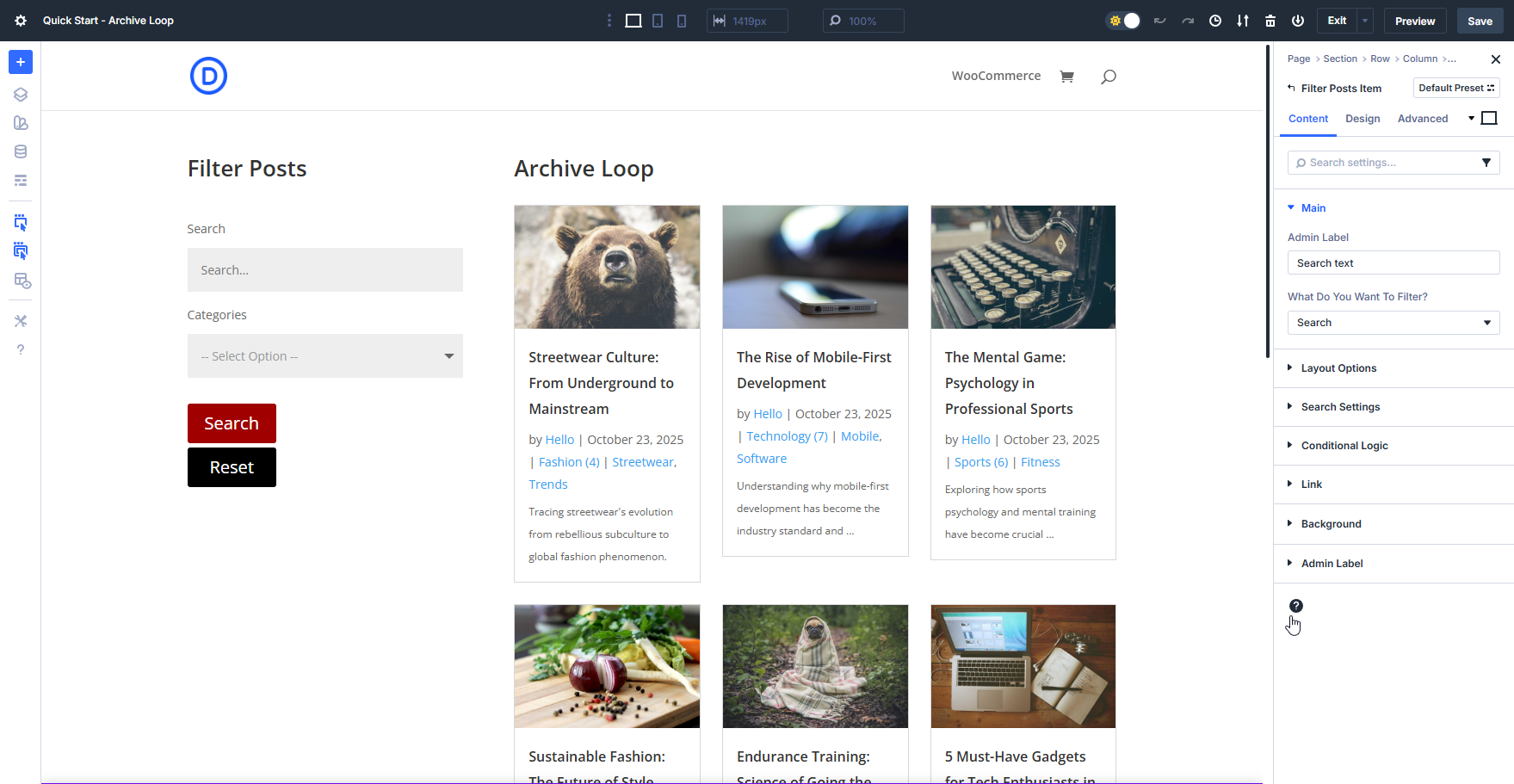
Each filter item you add works in conjunction with others, allowing visitors to refine results using multiple criteria simultaneously.
For detailed information on configuring individual filter items, see the Filter Item Settings.
Content Tab
This is where all the functional settings for the Filter Posts module lives.
Filter Item Settings
Filter items are the individual filters you add to create your filtering interface. Each filter item targets specific data (categories, price, custom fields, etc.) and can be displayed in various formats (dropdown, checkboxes, slider, etc.).
To add filter items:
- Click the Add New Filter Item button
- Give it an admin name for organization
- Select what data to filter (categories, price, ACF fields, etc.)
- Choose how to display it (dropdown, checkboxes, slider, etc.)
- Configure type-specific options
For detailed documentation on all filter item settings including filter types, display options, and advanced configuration, see the Filter Item Settings Reference.
Common filter item settings:
- Admin Filter Name - Backend label for organization (not shown to visitors)
- What Do You Want To Filter - The data source (categories, tags, price, ACF fields, etc.)
- Filter Type - How users interact with it (dropdown, checkbox, radio, slider, date picker, search, swatch)
- Show Label / Custom Label - Display options for the filter label
- Filter Width - Control the filter's width in your layout
The available configuration options change based on what you're filtering and how you're displaying it. See the Filter Item Settings Reference for complete details on all filter types and their options.
Main Settings
Configure core filter behavior and update methods.
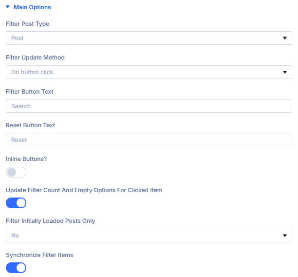
Filter Post Type: Choose the post type to filter
Choose the post type you want to filter.
Available options:
- Auto Detect - Automatically detects the post type based on the page context (recommended)
- Post - Filter standard WordPress posts
- Product - Filter WooCommerce products
- Project - Filter Divi Projects
- Variable Products as Single Products - Treat WooCommerce variable products as individual products in the filter results
In most cases, "Auto Detect" automatically determines the correct post type based on your page context (archive page, WooCommerce shop, etc.). Only change this if you need to override the automatic detection.
Filter Update Method: Control how filters apply changes
Select when you want the filter to be triggered. This setting allows you to determine whether the filter updates automatically as soon as a user selects a new filter option (On change), or if a manual button click is required to apply the selected filters (On button click).
On change: Results update immediately when a filter selection is made
Recommended for most cases. Filters update automatically as soon as a user makes a selection, providing instant feedback and a smooth filtering experience.
Since results update as you work with the filters you can remove the irrelevant empty options in your Filter Items. See Empty Filter Options in the Filter Items documentation for more information.
On button click: Results update only when a filter button is clicked
Useful for complex multi-filter setups where users want to select multiple criteria before updating results.
Filter Button Text: Customize the filter button label
Enter the text you want to display on the filter button.
This setting only appears when "Filter Update Method" is set to "On button click".
Default: "Search"
Examples: "Filter", "Apply Filters", "Show Results", "Search Products"
Reset Button Text: Customize the reset button label
Enter the text displayed on the reset button that clears all active filters.
Default: "Reset"
Examples: "Clear Filters", "Show All", "Reset Filters", "Clear All"
Scroll To Section After Ajax Update: Enable smooth scrolling after filtering
When enabled, the page automatically scrolls to the results section after filter updates complete. This improves user experience by bringing filtered results into view.
Enable Select2: Use enhanced select dropdowns
Enable Select2 to transform standard dropdown filters into enhanced select boxes with search functionality. This is particularly useful for filters with many options (e.g., large category lists).
Filter Initially Loaded Posts Only: Restrict filtering scope
When enabled, filters only apply to posts initially loaded by the Archive Loop, ignoring additional posts that might match the filter criteria but weren't in the initial query. This is useful when you want to filter a curated subset of posts rather than the entire database.
Layout Settings
Control the visual placement and style of your filters.
Filter Location: Position filters relative to results
Choose where the filter module appears:
- Above Loop - Filters appear above the Archive Loop results
- Below Loop - Filters appear below the Archive Loop results
- Left of Loop - Filters appear in a sidebar to the left
- Right of Loop - Filters appear in a sidebar to the right
Filter Style: Choose filter display style
Select how filters are presented:
- Default - All filters visible at once
- Toggle - Filters can be individually expanded/collapsed
- Slide - Filters slide in from the side
Hide Reset Button: Remove the reset option
Enable this to hide the reset button completely. Use this when you want users to manually adjust filters without a quick "clear all" option.
Align Reset Button: Set reset button position
Control the horizontal alignment of the reset button (left, center, or right).
Show Reset Button Only After Filter Change: Conditional reset display
When enabled, the reset button only appears after a user has made at least one filter selection. This keeps the interface clean when no filters are active.
Extra Settings
Additional options for controlling filter behavior and display.
Update filter count and empty options for clicked item: Control first-filter behavior
This setting determines whether the FIRST filter item clicked remains unchanged while other filters update based on it.
Options:
-
NO (Default) - All filters hide empty options independently
- The first clicked filter does NOT stay intact
- Empty options in ALL fields are removed based on active filters
- Creates balanced filtering where no single filter dominates
-
YES - First clicked filter stays intact, others update
- Tracks the first filter item clicked as the "primary" filter
- That first filter's options remain visible even if they become empty
- Other filters dynamically hide empty options based on the first filter
- Creates a "primary + refinement" filtering pattern
Example with YES:
If user clicks "Red" color first, ALL colors stay visible (Red, Blue, Green, etc.), but the Size filter automatically hides sizes that don't exist in red products.
Example with NO:
If user clicks "Red" color, then "Large" size, both the Color AND Size filters will update to hide options with zero results.
Related Feature Documentation:
Mobile Settings
Optimize filter behavior for mobile devices.
Toggle Whole Filter: Create mobile filter menu
Enable this to hide all filters behind a toggle button on mobile devices. This saves screen space and improves mobile UX by letting users show/hide the entire filter panel.
Mobile Toggle Style: Style the mobile toggle button
Select the appearance style for the mobile filter toggle button.
Auto-Close Toggle On Filter: Collapse after selection
When enabled, the mobile filter panel automatically closes after a user makes a selection, returning focus to the results.
Filter Toggle Name: Label the mobile toggle
Set the text displayed on the mobile filter toggle button (e.g., "Filters", "Refine Results", "Filter Options").
Toggle Individual Filters: Expandable filter groups
Enable this to make each filter individually collapsible on mobile, rather than showing/hiding the entire panel at once.
Design Tab
The Design tab provides comprehensive styling controls for your filter elements. In addition to standard Divi design options (spacing, borders, shadows, typography), the Filter Posts module includes several plugin-specific design accordions for precise control over filter appearance.
Plugin-Specific Design Options
The Filter Posts module adds these specialized design accordions:
Filter Container: Style the overall filter wrapper
Control the appearance of the container that wraps all filter items:
- Background color and gradients
- Border styles and radius
- Box shadow
- Padding and margins
- Width and alignment
Use this to create a distinct visual container for your filters, especially when using sidebar layouts or above/below placements.
Filter Items: Style individual filter inputs
Control the appearance of each filter input element:
- Label Typography - Font, size, weight, color for filter labels
- Input Field Styling - Background, borders, padding for dropdowns and text inputs
- Checkbox/Radio Styles - Custom styling for checkbox and radio button filters
- Button Styles - When using button-style filters
- Hover States - Interactive styling for user engagement
- Active States - Visual feedback for selected filters
- Focus States - Accessibility-focused styling for keyboard navigation
These options help you match your filters to your site's design system.
Reset Button: Customize the reset/clear button
Style the button that clears all active filters:
- Button Background - Color and gradient options with hover states
- Button Text - Typography, color, and alignment
- Border - Style, width, radius, and color
- Icon Options - Add and style an icon (size, color, position)
- Spacing - Padding within the button and margins around it
- Alignment - Position relative to other filters
The reset button is crucial for user experience, so ensure it's clearly visible and styled consistently with your site's call-to-action buttons.
All standard Divi design controls are also available, including Animation, Visibility, Transforms, and Position settings. The above accordions are specific to filter functionality.
What's next?
- Filter Item Settings Reference - Comprehensive guide to all filter item configuration options
- Archive Loop Module - Learn how to configure the Archive Loop that displays filtered results