Build a Multistep Form
A multistep form breaks down a long form into smaller, manageable sections, improving user experience by reducing form abandonment. Users fill out one step at a time, making the process less overwhelming.
Video Guide
Step 1: Add the Form Module
- Navigate to the desired page.
- Add the Form module.
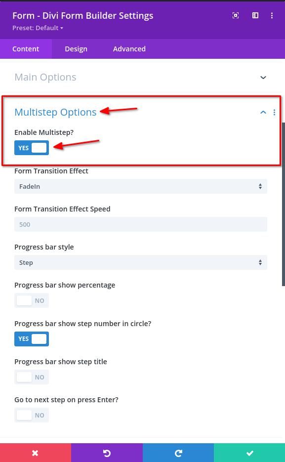
Step 2: Enable Multistep Form
Within the form module settings, open the Multistep Options section and set Enable Multistep to Yes.
You can customize the multistep options from the settings that appear below after enabling Multistep.
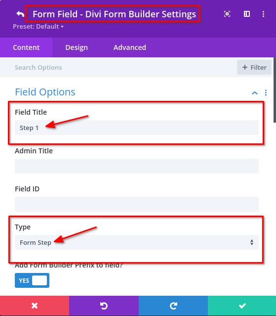
Step 3: Add a Form Step Field
- Add a new Form Field.
- Select
Form Stepfrom the Type dropdown underType.- Ensure this is the first field.
- Enter a suitable
Field Title. You can display the title under the step by enabling theProgress bar show step titleoption in the Form settings >Multistep Optionssection.
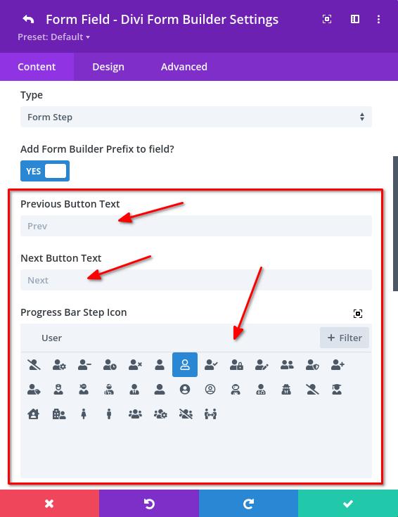
Step 4: Configure Form Step Field
Within the Field Option, you can customize additional settings for the step.
- Customize the Previous and Next button text.
- Adjust the Progress Bar Step Icon settings if needed.
- Note: The Progress Bar Step Icon only shows when
Progress bar show step number in circleis disabled andProgress bar show step icon in circleis enabled in the main Form module settings >Multistep Optionssection.
- Note: The Progress Bar Step Icon only shows when
Step 5: Add Additional Fields
Add various fields (e.g., Input Field, Email Field) under the first Form Step field.
- These will appear in the first step.
You can find a list of fields here.
Step 6: Add Another Form Step Field
Insert another Form Step field after the other fields. This creates a second step.
Step 7: Continue Adding Fields and Steps
Repeat the process of adding fields and Form Step fields. Each step will display the fields added under its respective Form Step field.
Additional Multistep settings
Within the form module settings > Multistep Options section, you can find various options to customize the multistep form:
- Form Transition Effect: Choose from various effects like
FadeIn,ScaleIn,ScaleOut,SlideHorz, andSlideVert. - Form Transition Effect Speed: Set the speed of the transition effect in milliseconds.
- Progress Bar Style: Select the style for the progress bar (
None,Basic,Lollipop,Step). - Basic Progress Bar Height: Adjust the height of the basic progress bar.
- Lollipop Progress Bar Settings: If
Lollipopstyle is selected, adjust the border radius and height of the progress bar. - Progress Bar Options:
Show percentage: Display the completion percentage.Show step number in circle: Display step numbers in a circle.Show step icon in circle: Display icons in a circle.Show step title: Display the title of each step.
- Navigation Option:
Go to next step on press Enter: Allows users to navigate to the next step by pressing the Enter key.