Membership Cycle Switcher
Divi 5 only
This reference is for Divi 5. The same module exists in the Classic Builder. See Membership Cycle Switcher on Divi 4.
Purpose and when to use
Membership Cycle Switcher (divi-membership/cycle-switcher) lets a visitor change billing cycle on the front end, for example monthly and yearly. Its Divi 5 module picker label is Membership Cycle Switcher. Membership Item modules on the same page update to that cycle’s price and details.
Add it from the Divi Membership folder in the Visual Builder.
Toggle can only use two cycles. There is no limit on how many memberships those two cycles belong to. Select can list more than two cycles.
Before you configure this module
- Each plan you are showing has the billing cycles you want in the switcher.
- Membership Item modules on the page use a billing cycle that matches Default Billing Cycle.
Quick setup
- Add Membership Cycle Switcher above or beside the pricing modules.
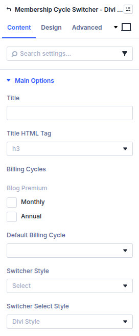
- Tick the Billing Cycles that should appear. Cycles are grouped by plan.
- Set Default Billing Cycle to the cycle that should be selected on page load.
- Set Switcher Style to Select (default) or Toggle.
- Optionally set Title. The title HTML tag defaults to
h3.
Content tab
| Group | What it configures |
|---|---|
| Main Options | Title, cycles, default cycle, select or toggle |
| Background / Link / Admin Label | Standard Divi groups |
Core settings
| Setting | Type | Default | Notes |
|---|---|---|---|
| Title | text | empty | Shown above the control |
| Title HTML Tag | select | h3 | div, p, span, or h1–h6 |
| Billing Cycles | checkboxes | none | Cycles from your plans |
| Default Billing Cycle | select | empty | Must match the Membership Item modules |
| Switcher Style | select | Select | Toggle allows two cycles only |
| Switcher Select Style | select | Divi Style | Shown when style is Select |
Design tab
| Group | What it configures |
|---|---|
| Typography | Title. Select Text when style is Select. Toggle Text and Toggle Active Text when style is Toggle |
| Toggle | Track and switch colours. Shown for Toggle. Default track is #cdcdcd. Active switch defaults to #ffffff |
| Select | Dropdown background and arrow. Shown for Select. Background defaults to #eee, arrow to #666 |
| Sizing, spacing, border, box shadow, filters, animation, transform | Module chrome |
Advanced
Standard Divi groups: attributes, CSS, conditions, visibility, transition, position, and scroll.