Expand From Outside Screen
Divi Mobile allows you to choose how your site’s navigation menu appears on mobile devices with a range of animated styles. "Expand From Outside Screen" makes the navigation menu slide into view from off-screen, an elegant way to keep your design clean and save valuable screen space while still providing an intuitive user experience.
How to Set Up
- Open the
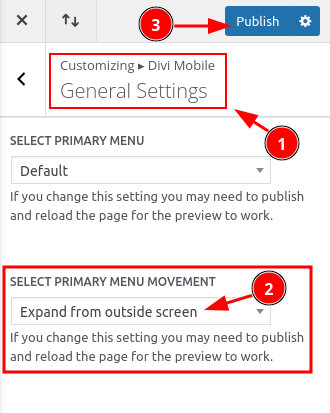
Theme Customizerand navigate toDivi Mobile>General Settings. - Find the "Expand From Shape Style" dropdown menu.
- Select "Expand From Outside Screen" from the list of available styles.

Customize the Style of the Expansion
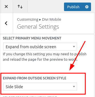
You can select the animation style that best fits the design and functionality of your mobile menu. The settings are just below the previous option:

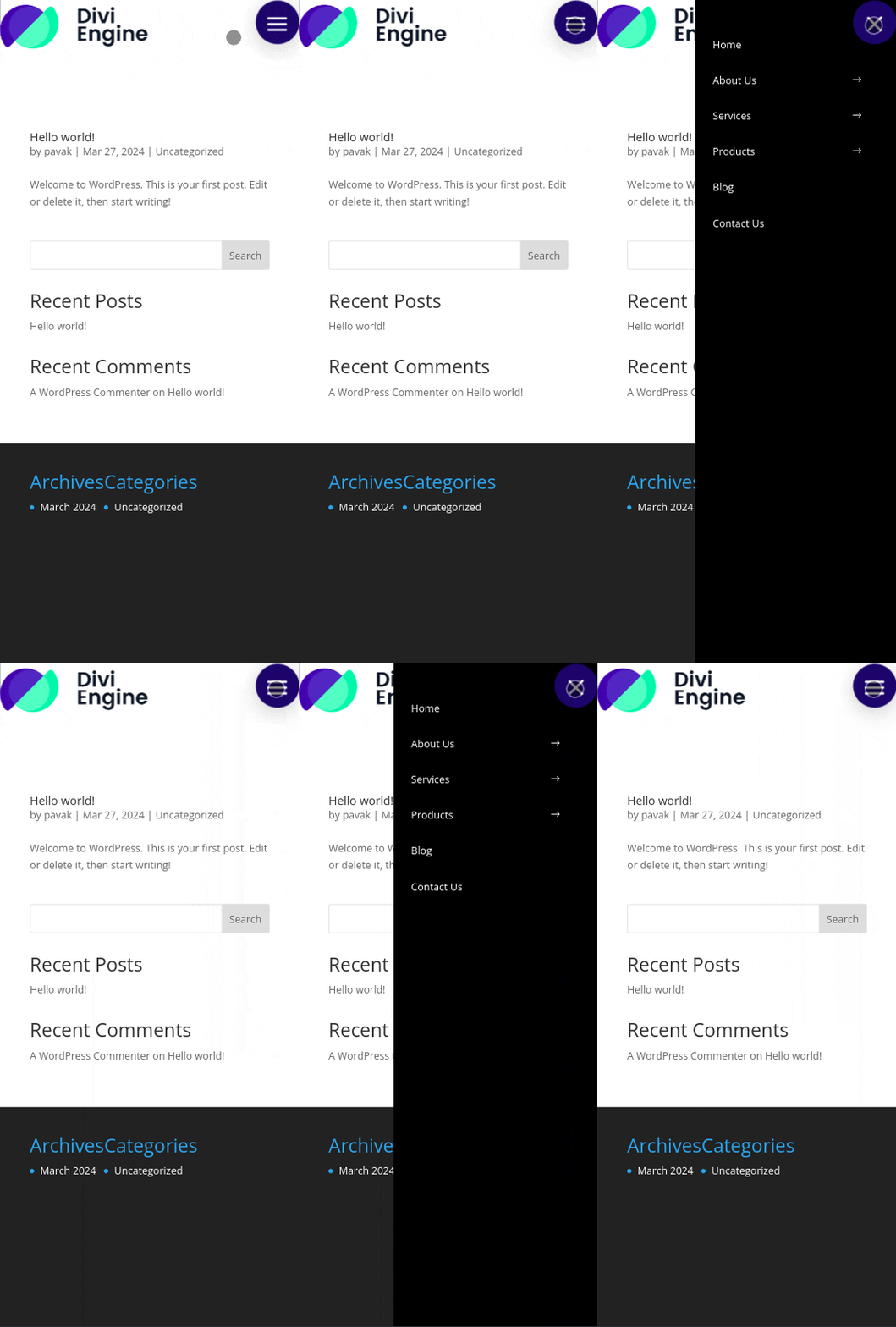
1. Side Slide
The menu slides in from the side.

2. Top Slide
The menu slides down from the top.
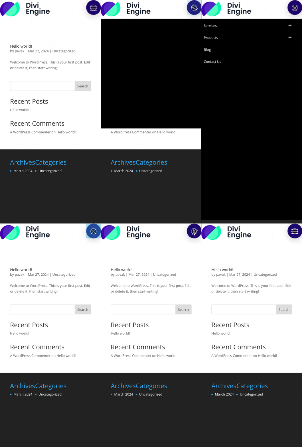
3. Elastic
The menu appears with an elastic animation.

4. FullScreen Slide Down
The menu slides down, covering the whole screen.

5. FullScreen Fade
The menu fades in, covering the full screen.

6. Divi Engine Style
A style provided by Divi Engine with unique animation.
