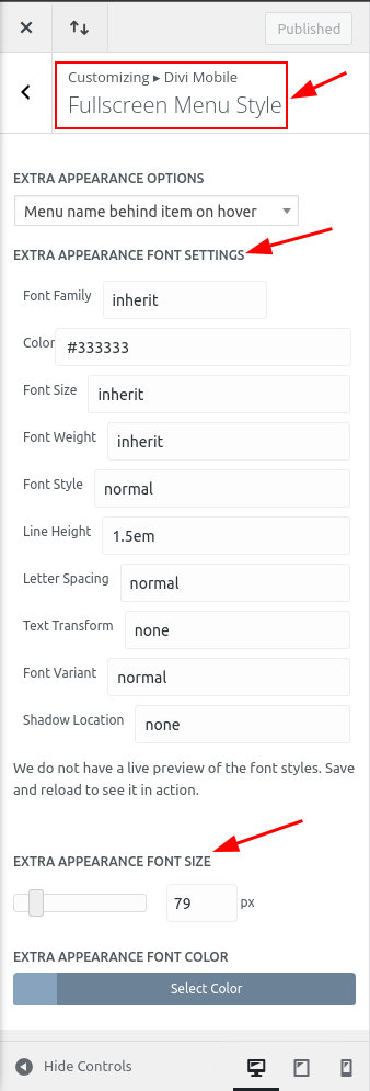
Fullscreen Menu Style
Video Guide
Divi Mobile brings the convenience and style of mobile navigation to your desktop experience. Utilizing fullscreen menu styles like FullScreen Slide Down or FullScreen Fade, your website can offer a dynamic, modern navigation solution on larger screens.
Activating Divi Mobile Menu on Desktop
The feature we are discussing in this doc relies on cursor hover. It requires the presence of a mouse or similar pointing device, which is typical in a desktop environment.
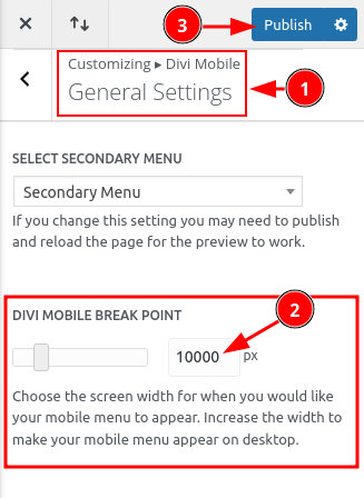
To use the Divi Mobile menu on the desktop, follow these steps:
- Access the
Theme Customizerin your WordPress dashboard. - Navigate to
Divi Mobile>General Settings. - Locate the
DIVI MOBILE BREAK POINTsetting. - Set the breakpoint pixel value to a high enough number so the mobile menu to trigger on desktop screens.
Selecting the FullScreen Menu Style
Within the Expand From Outside Screen Style, select either FullScreen Slide Down or FullScreen Fade. Detailed guidance on selecting these styles is available in the linked documentation:
Remember, FullScreen Slide Down or FullScreen Fade styles are necessary for the feature below to function correctly.
Enabling the EXTRA FullScreen Menu Appearance
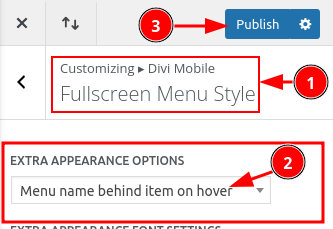
For a singular extra option for the FullScreen menu style:
- Still in the
Theme Customizer, proceed toDivi Mobile>FullScreen Menu Style. - In the
EXTRA APPEARANCE OPTIONSfield, selectMenu name behind item on hover.
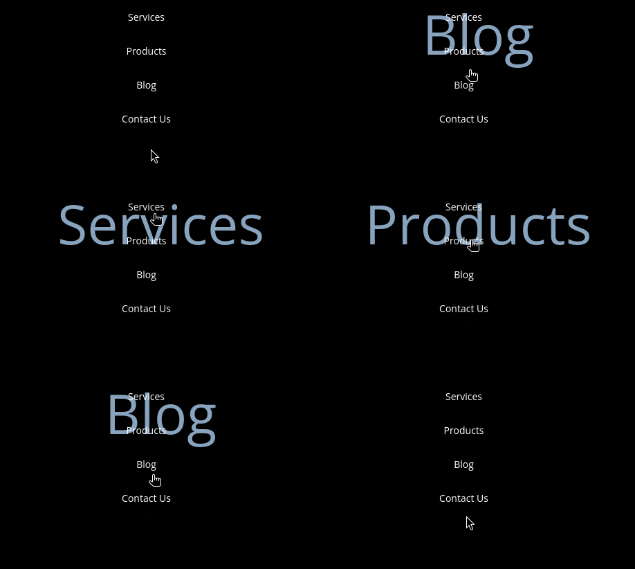
Here is a preview of the settings:
Customize the Appearance Further
Below the previous settings, you can customize the font: