Thumbnail Module
This loop module is for Divi 5 custom loop layouts. On Divi 4, use Thumbnail module under Divi 4 modules.
Overview
The Thumbnail module displays the featured image for each post or product in a loop layout. It includes options for image size, linking, placeholders, optional WooCommerce variation swaps, and hover styles such as overlay or flip image. Sections below follow the builder group titles (Content, Design, Advanced). Some fields only appear when a parent toggle or Image Style choice matches—as noted.
When to use it
Use this module as a component of a Custom Loop Layout that will be used inside the Archive Loop to dynamically display the featured image of each loop item. Custom loop layouts are saved in the Divi Library.
This module is not compatible with the Loop Builder.
Content Tab
Text
Configure how the featured image is sourced, displayed, and linked.
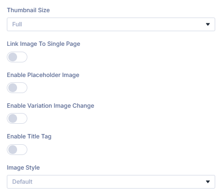
Thumbnail Size
Choose which registered WordPress image size to render (for example Thumbnail, Medium, Large, or Full). Options load from your site.
Link Image to Single Page
When enabled, the image links to the loop item’s single post or product page.
Open Link in New Tab
When: Link Image to Single Page is on. Opens the linked page in a new browser tab.
Enable Placeholder Image
Shows a fallback image when the item has no featured image.
Placeholder Image
When: Enable Placeholder Image is on. Upload or select the fallback image.
Placeholder Alt Text
When: Enable Placeholder Image is on. Alt text for accessibility and SEO.
Placeholder Title Text
When: Enable Placeholder Image is on. Optional title attribute for the placeholder image.
Enable Variation Image Change
For variable WooCommerce products, swap the thumbnail when shoppers select a variation.
Enable Title Tag
Outputs a title attribute on the image element when enabled.
Image Style
Controls hover behavior:
- Default — Featured image with an overlay (overlay design settings appear on the Design tab).
- Image Only (no overlay) — No overlay or hover effect.
- Flip Image — Secondary image on hover (WooCommerce gallery second image, or an ACF image when configured).
Flip Image ACF Field
When: Image Style is Flip Image. Pick the ACF image field for the hover image. For WooCommerce, leave blank to use the second gallery image.
Background
Module-level background for the Thumbnail wrapper (Divi Background group on the Content tab).
Background Color
Solid background behind the thumbnail output.
Background Gradient
Gradient background for the module wrapper.
Background Image
Background image with standard Divi position, repeat, and size controls.
Background Video
Optional background video on the module wrapper when supported.
Admin label
Admin Label
Optional label in the Visual Builder layer list for this Thumbnail instance.
Design Tab
Design groups mirror the Visual Builder Design tab. Overlay appears when Image Style is Default.
Thumbnail
Image frame styling for the featured image.
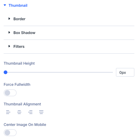
Thumbnail Height
Set a fixed height for the thumbnail area (px, em, rem, or %).
Force Fullwidth
Stretches the thumbnail to the full width of its column.
Thumbnail Alignment
Horizontal alignment: left, center, right, or justify.
Center Image on Mobile
Centers the image on smaller breakpoints.
Border (Thumbnail group)
Border around the image within the Thumbnail design group.
Box Shadow (Thumbnail group)
Shadow on the thumbnail image.
Filters (Thumbnail group)
CSS filters applied to the thumbnail image.
Overlay
When: Image Style is Default on the Content tab.
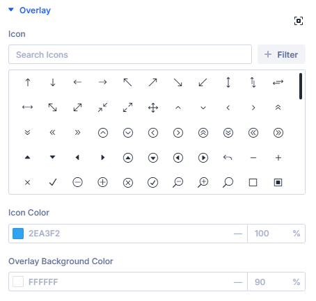
Icon
Icon shown on the hover overlay.
Icon Color
Color of the overlay icon.
Overlay Background Color
Background color of the hover overlay.
Standard Divi design groups
Module wrapper polish beyond field-specific palettes.
- Sizing
- Spacing
- Border
- Box Shadow
- Filters
- Transform
- Animation
Use together to align gutters with sibling columns and motion preferences.
Advanced tab (standard Divi)
- Attributes — Custom data attributes safely merged.
- CSS (Custom CSS) — Targeted snippets.
- Conditions (Divi display conditions).
- Visibility — Responsive / scroll visibility toggles per Divi norms.
- Transition (Transition Group) — Motion curves for property changes when applicable.
- Position — Layering / anchors.
- Scroll — Effects tied to scrolling.
Consult Divi Advanced documentation when you need granular behavior beyond plugin filters.
What's next?
- Archive Loop module — Build the filtered results canvas that uses this thumbnail in custom loop layouts.
- Post Title module — Pair titles with featured images in the same loop card.
- Filter Posts module — Add filtering on archive pages that feed the loop.