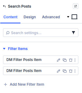
Search Posts Module

Divi 4 module

The Search Posts module builds the search and filter UI. Global behavior (which fields are searchable) is configured under Divi Engine → Machine Settings → Search Settings.

Overview

Visitors use this module to run searches against your selected post type. You add Search Items for each control (text, select, taxonomy, checkbox, range, swatch, and more), then send results to a Search Results template built with the Archive Loop module.


When to use it

  • Site-wide or section search for a custom post type directory
  • Filterable directories where URL parameters should stay in sync with the UI
  • Replacing the default WordPress search experience with a Divi-designed results page

Setup workflow

  1. Add Search Posts to any layout that should expose the form.
  2. Configure Main Settings (post type, button text, inline button, new tab, archive redirect).
  3. Add one or more Search Items and pick what each item filters.
  4. Configure Divi Engine → Machine Settings → Search Settings so Machine knows which ACF groups and fields participate in search.
  5. Build a Search Results Theme Builder template with Archive Loop + your Custom Loop Layout.
  6. Optional: assign a No Results layout in the Archive Loop when nothing matches.

Main settings — main options

Search Posts — main options (placeholder)

Search Post Type

Select the post type this form searches.

Search Button Text

Customize the submit button label.

Make Button Inline

Place the submit button inline with the filters instead of stacked.

Show Search Result In New Tab

Open the results page in a new browser tab.

Submit To Archive Page

Send visitors to the archive page that uses your Archive Loop layout instead of a separate search template.


Search item — main options

Search Posts — search item main (placeholder)

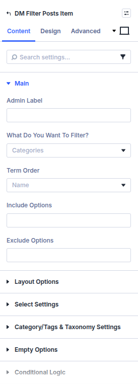
Admin Filter Name

Internal reference used to map this item to query parameters and Machine search logic.

Search/Filter

Choose what this row searches or filters (taxonomy, meta, text, and so on).

Delay To Filter

Debounce live filtering so AJAX does not fire on every keystroke.

Post Type

Restrict this item to a specific post type when you run multi-type setups.

Show Filter & Parameters

Show active filter chips or query summary text with the form.

Exclude Options

Remove specific URLs or values from the selectable list.

Display Filter Count

Show counts next to filter choices when data is available.

Display Empty Filter Options

Keep choices visible even when the count is zero.

Show Label

Toggle the visible label for this item.

Custom Label

Override the default label copy.


Search item — layout options

Search Posts — layout options (placeholder)

Filter Width

Control the width of the filter control in the layout.


Search item — text filter options

Search Posts — text filter (placeholder)

Placeholder Text

Placeholder string inside the text input.

Make Text A Number Input

Use a numeric keyboard-friendly input for numeric searches.


Search item — select filter options

Search Posts — select filter (placeholder)

Enable Select2

Use the Select2 dropdown experience for long lists.

First Option Text

Label for the empty “choose an option” row.


Search item — category filter options

Search Posts — category filter (placeholder)

Sub Category Identification

Choose how nested categories are detected in the markup.

Indent Spacing

Spacing for nested category rows.

Toggle Color

Color for expand/collapse toggles in hierarchical lists.


Search item — checkbox and radio options

Search Posts — checkbox radio (placeholder)

Checkbox / Radio Button Functionality

Choose how multi-select and single-select behaviors work together.

Checkbox / Radio Style

Visual style for checkbox or radio lists.

Display Checkbox / Radio Button Inline

Lay choices out horizontally.

Gap Between Each Item

Spacing between inline items.

All Label Text

Label for the “select all” style option.

Hide All

Hide the “all” shortcut row.

Limit Height Of Checkbox / Radio Filter

Clamp tall lists with an internal scroll area.

Max Height Of The Filter Item

Maximum height before scrolling.

Show More Text

Label for expanding truncated lists.

Show Less Text

Label for collapsing lists.

Show More/Less Icon

Icon shown with more/less controls.

Show More/Less Icon Size

Icon dimensions.

Show More/Less Icon Position Top

Vertical alignment for the icon.

Show More/Less Icon Position Right

Horizontal alignment for the icon.

Only Show Available Options

Hide choices that would return zero results.


Search item — swatch filter options

Search Posts — swatches (placeholder)

Swatch Style

Shape and border treatment for color or image swatches.

Swatch Width

Width of each swatch.

Swatch Height

Height of each swatch.

Swatch Background Color

Default swatch fill color.

Swatch Border Color

Border color for idle swatches.

Active Swatch Background Color

Fill color when selected.

Active Swatch Border Color

Border color when selected.

Swatch Border Width

Border thickness.


Search item — conditional logic

Search Posts — conditional logic (placeholder)

Logic ID

Machine-safe identifier referenced by other rules.

Logic Title

Friendly admin title for this rule group.

Enable

Turn this conditional block on or off.

Relation

Match any or all nested rules.

Rule 1

Choose the field that drives the condition.

Rule 2

Choose the comparison operator.

Rule 3

Enter the comparison value.

More information

See Elegant Themes’ documentation on Divi form conditional logic for general concepts that also apply to these controls.


Search item — range filter options

Search Posts — range filter (placeholder)

Range Values Type

Use Machine defaults or supply a custom list of values.

Range From Number

Starting value for numeric ranges.

Range To Number

Ending value for numeric ranges.

Set Your Customer Values

Custom value list when using a custom range definition.

Number/Range Step

Increment between selectable stops.

Number/Range Appearance Style

Skin for the range UI control.

Range Primary Colour

Primary track color.

Range Secondary Colour

Secondary track color.

Range Hide Min And Max Values

Hide min/max labels.

Range Hide From And To Values

Hide from/to labels.

Number/Range Prettify

Format large numbers with separators.

Number/Range Prettify Separator

Separator character for prettified numbers.

Number/Range Before Text

Prefix text before the control.

Number/Range After Text

Suffix text after the control.


Search item — true and false filter options

Search Posts — true/false filter (placeholder)

True Text

Label shown for the true choice.

False Text

Label shown for the false choice.


What is next