Gallery / Slider
Gallery/Slider displays images from a custom field as a grid or slider, with optional captions, arrows, dots, load more, and lightbox. Custom Field Gallery Type has two sources:
- Gallery field (ACF Pro only) — ACF Pro Gallery field.
- Group field with image fields inside — Free ACF workaround: a Group of Image sub-fields that share a name prefix.
Overview
Use this module when you need slider modes, advanced grids, or lightbox behavior tied to Machine fields. For a simple field-backed grid, native Gallery + Insert Dynamic Content is often enough—see Native modules and dynamic content.
Full field-group setup (especially free ACF naming and screenshots): Image gallery (free ACF), Image gallery (ACF Pro).
How to use Gallery field (ACF Pro)
- Add an ACF Pro Gallery field to the post type and save images on the post.
- Add Gallery/Slider and set Custom Field Gallery Type to Gallery field (ACF Pro only).
- Set Custom Field Gallery Name to that gallery field.
- Optional: enable Is this inside a repeater loop layout? when the module sits in a Repeater loop layout.
- Choose Gallery Layout (grid or slider) and configure columns, arrows, dots, and lightbox.
How to use Group field with image fields inside (free ACF)
ACF free has no Gallery field. Put Image fields inside a Group, and give each image the same prefix plus _1, _2, _3:
- Group name:
portfolio_gallery - Image names:
portfolio_image_1,portfolio_image_2,portfolio_image_3
Then in Gallery/Slider:
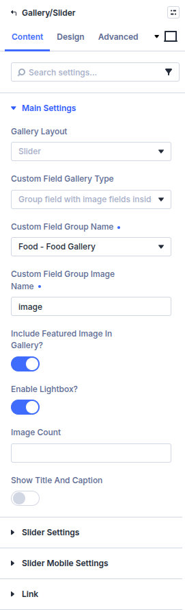
- Set Custom Field Gallery Type to Group field with image fields inside.
- Custom Field Group Name — the group (
portfolio_gallery). - Custom Field Group Image Name — the shared prefix only (
portfolio_image), notportfolio_image_1and not the label text.
Creating the Group and sub-fields: Image gallery (free ACF).
Main Settings
Gallery Layout
Grid or Slider.
Custom Field Gallery Type
Gallery field (ACF Pro only) or Group field with image fields inside. This choice shows either Custom Field Gallery Name or the group name / image prefix fields.
Custom Field Gallery Name
Shown for the Pro gallery type. Pick the Gallery field.
Custom Field Group Name / Custom Field Group Image Name
Shown for the group type. Group field name, then the image prefix without _1, _2.
Is this inside a repeater loop layout?
Shown for the Pro gallery type. Enable when the gallery sits inside a Machine Repeater custom loop layout.
Include Featured Image in Gallery?
Optionally prepend the post featured image to the gallery set.
Enable Lightbox? / Show all images in Lightbox?
Open images in a lightbox; optionally include the full set (“see all photos” style behavior).
Image Count / Show Title and Caption
Limit how many images render initially and whether titles/captions appear.
Grid Settings
Grid style, columns, gap, overlay icons/colors, “all images” icon/text, Enable Load More? with load counts and button labels, optional Grid Custom Code.
Slider Settings
Slider style, top space, infinite scrolling, arrows, dots, animation speed, center mode, variable width, adaptive height, autoplay, plus mobile slider options when present.
Design
Design groups appear according to the grid/slider options enabled under Content:
- Design → Load More Button — Style the button when a grid uses Enable Load More.
- Design → Arrows — Set arrow position, icons, colors, and sizes when arrows are enabled for a slider.
- Design → Dots — Set active/inactive colors, size, and border radius when dot navigation is enabled.
- Design → Image Title and Image Caption — Set typography when Show Title and Caption is enabled.
Enable the related Content option before looking for its Design group. Standard Divi sizing, spacing, borders, filters, transforms, and animation remain available.
Pitfalls and limits
- Empty or mis-assigned fields show no images. For Pro, match the Gallery field and return format. For the group type, the image prefix must match every sub-field name except the
_1,_2suffix. - Is this inside a repeater loop layout? applies to the Pro gallery type. For repeater-nested media, you can also use Repeater + Custom Field Item.
- Native Divi Gallery + Insert Dynamic Content is enough for many simple cases; use this module for slider/grid/lightbox workflows tied to Machine fields.
What's Next
- Image gallery (free ACF) — Group field and image prefix setup
- Image gallery (ACF Pro) — Gallery field setup and custom CSS grids
- Build Unique Gallery Grid (Grid Custom Code) — Mosaic layouts, and matching the desktop column count to the template
- Repeater — Repeater-driven media rows
- Native modules and dynamic content — Native Gallery dynamic content