Thumbnail Module
Thumbnail is intended for Custom Loop Layouts and single templates where each item should show its featured image.
Overview
Displays the featured image with optional link to the single, placeholder artwork when no image exists, flip-on-hover using a second ACF image, and Visual Builder preview controls.
When to use it
- Product or post cards inside a Custom Loop Layout
- Single post headers that should stay dynamic per post
Content — Thumbnail
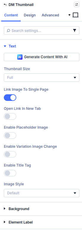
Thumbnail Image Size
Pick a registered WordPress image size (thumbnail, medium, large, full, or custom sizes added by your theme).
Link Image to Single Page
Wrap the image in a link to the post’s permalink.
Enable Placeholder Image
Show a fallback graphic when no featured image is set.
Placeholder Image
Upload or choose the media item used as the fallback.
Image Alternative Text
Populate the alt attribute for screen readers and SEO.
Image Title Text
Optional title attribute content for the image element.
Open In New Tab
Open the linked single in a new browser tab.
Enable Title Tag
Expose the browser tooltip title attribute for the image.
Image Style
Choose default image output, image-only treatment, or flip mode for hover swaps.
Choose Second Image
When using flip mode, select the ACF image field used for the alternate face.
Content — Visual Builder
Visual Builder Post
Select which post feeds preview data while editing.
Design
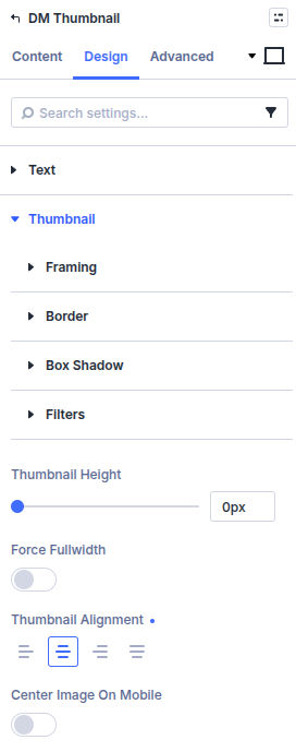
Style the image under Design → Thumbnail: height, full width, alignment, and centering on mobile, plus image fit, border, box shadow, and filters.
If you use an overlay-capable Image Style, an Overlay group appears for the hover icon and overlay colors. Other Design groups (sizing, spacing, and similar Divi defaults) stay available if you need them; this page does not list every field.
What is next
- Post Title module — Add semantic headings beside imagery
- Custom Field Item module — Surface extra fields around the card