Shared Field Settings
In Divi Form Builder, all form fields share a set of common settings. This document outlines the most frequently used shared settings.
Main Field Options

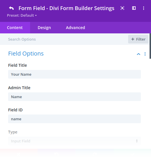
- Field Title: The field title displayed on the frontend. It also serves as the default placeholder unless a custom one is provided.
- Admin Title: This appears in the Form module settings in the Divi Builder. If left blank, the
Field Titleis used instead. - Field ID: The unique identifier used internally by the plugin. Field IDs must be unique and are typically required for Email Notifications, Confirmations, PDF Generator merge tags, Calculable Fields, Form AI, and Custom Forms. If you don’t need a specific Field ID, you can leave this blank, and one will be automatically generated. Field IDs should contain only English letters, numbers, and underscores, must start with a letter, and are best written in lowercase.
- Is Google Address Field: Enable this option to use the Google Maps address autocomplete API for the field. Ensure your Google Maps API key is added to Divi Theme Options. Follow this guide to generate and add an API key.
- Minimum Length: Sets the minimum number of characters allowed in the field. Enter
0to remove any restriction. - Maximum Length: Similar to the minimum length, but sets the maximum number of characters allowed.
Layout Options
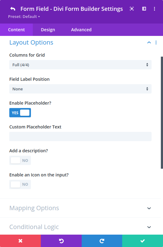
Basic Layout Options apply to all fields, except for Hidden Fields. Some options may be limited to specific field types.

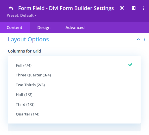
- Columns for Grid: Specifies the column layout for fields, with up to 4 columns supported. Available configurations include:

- Field Label Position: Sets the Field Label to appear at the
Top,Left, orRightof the field. - Enable Placeholder: Allows placeholders for supported field types that accept text input.
- Custom Placeholder Text: By default, the
Field Titleserves as the placeholder. Enter a custom placeholder here to override it. - Add a Description: Enables a description for the field, with additional customization options available when enabled.
- Enable an Icon on the Input: Adds an icon to the field. This option is only available for certain field types that accept text input.