ACF Item Module
The ACF Item module allows you to dynamically display custom field values created with Advanced Custom Fields (ACF) inside your layouts. This module is highly flexible and supports all ACF field types including text, image, audio, video, repeater, and relational fields.
Video Guide
How to Use the ACF Item Module
Step 1: Create a Custom Field
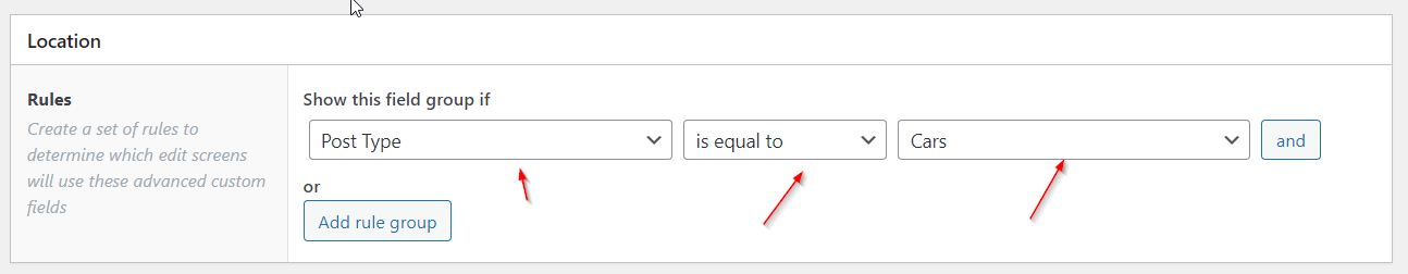
In ACF, create a field group and add the relevant field(s). Assign the group to your desired location such as:
- Custom Post Types
- Divi Posts or Projects
- Users
- Taxonomies
Step 2: Build A Post
Head over to your posts linked to the above Post Type and add ACF Field information.
Step 2: Populate Your Field
Go to the relevant post, user, or taxonomy item and enter data for the ACF fields you've created.
Step 3: Add the ACF Item Module
Add the ACF Item module to your layout in the Divi Theme Builder or post content.
- Set the
ACF Nameto match your field slug. - Configure the settings as needed depending on your field type.
ACF Item Module Settings
Main Options
The Main Options tab includes four sub-sections: Main, Label, Prefix/Suffix, and Visibility.
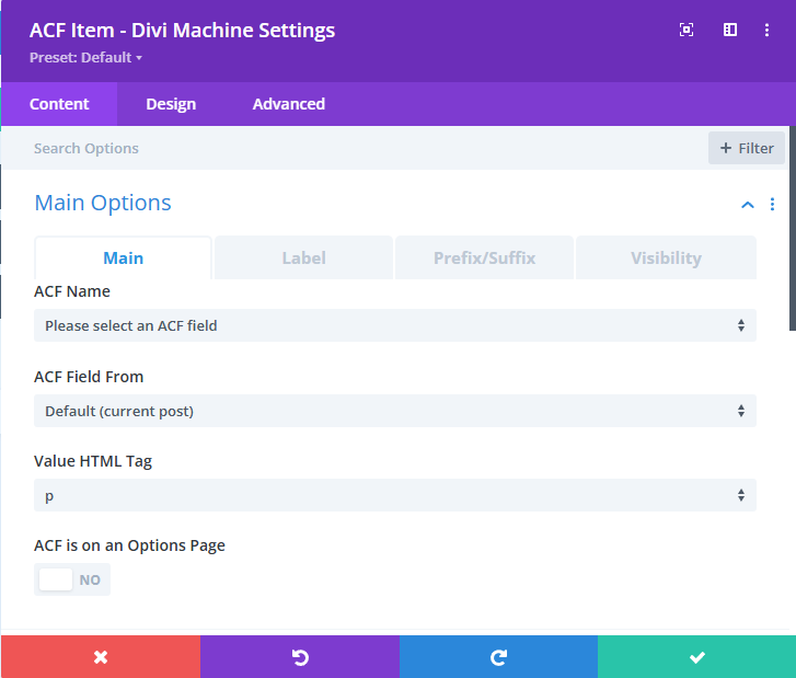
Main
Configure the basics of how your ACF value is displayed.
ACF Name: Select the ACF field to pull data from.ACF Field From: Choose the source of the field (e.g. current post, user, options page).Value HTML Tag: Choose the HTML tag to wrap around the value (e.g.p,h2,div).ACF is on an Options Page: Enable if the ACF field exists on an ACF Options Page.
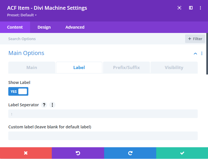
Label
Controls how labels appear alongside field values.
Show Label: Toggle to show or hide the field label.Label Separator: Choose a character to separate the label and value (default is:).Custom Label: Set a custom label instead of using the default ACF label.
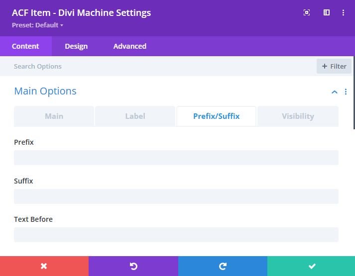
Prefix/Suffix
Add text before or after the value to provide context.
Prefix: Appears directly before the field value (e.g. "£").Suffix: Appears directly after the field value (e.g. "kg").Text Before: Full text shown before the entire value (useful for units, notes, etc).
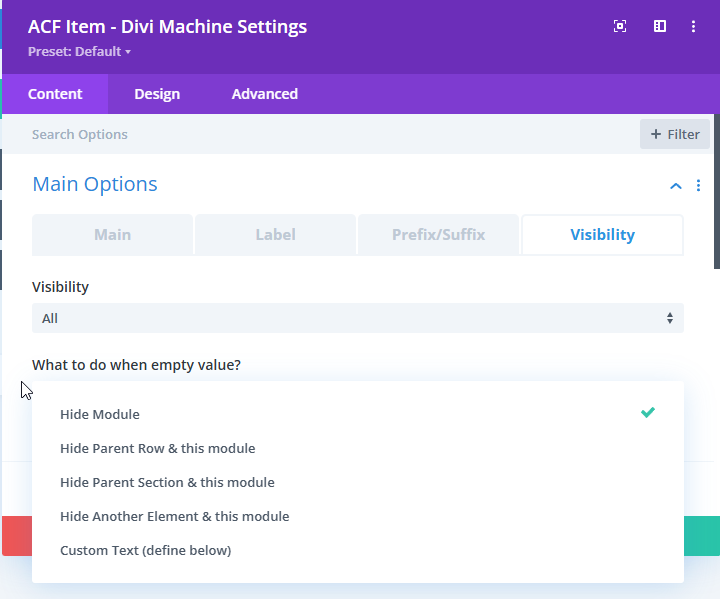
Visibility
Control who can see the field and what happens if the value is empty.
Visibility: Choose between All Users, Logged In, or Logged Out.What To Do When Empty Value: Choose how to handle an empty field.- Hide Module
- Hide Parent Row & Module
- Hide Parent Section & Module
- Hide Another Element & Module
- Display Custom Text
Image, File, URL, Phone, Email & Link Settings
These settings apply when displaying ACF fields such as file uploads, images, URLs, phone numbers, and email addresses. The section is split into three tabs for easier navigation:
Shared Settings
These options apply across most supported ACF field types (File, Link, Image, URL, Email, and Phone).
-
Image/File/Link: Return Format
Choose how you have defined the return format in ACF settings.
Options:Array,URL,ID,Choice Value,Choice Label,Choice BothnoteYou must select
Arrayhere and in the ACF field settings if using options like "Custom Text" or "Another ACF Field" below. -
Auto Detect Video/Audio for File field?
Enable this to automatically detect and render supported file types as video or audio players. -
File/Link/Email/Phone field: Make it a Button?
Turn the output into a stylized clickable button. -
Link/URL/image/email/phone: Open in a New Tab?
Opens the link or resource in a new tab when clicked. -
File/Link/URL: Text Name
Choose the display text for hyperlinks. Options:Another ACF FieldFile/Link/URL NameCustom Text
-
File/Link/URL/Email: Custom Text
Use this field to define the link text if "Custom Text" is selected above. -
File/Link field: remove website link name
Hide the raw URL and only display the formatted link or button. -
URL: Make it an image?
If the field contains a direct link to an image, you can render it as an image instead of a text link.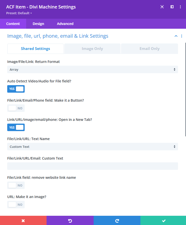
Image Only
These options are specific to Image fields returned by ACF.
-
Placeholder Image
Upload a fallback image to use when the ACF image field is empty. -
Image: Link image to another ACF field?
Enable to link the image dynamically to a value from a separate ACF field. -
Image: Image Size
Select the WordPress image size to output for example:thumbnail,medium,large, orfull. -
Image: Full Width
Stretch the image across the full width of its container.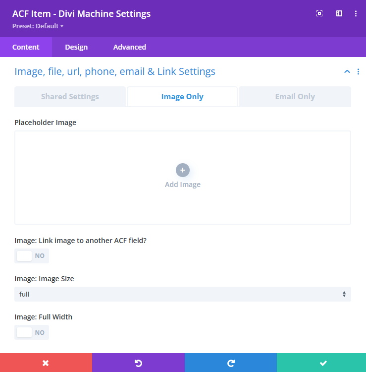
Email Only
These fields allow you to create pre-filled mailto: links with subject and body parameters.
-
Email: Subject
Choose the email subject dynamically or set it manually.
Options:None,Page Title,Page URL,Custom Text -
Email: Body Text
Add body text for the email content. -
Email: Body after
Choose additional text to append after the main body.
Options:None,Page Title,Page URL -
Email: Custom parameters
Manually append additional parameters to the mailto link (e.g.,&[email protected]).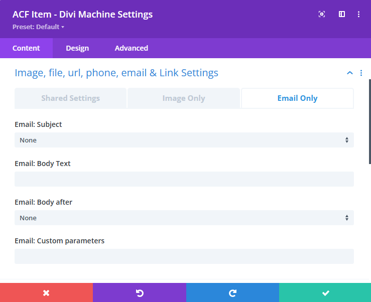
Checkbox/Radio Settings
These settings control how ACF checkbox, radio, or select field values are displayed in the frontend. The settings panel is split into two tabs: Shared Settings and Checkbox Only.
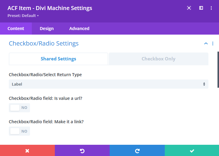
Shared Settings
These apply to both checkbox and radio fields.
-
Checkbox/Radio/Select Return Type
Choose the format used to return the ACF value.
Common options include:LabelorValue. -
Checkbox/Radio field: Is value a url?
Enable this if the returned value is a URL. This will turn the value into a hyperlink. -
Checkbox/Radio field: Make it a link?
Enable to turn the displayed value into a clickable link.
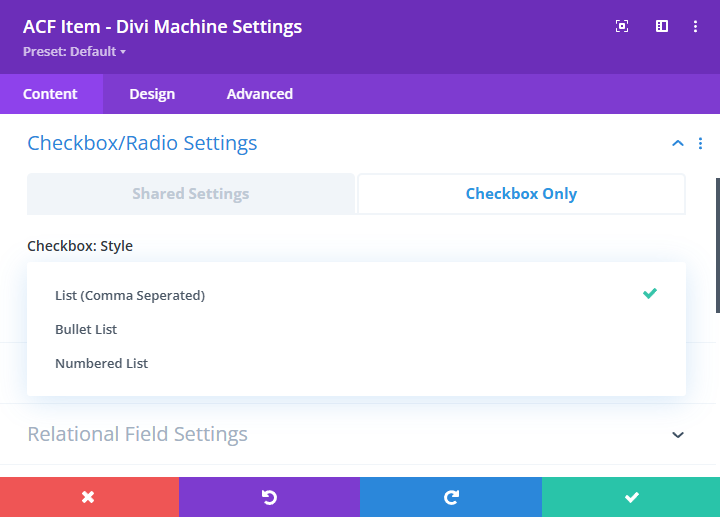
Checkbox Only
These settings apply only when the ACF field type is a Checkbox.
- Checkbox: Style
Select how the checkbox items should be displayed on the frontend.
Options include:List (Comma Separated)Bullet ListNumbered List
Other Field Settings
These settings apply to field types like text, number, true/false, audio, video, and oEmbed.
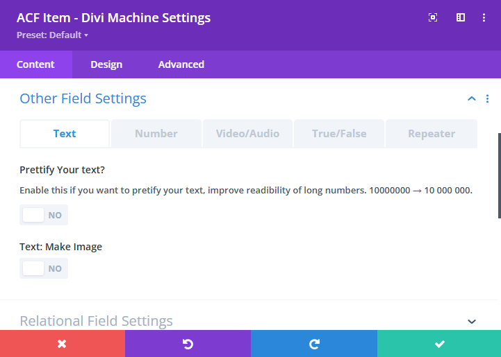
Text
- Prettify Your Text: Automatically formats and enhances plain text.
- Text Make Image: Turns image URLs in text fields into rendered images.
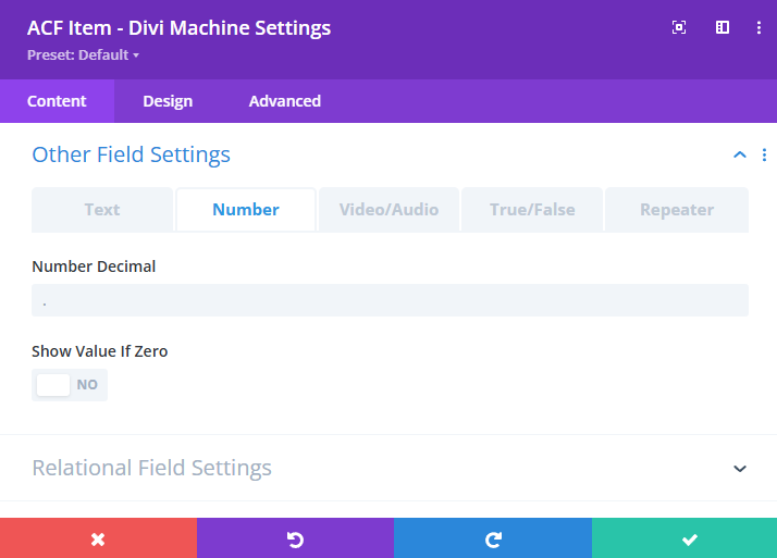
Number
- Number Decimal: Define the character used for decimal formatting (e.g., use
.for 10.5 or,for 10,5 depending on your locale). - Show Value If Zero: Enable this to display
0when the ACF field value is zero. If disabled, zero values will be hidden from the frontend display.
Video/Audio
These settings allow you to display audio and video files dynamically through ACF File or oEmbed fields.
-
Is Audio?
Enable this if the ACF field contains an audio file. This will render an audio player instead of a video. -
Is mp4 Video?
Enable this if the field is a self-hosted video (typically an mp4 file). This activates the relevant video player settings. -
Video Width
Use the slider or input to define the rendered video width in pixels. This setting controls the maximum width of the video player on the frontend. -
Keep Aspect Ratio?
Maintain the video’s native aspect ratio even if its width is adjusted. -
Loop Video?
Enable this to loop the video playback continuously once it ends. -
Autoplay Video?
Automatically starts playing the video on page load.noteThe Thumbnail Image field (used for video previews) is only shown when this is disabled.
-
Show Video Controls?
Toggle to show or hide native browser video controls like play/pause, volume, and progress bar. -
Set as Background Video?
Enable this to use the video as a background element rather than as a standard player. -
Is oEmbed Video?
Enable this if the ACF field is of type oEmbed (e.g., YouTube, Vimeo). This loads the video using the embedded player from the platform. -
Defer Video?
Delay loading of the oEmbed video until user interaction. This improves performance and is useful for lazy-loading behavior. -
Play Icon
Choose a custom play icon that will overlay the video thumbnail or display before playback begins. -
Play Icon Color
Select a color for the play icon to ensure it contrasts well with the video thumbnail or background. -
Thumbnail Image
Upload a placeholder image that displays before the video loads or plays. This setting only appears ifAutoplay Videois disabled.
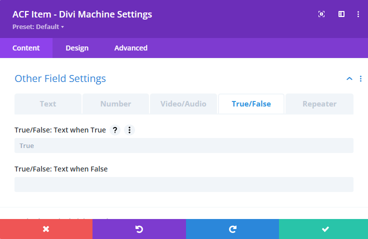
True/False
- Text When True: Text shown when field is true.
- Text When False: Text shown when field is false.
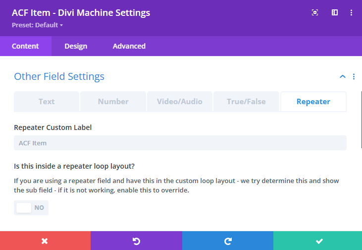
Repeater
- Custom Label: Use a custom label for the ACF Item module inside a repeater.
- Inside Repeater Loop Layout: Enable this if the module is placed inside a repeater loop.
Relational Field Settings
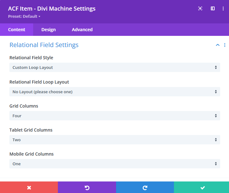
-
Relational Field Style
Choose how related posts are displayed.
Options:Custom Loop Layout,Comma-Separated List -
Relational Field Loop Layout
Select the Custom Loop Layout used to display the related posts when using theCustom Loop Layoutstyle. -
Grid Columns
Number of columns to display on desktop. -
Tablet Grid Columns
Number of columns to display on tablet devices. -
Mobile Grid Columns
Number of columns to display on mobile devices.
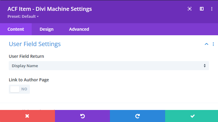
User Field Settings
-
User Field Return
Choose the user property to display.
Options:Display NameUser EmailUser NicknameUser URLUser DescriptionUser First NameUser Last NameUser IDUser Avatar
-
Link to Author Page
Enable this to link the user value to the user’s post archive page.
Conditional Settings
Use these options to add conditional logic or dynamic styling to your ACF Item module based on checkbox, select, or true/false field values.
-
Checkbox/Select – Add value as a CSS class?
Enable this to add the field value as a class on a specified element. -
Is this in a loop layout?
Enable this if the module is used inside a Custom Loop Layout. This ensures proper class scoping. -
CSS Selector
Define the element selector that should receive the dynamic class (e.g.,body,.your-class). -
CSS name prefix
Optional prefix to prepend to the generated CSS class. -
CSS name suffix
Optional suffix to append to the generated CSS class. -
True/False – Hide another module/column/row in same section
Enable to conditionally hide a target element in the same section based on the true/false value. -
Hide the element with this CSS Selector
Provide the selector of the element you want to hide (e.g.,.et_pb_button).
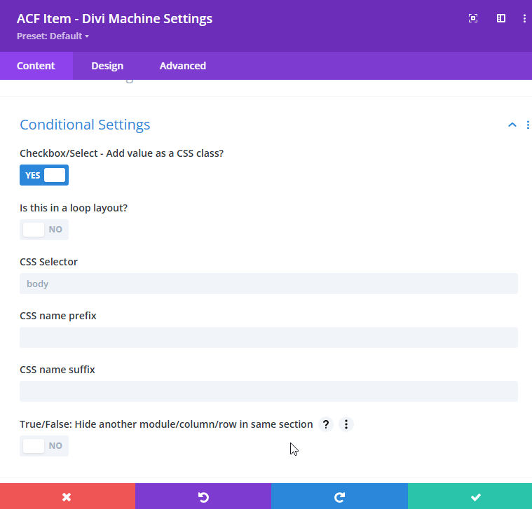
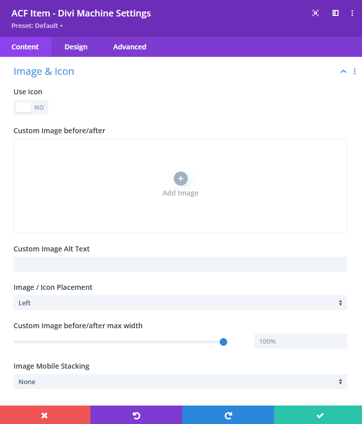
Image & Icon
-
Use Icon
Enable this to use an icon instead of a custom image. -
Custom Image before/after
Upload an image to display before or after the ACF value. -
Custom Image Alt Text
Define alternative text for the image to improve accessibility. -
Image / Icon Placement
Choose where the image or icon appears in relation to the content.
Options:Left,Right,Top,Bottom -
Custom Image before/after max width
Set the maximum width of the image using a slider or manual value (e.g.,100%,50px). -
Image Mobile Stacking
Control how the image or icon stacks on smaller screens.
Options:None,Stack Above,Stack Below